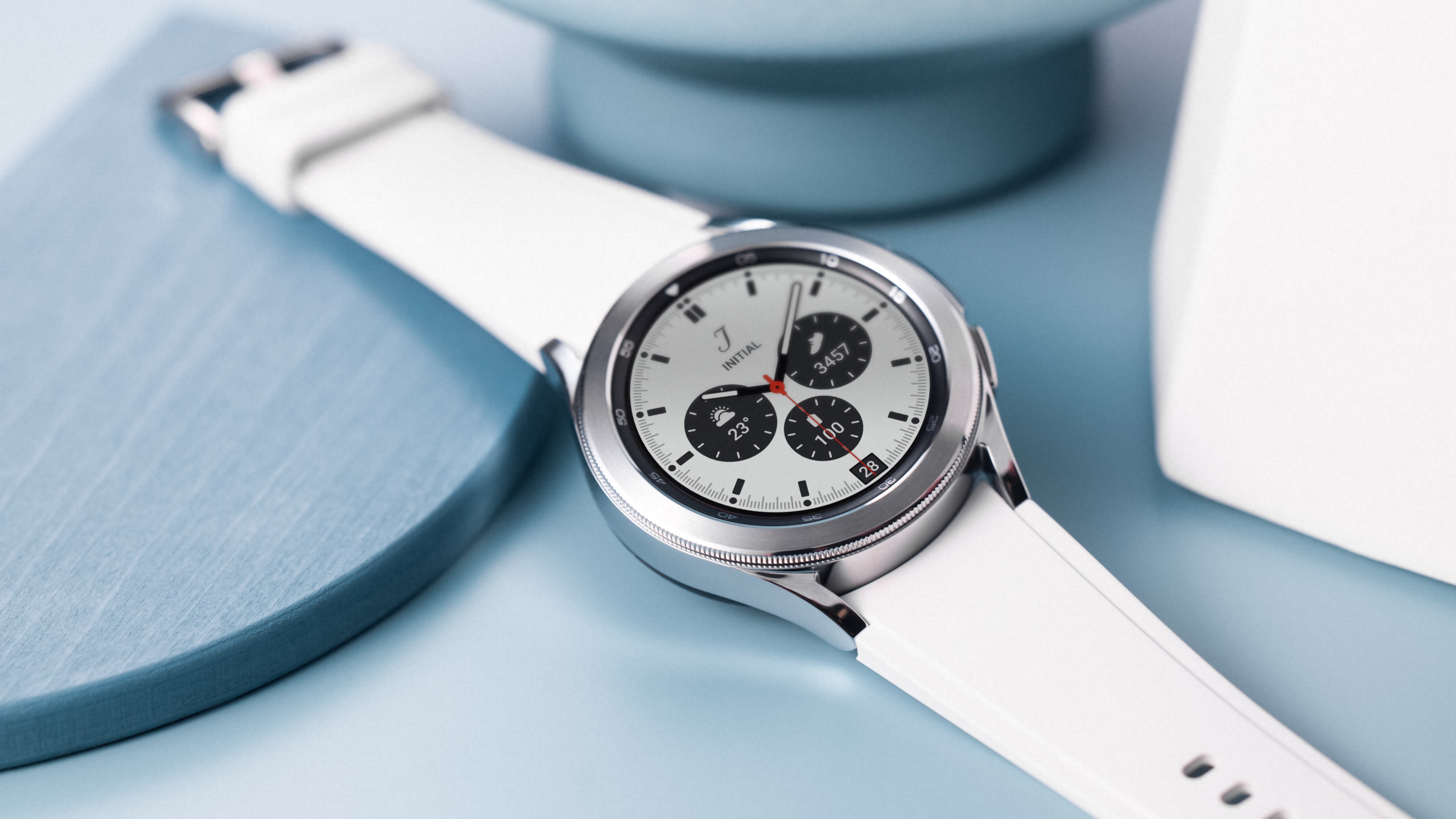
GamesRadar+ Verdict
Some noticeable improvements make this Samsung’s best smartwatch yet. Everything runs faster on the new OS, Google Maps is now on your wrist and the exercise and sleep tracking are superb features. We’re just tired of the daily charging.
Pros
- +
Improved workout options and tracking
- +
Sleep monitoring is very detailed
- +
Smoother operating system
Cons
- -
Needs charging daily
- -
Poor widget customization on some watch faces
- -
Classic model much more expensive than the standard one
Why you can trust GamesRadar+
Samsung watches have been on a roll for a few years now, making some of the best smartwatches for fitness fans and gadget lovers alike, and the Samsung Galaxy Watch 4 Classic has made some useful improvements to ensure it’s a tempting buy, especially for Samsung fans that own a Galaxy phone.
The promise of a new operating system, more fitness features, and faster performance are welcome benefits, but are they worth the price of admission over previous models? Or would we forsake them all for better battery life? Let's take a look.
There are now two different Galaxy Watch 4 models
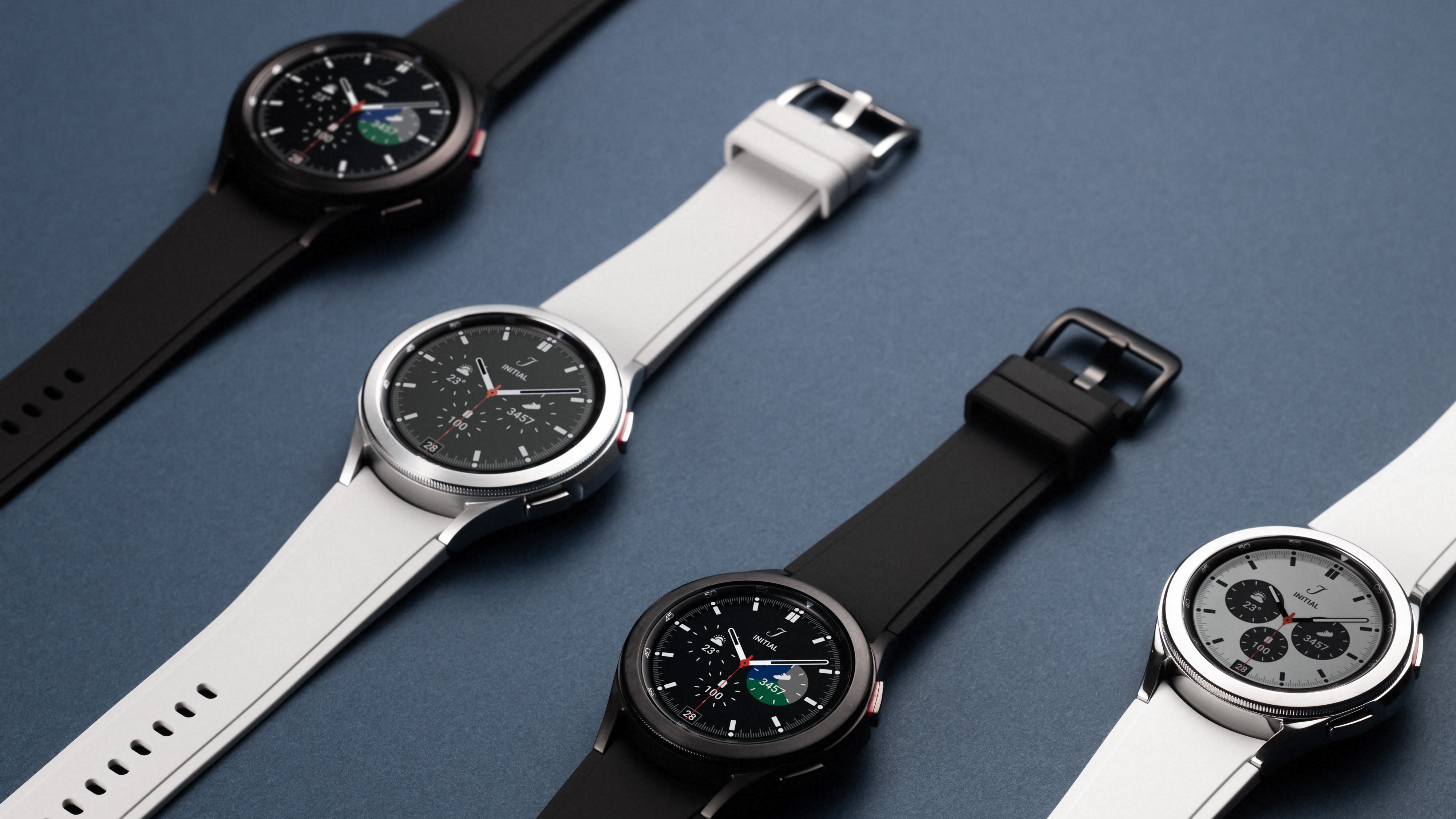
Before we really get stuck in though, let’s clear something up. The Samsung Galaxy Watch 4 Classic sees the series split into two different models. This ‘Classic’ model is the direct follow-up to 2020’s Galaxy Watch 3, complete with a distinct rotating bezel design.
Alternatively, there is a new version, simply called the Samsung Galaxy Watch 4, coming without a rotating bezel where you swipe around the edge of the screen in a circular motion to replicate the bezel action of the Classic. The non-Classic model also comes with smaller displays but otherwise carries the same specs and features. The biggest difference is the price.
Samsung Galaxy Watch 4 prices
The Samsung Galaxy Watch 4 Classic is priced at $349 / £349 (42mm) and $379 / £369 (46mm), while the standard Watch 4 is considerably cheaper at $219 (40mm) / £249 and $279 / £269 (44mm).
There are certainly benefits to having the rotating bezel and even the larger displays due to some small text issues (more on that later). Turning the bezel on the classic has a satisfying click and is the best way to navigate menus between app tiles. The Classic is the model I’ve been using for a few months now, whereas I only spent an hour or so at a preview event using the model without a bezel. That was enough time to see that using the screen edges was much clumsier for navigation - but you do have the option of just swiping between apps too.
If you are caught between the two, I’d advise heading into an electronics store with some display models and playing with the app tiles on both models to see which you prefer. Considering the price difference between the two, it’s certainly worth looking at the cheaper model if you’re able to give it a hands-on try before you buy. For the rest of this review, as we dive into software features, I’ll generally be referring to the Watch 4 Classic as just the Watch 4.
Samsung Galaxy Watch 4 operating system upgrade
We’re now getting the new Wear OS 3 which was built between Google and Samsung specifically for the Watch 4 series. It’s been a long time coming as, on the Watch 3 and earlier models, there has always been an odd disconnect between the watch and how we expect Samsung Galaxy apps to work together.
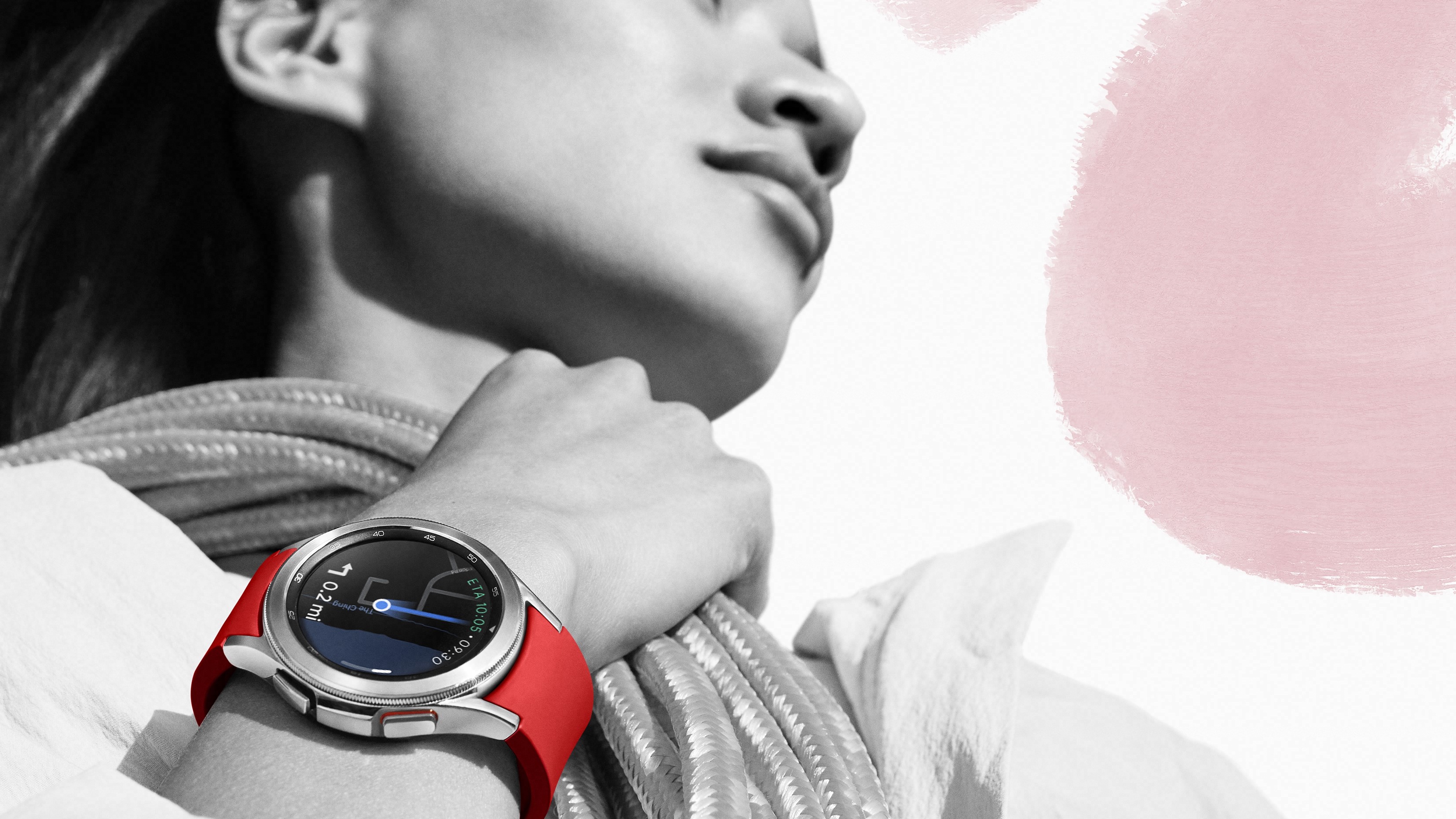
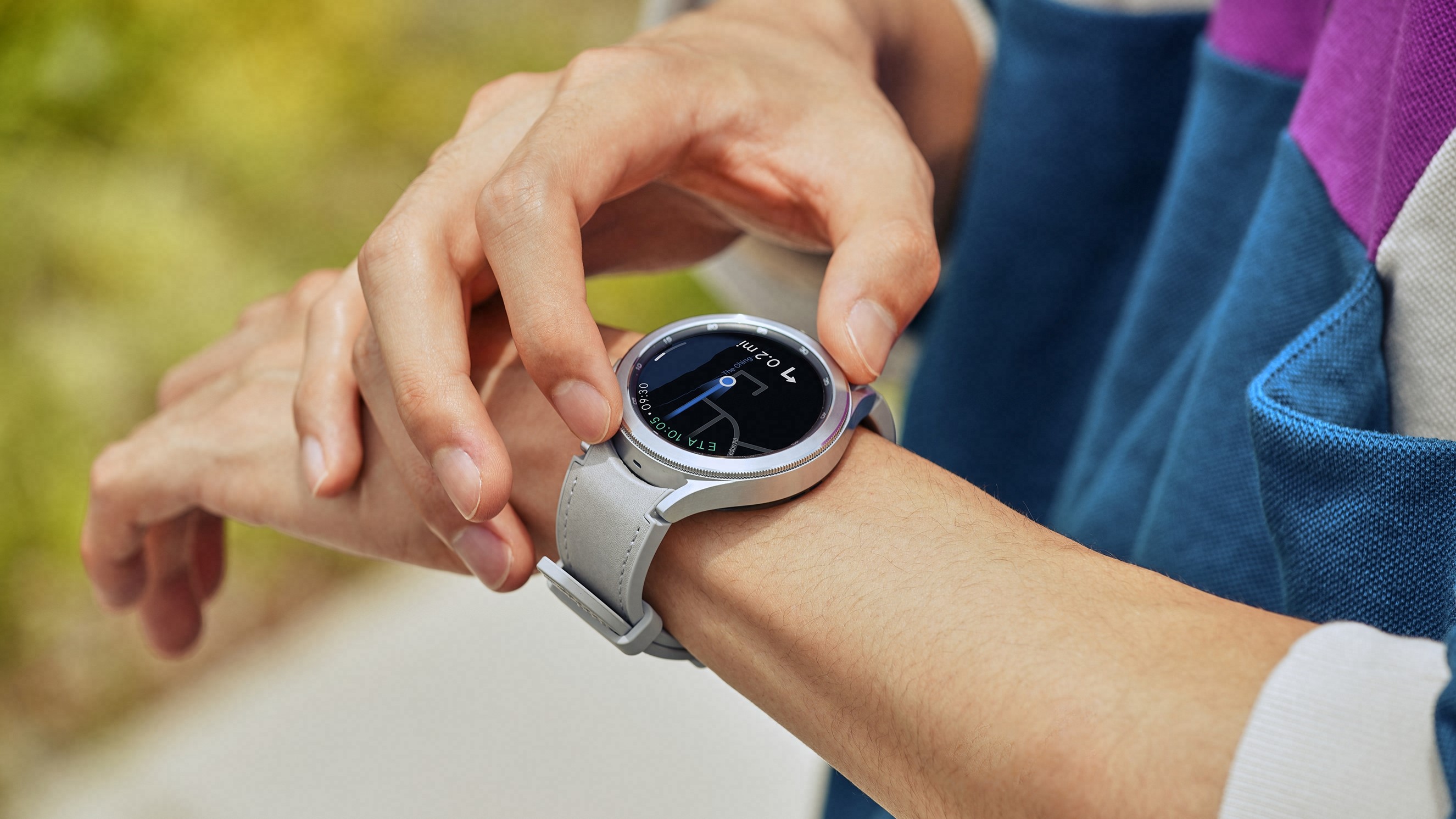
The biggest change is that the Google Play store is now supported on the Watch 4 models, meaning you can download many of the same apps you have on your phone, as long as they support a watch version - so yes, Google Maps is finally on your wrist without any dodgy third-party apps that have disappointed over the years.
Looking at maps on your wrist is of course another good excuse to get a larger display. As a first attempt, it’s not a bad effort, but it does crash sometimes and forget to refresh as you’re walking. You can’t zoom in further on the route either to see some of the other street names or scroll ahead without backing out from the route’s navigation. Hopefully, a few updates will tidy it all up and allow us to banish holding our phone while navigating and looking like tourists.
Let’s get back to navigating the Galaxy Watch 4 though. You can now swipe up to see all your apps in a list that looks similar to the layout on an Apple Watch, albeit strictly in a vertical scroll. As for app tiles/widgets themselves, they’re still accessed by swiping from the side or using the bezel and this area feels very similar to the last watch. It’s a little underwhelming considering this is supposed to be a new operating system.
The extra app support is of course much appreciated, but it would have been nice for the tiles to get a bit of an overhaul too. I have to say though, everything does run much smoother when you’re flying through various tiles, and firing up apps is now super quick. The Watch 3 seemed to almost crash whenever taking a manual heart rate measurement, but the Watch 4 series now does it in a few seconds with no irritating stuttering that previously tempted you to start the process again. The sensors seem to do a better job too and aren’t as fussy with warnings you’re not wearing the Watch 4 tight enough.
There are more watch faces to choose from once again and it can be tricky finding one that supports the Complications (the awful name used by Apple and Samsung alike for onscreen data widgets) you want to see represented.
In some watch faces, you can choose from any of the widgets across the range with step counters, battery, weather, compass, workouts, and everything in between available to choose from. Whereas others will only support a small amount of them meaning you’ll have to dive into apps/tiles to get the info you want rather than have it at a glance when looking at the main screen on raising the watch.
By this stage, you should at least be able to put the four standard widgets along the rounded edges of the screen on any watch face of your choosing, but many of them insist on being super clean and clutter-free - they look nice but are functionally disappointing.
My review model was the 42mm version and some of the text on the widgets is really small, too small to read at a glance in all honesty. I had a 45mm version of the Watch 3 and the same widgets were much easier to read, so I’d certainly advise going for the largest model here, which is the 46mm one - certainly something to bear in mind over the non-classic Watch 4 as it only comes in 40mm/44mm.
Galaxy Watch 4 Classic: Battery
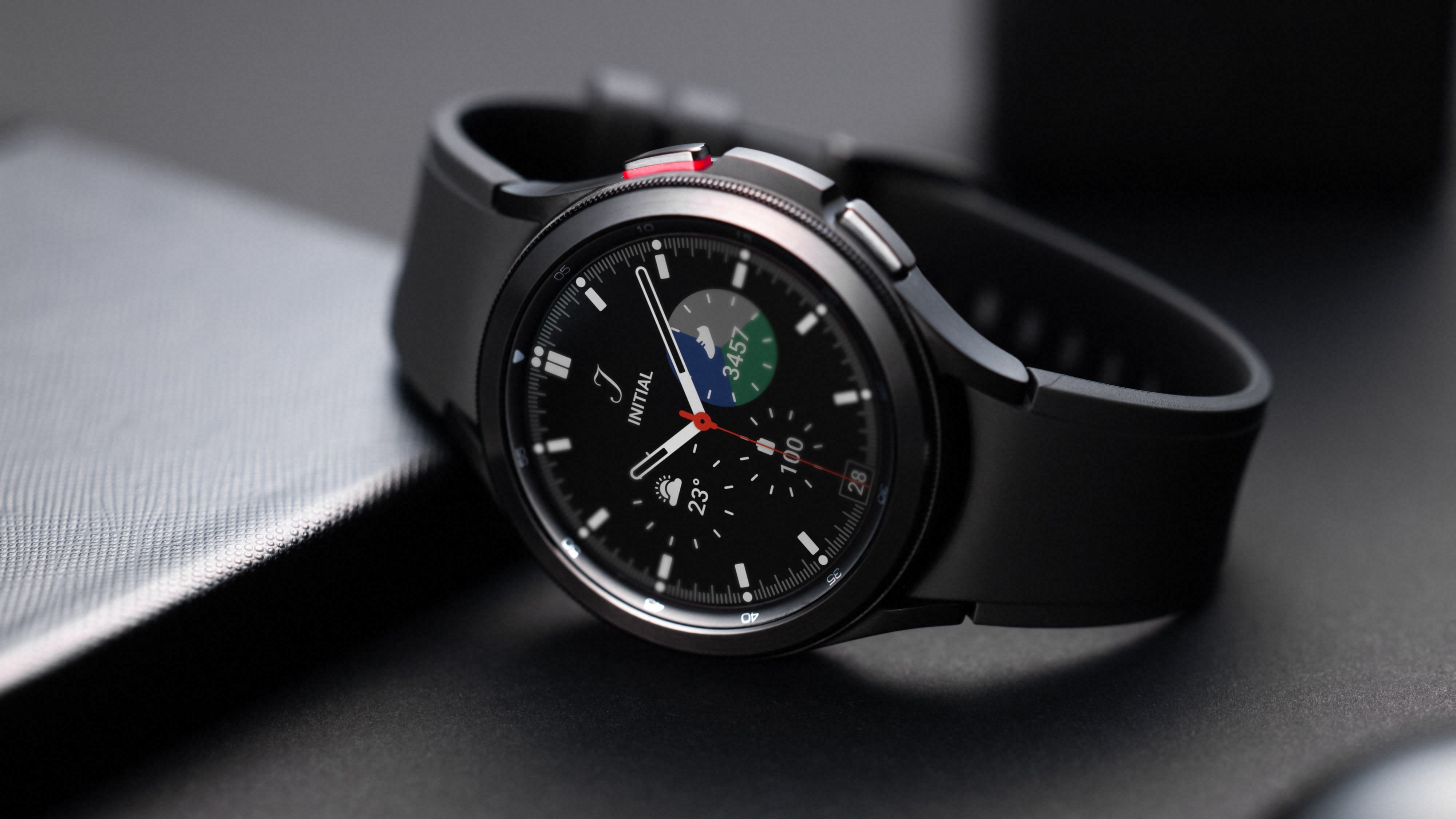
While the Galaxy Watch 4 series has made some nice improvements over the previous models, it continues to disappoint in terms of battery life, with it essentially requiring a daily charge if you want to enjoy its full feature set.
Typically, I would have the display set just below half of the max brightness and have features like blood oxygen and heartbeat monitoring constantly running in the background during the day and have sleep and snoring detection enabled during the night. Even without doing anything else particularly intensive (music playback, taking calls, or vigorous exercise), I’d be down to around 30% by the time I’d be thinking of heading to bed. Going to bed without charging it would run the risk of hitting zero percent while sleeping and losing the sleep-tracking data or the watch vibrating to warn me the battery was running low during the night - an irritating and further battery-draining quirk that needs to be killed on all phones and smartwatches.
If I was closer to 40% I’d sometimes get away with it and only have to charge it up in the morning with a few percent remaining. Charging times from near-empty are 70-80 minutes via the small supplied wireless USB charging base - you’ll need to supply your own plug.
So while you’ll occasionally get over a day of charge, you’ll still find yourself charging on a daily basis in order to avoid being caught short. Setting the heart rate monitor to every ten minutes instead of constant didn’t give me much more juice and if you’re turning off these health settings in order to eke out a bit more power then you have to ask if it’s worth spending this much money on a smartwatch in the first place?
Sleep monitoring won’t be for everyone, and you might get a day and a half on a regular basis if you’re not wearing the watch overnight. But I’ve actually found this feature to be one of the Watch 4’s standout features.
Fighting Fitbit on fitness features
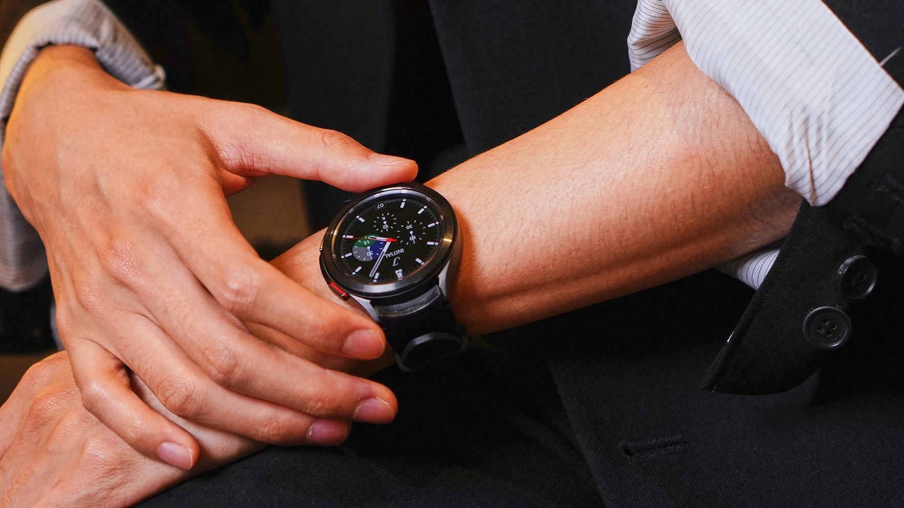
The Watch 4 series is certainly ambitious and really gunning for not just Apple but also smartwatches from fitness specialists, Garmin and Fitbit. Workout sessions track a huge range of activities walking, running, squats, stretches, swimming, weights, ellipticals, leg curls, aerobics, and more.
The gyro sensors are much better than those on the Watch 3 too as they register movements much more accurately, especially on your hourly stretches if you have the prompt set on the watch to remind you to get out of your office chair/off the sofa more often during the day.
Previously, on a set of ten reps it would take four or five before the watch would start counting them. Now they all seem to be counted, although one or too sloppy reps still won’t get counted if you half-ass it, but it always feels fair now.
Heart rate tracking seems more reliable this time around and is best left to always-on, rather than just manual testing if you want to set some decent baselines for regular ratings at resting and exertion.
More in-depth health features are a bit hit and miss. The new body composition metrics measurement sensor enabled by placing fingers on the two buttons for a short time gives readings for body fat, skeletal muscle, BMI, body water, and more after you give it your weight.
Results seem to vary quite wildly unless you strictly stick with doing it at the same time every day, and even then you can get different results if your arms are in slightly different positions during the scan. You’d be much better off using the results from a proper set of BMI scales really, especially as they’re pretty cheap nowadays.
There’s an ECG scanner as well (only if you have a Samsung phone) which looks for any patterns you might be concerned about. Samsung is clear that the Watch 4 isn’t a medical piece of equipment, so take it all with a pinch of salt. Or not if you’re already dining out on snacks too much.
I have to give a shout-out to the sleep detection though as this has turned out to be one of the Watch 4’s best features. Wearing a watch to bed isn’t something I’d usually do at all, and it has presented issues on when to charge the damn thing, but I’ve found myself wearing the Watch 4 every night for a few months now and will be carrying on for the foreseeable.
The watch is capable of giving you readings for how much REM, light, and deep sleep you get as well as how often you woke up during the night via a colored timeline display you can view in the morning. You’re told how much actual sleep you had and it’s also scored. The score isn’t particularly helpful though as it varies wildly. I’ve had a high score on an erratic night’s sleep of fewer than five hours, but middling to low scores on relatively uninterrupted six or seven-hour sessions.
Blood oxygen is monitored during the night and you can set up snore detection if you have your phone next to your bed as it will record it for you to playback in the morning. Thankfully, I’ve only snored twice in the last few months which is plenty enough given the creepy audio on the recording.
You can use your phone to scroll back through the data to see how much sleep you’ve been getting over longer periods of time, but the way the data is presented in the app is misleading. The graphs tend to highlight the amount of time you’ve tried to sleep, rather than the actual sleep you had. Click on an individual day and then you get the full breakdown of how much sleep you had, along with what types. So it’s a bit back to front, but overall, I’m impressed with the tracking itself which does seem to accurately pick up genuine sleep rather than me lying in bed watching TV or those nights where I’m spending more time lying there with my eyes closed.
I was keen to try out the blood pressure monitoring, but have not been able to due to the requirement of setting up the device with an initial one-time reading from a proper blood-pressure cuff. Oddly enough, I don’t have one of these lying around at home and the idea of heading down to my local doctor’s during a pandemic so I could get a measurement to help me write my little smartwatch review seemed to be a bad idea.
An important note: most health features are compatible with any Android phone, but the ECG and blood pressure features only work on Samsung phones. Not the biggest of deal-breakers and I wouldn’t lament their loss if you’re thinking of pairing the Watch 4 with something from OnePlus or maybe one of Google’s Pixel phones - although a Pixel watch is heavily rumored to be coming this year too.
Should you buy the Galaxy Watch 4 Classic?
If you’re already an Android phone user, especially a Galaxy model, then this is one of the best smartwatches you could possibly buy (the Galaxy Watch 4 series is not compatible with iPhones at all). It’s a decent upgrade over previous models with a snappier operating system and improved health features, with exercise and sleep tracking being the standouts.
The display is super clear and bright, although we’d opt for the largest size you can for the smaller text on some watch faces. The raise to activate display works much better than previous models too. The Watch 4 is also pretty damn good for taking quick phone calls thanks to the built-in speaker and mic. Google assistant is still missing, so you’ll have to rely on Bixby for voice commands - we all know you won’t though.
The Watch 4 Classic is a harder sell if you picked up last year’s Watch 3 as there’s not a huge difference despite the new operating system. The battery continues to be a letdown (as it does on Apple’s latest watches too to be fair), so that’s something to bear in mind if charging daily will be a hassle for you. Garmin and Fitbit have models with better battery life, but they’re much more lacking in general smart features.
Overall though, the Watch 4 Classic is the best smartwatch Samsung has ever made and the bezel-free standard Watch 4 provides a far cheaper alternative that should be considered if you want to save some cash or if you prefer that cleaner open design.
Brendan is GamesRadar's former Managing Editor of the Hardware & eCommerce team. He also spent time as the Deals Editor at our sister site, TechRadar. He's obsessed with finding the best tech, games, gadgets, and hardware at the lowest price. He also spends way too much of his free time trying to decide what new things to watch on Netflix, then just rewatches It's Always Sunny in Philadelphia instead. Nowadays you'll find him as the eCommerce Content Director for Future's mobile tech sites, Android Central, iMore, and Windows Central.
