GamesRadar+ Verdict
The Samsung Galaxy Z Fold 3 is the best foldable phone/tablet ever made and offers a range of features that will help you do more than ever before. It’s priced far beyond what most are willing to pay though, and a few of the apps need work yet.
Pros
- +
The tablet/phone hybrid we’ve been dreaming of
- +
Multitasking app support is fantastic
- +
Feels like a more polished product overall
- +
120Hz on every screen
Cons
- -
Some apps are buggy in Flex mode
- -
Under display camera isn’t great
Why you can trust GamesRadar+
Whenever a new form of technology comes along, it’s usually expensive and it takes a few versions before it’s done right and can justify the cost. The Samsung Galaxy Z Fold 3 is foldable phones done right for the first time. It’s still very expensive (prices start at $1799/£1599), but it’s the first device that’s really nailed that wow factor of having a mobile phone that folds out into a tablet. Sure, there are some minor elements that we hope to see worked on in future iterations, but for now, this is quite simply, one of the best phones ever made.
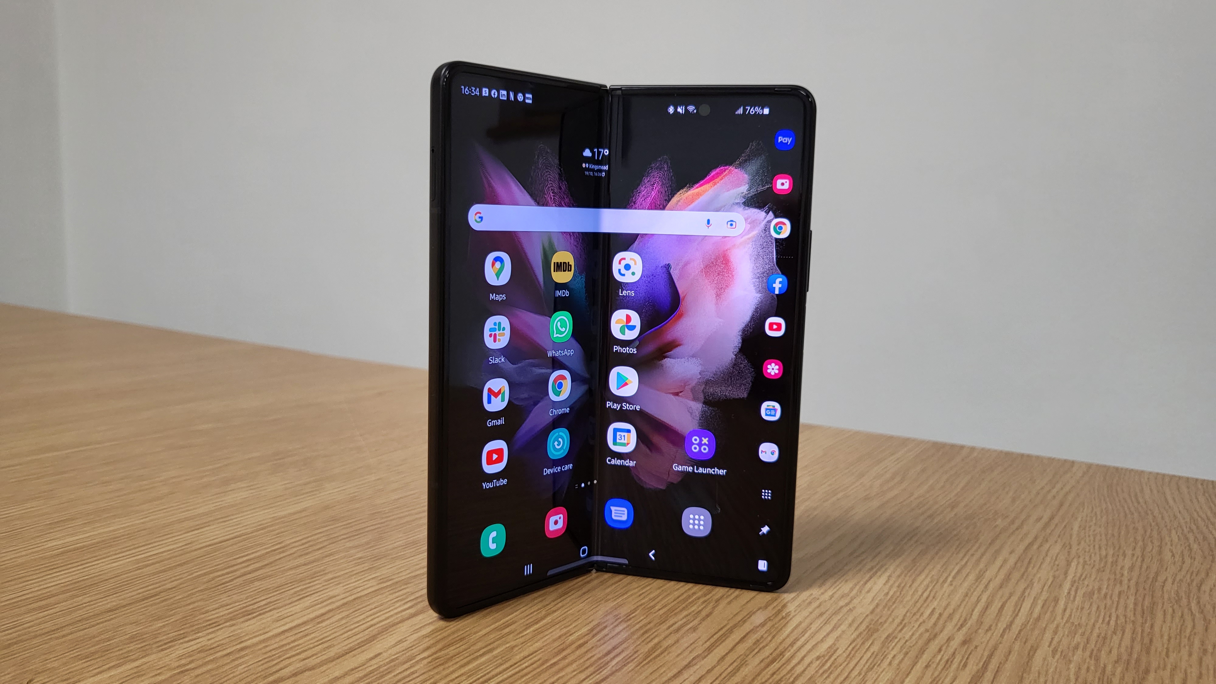
This device isn’t to be confused with other foldable phones that are going for a clamshell design, opening up into a regular phone-sized device. Samsung has released one of those at the same time in the Samsung Galaxy Z Flip 3 (stay tuned for our upcoming review of that one). Instead, the Z Fold 3 opens up horizontally to reveal an almost-square 7.6-inch tablet-esque screen at an 11.2:9 ratio. You also get a large 6.2-inch cover screen on one half of the front side of the device too for quicker access.
The sizes of both screens haven't changed over the previous model, but the cover screen has been upgraded to match the 120Hz display seen on the main display, so it gets that lovely smooth feeling when scrolling through feeds.
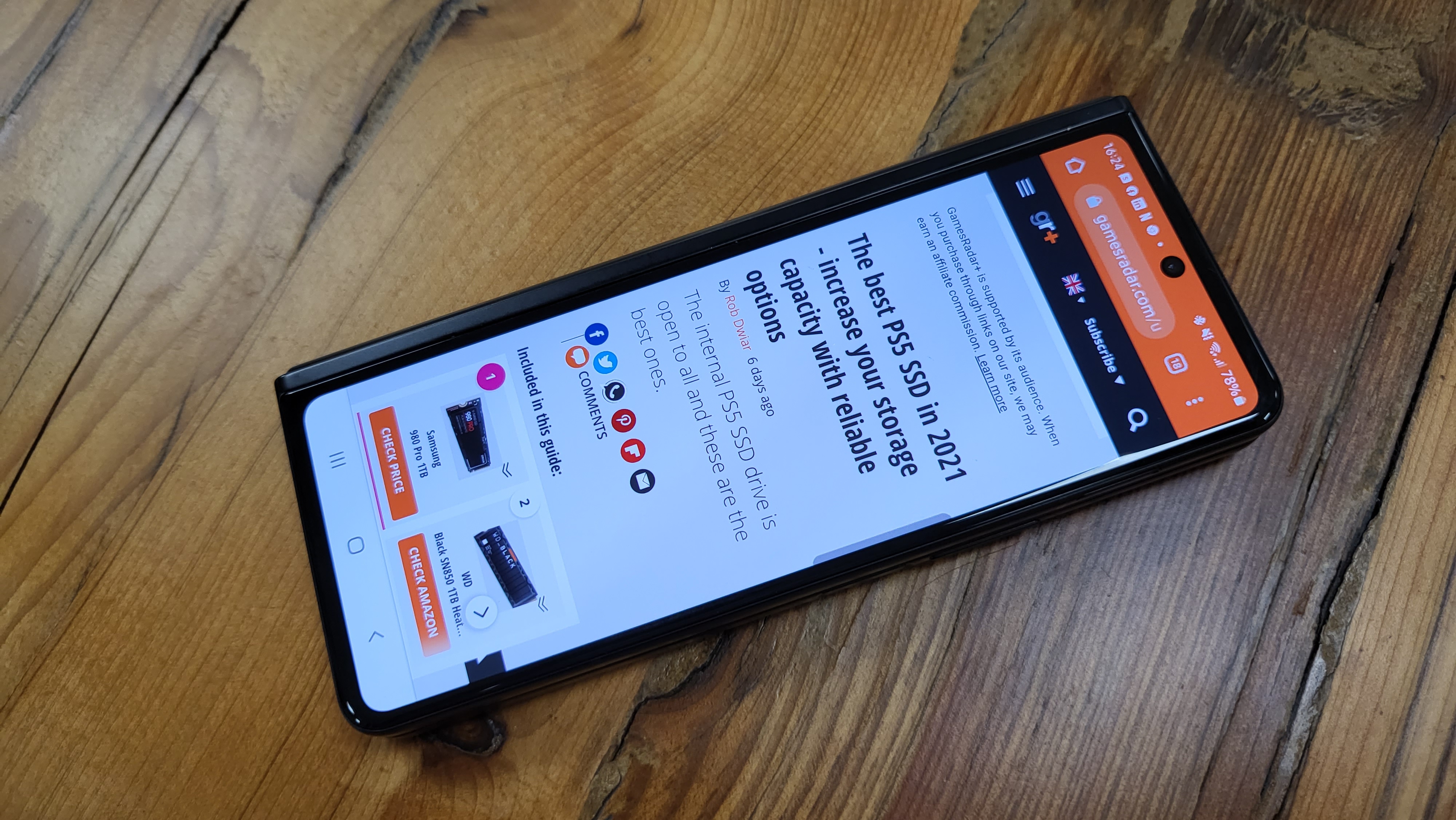
As a functional display though, the cover screen is a tad too narrow to use that much - outside of quickly checking your messages, brief articles, or maybe Google Maps if you’re walking and want to hold the device one-handed. I found the cramped page layouts added way too much scroll to the experience. The compressed keyboard results in too many typos and placing the cursor first-time to edit them is too difficult. Swipe typing did fare a bit better though, so I’d advise switching to that. It’s a tough balance as we’ve seen text automatically shrunken down to accommodate narrow screens on phones like the Sony Xperia 1 III but in these cases, it’s often too small. The front screen here is much narrower than Sony’s phone too.
Thankfully, in instances where I’d decide the front display wasn’t working for me, opening up the phone automatically opens the same app on the internal one for a smooth transition. And for all but the quickest tasks, you’ll want to open up the Samsung Galaxy Z Fold 3 because this is where the magic happens.
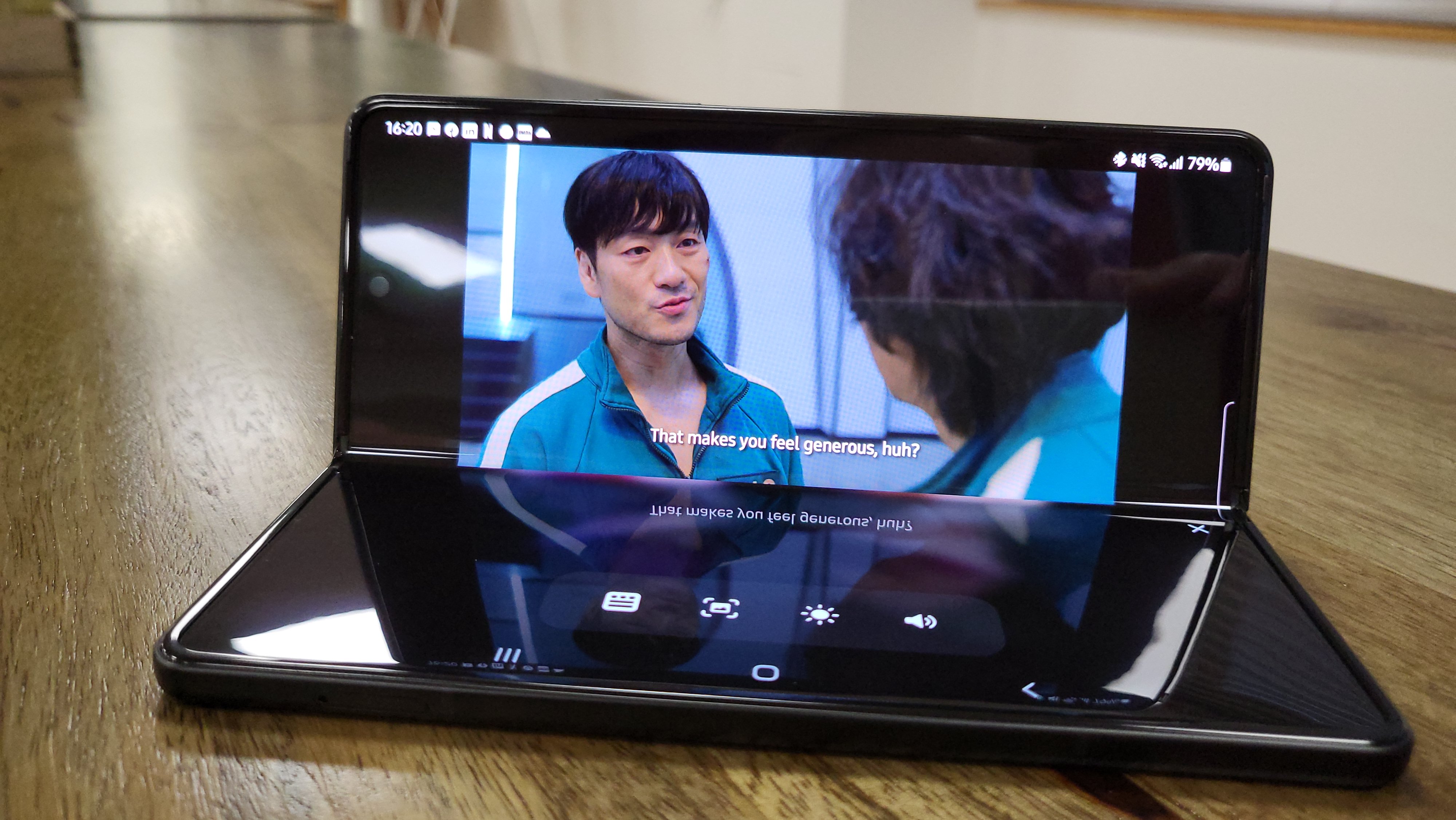
The internal tablet display
Despite being the third in the series, it’s taking a while for Samsung, and indeed app developers, to really get on board with the square screen ratio offered by the internal displays on phones like the Galaxy Z Fold 3. On default settings, you’ll find Facebook and many other feed-based apps try to use the full width of the screen. While all seems well initially on Facebook, I soon started to notice that long vertical images and videos (think anything shot with a phone) wouldn't quite fit. If you can see the top of a video you can forget seeing the subtitles at the other end. Tapping videos will open them up at a viewable ratio, but it’s an extra interaction you might not want to make if you’re only lightly browsing videos on your feed as you scroll.
On the plus side, all apps can be adjusted in the ‘Labs’ settings and you can choose 4:3 (narrower, but still not quite right for video cropping issues) or a much more traditional 16:9 which does fix these awkward fits. 16:9 mode does mean adding some dead space to the sides of the screen, and they really are dead. It would have been nice if you could at least use these to scroll through the feed given they’re much more in reach for your thumbs.
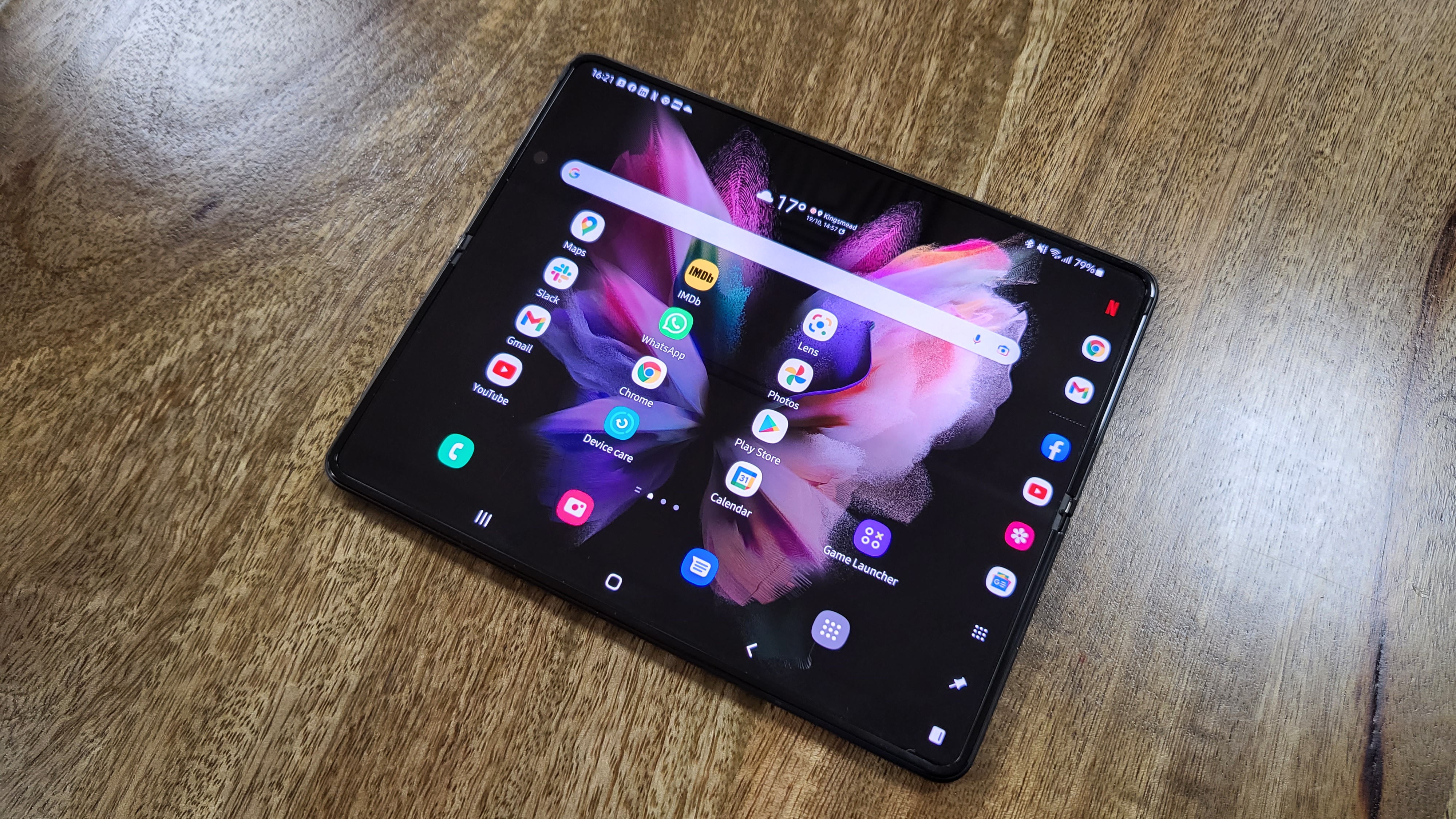
The ‘crease’ is still there in the center of the screen but it really isn’t that noticeable and has never gotten in the way of my enjoyment reading or watching content, especially as it basically vanishes when viewed head-on with any bright backgrounds.
Flex mode -where you fold the phone halfway into an L-shape and put it on a flat surface - has a lot of potential, but is lacking polish and wide app support at the moment. For Netflix and YouTube, it moves the media controls to the bottom half and leaves the other half, the one facing you directly, to show the video content. It’s great when you’ve nothing to prop the phone up against to watch something on the whole screen. Think of a shaky table on a train, or when watching in bed. However, it recently stopped working for me on Disney Plus and it isn’t supported yet for Google Meet. Likewise for video calls on WhatsApp, but it does split nicely to half keyboard, half messages for texting. So if you like to send long messages you can settle down to type almost like a proper keyboard rather than just using thumbs.
The wider display in full-screen tablet mode does excel for other apps, though. Reading articles in Chrome or going through emails is instantly better than a traditional mobile experience, even if you’re coming in from a large device like the Samsung Galaxy Note 20 Ultra (which I am personally).
"My old tablet’s time is up and I don’t have to use my laptop as much. This is exactly what I want from a large foldable phone/tablet hybrid."
Where the device really comes alive, though, is in split view and viewing multiple apps at once. For me, running Gmail and Chrome alongside each other while holding the phone horizontally is fantastic and something I can only usually do with a tablet - which I’m loath to drag around outside the house.
Sorting through an email backlog and being able to open their links onto the other side of the screen is a big timesaver. But you can really ramp it up as pretty much any app can be used in split view and you can even have a third open as a pop-up over the top, which is handy if you perhaps want to have controls for Spotify running on-screen at once too. The third app feels like overkill for me personally, especially in conjunction with Chrome and email, but the functionality may suit your own needs and brings the tablet experience more in line with that of iPad OS.
What is new this year is the new taskbar. On recent Galaxy phones you might have (should have!) been using the excellent feature that lets you drag in a quick access taskbar from the edge of the screen for your favorite apps. That feature is here too, but you can now pin it to stay in place. So, if you’re working simultaneously between multiple apps you can move between them with ease. For example, I can access Chrome, Gmail, Google Docs, and Google Sheets with a similar speed to my laptop now. Previously, I’d have to press the Menu button, then scroll through my recently opened apps each time. Now with this quick access, combined with split-view, I can get much more done at speed. And best of all, unpinning this taskbar is a swipe and a click away for when I want that screen real estate back for more casual use. My old tablet’s time is up and I don’t have to use my laptop as much. This is exactly what I want from a large foldable phone/tablet hybrid.
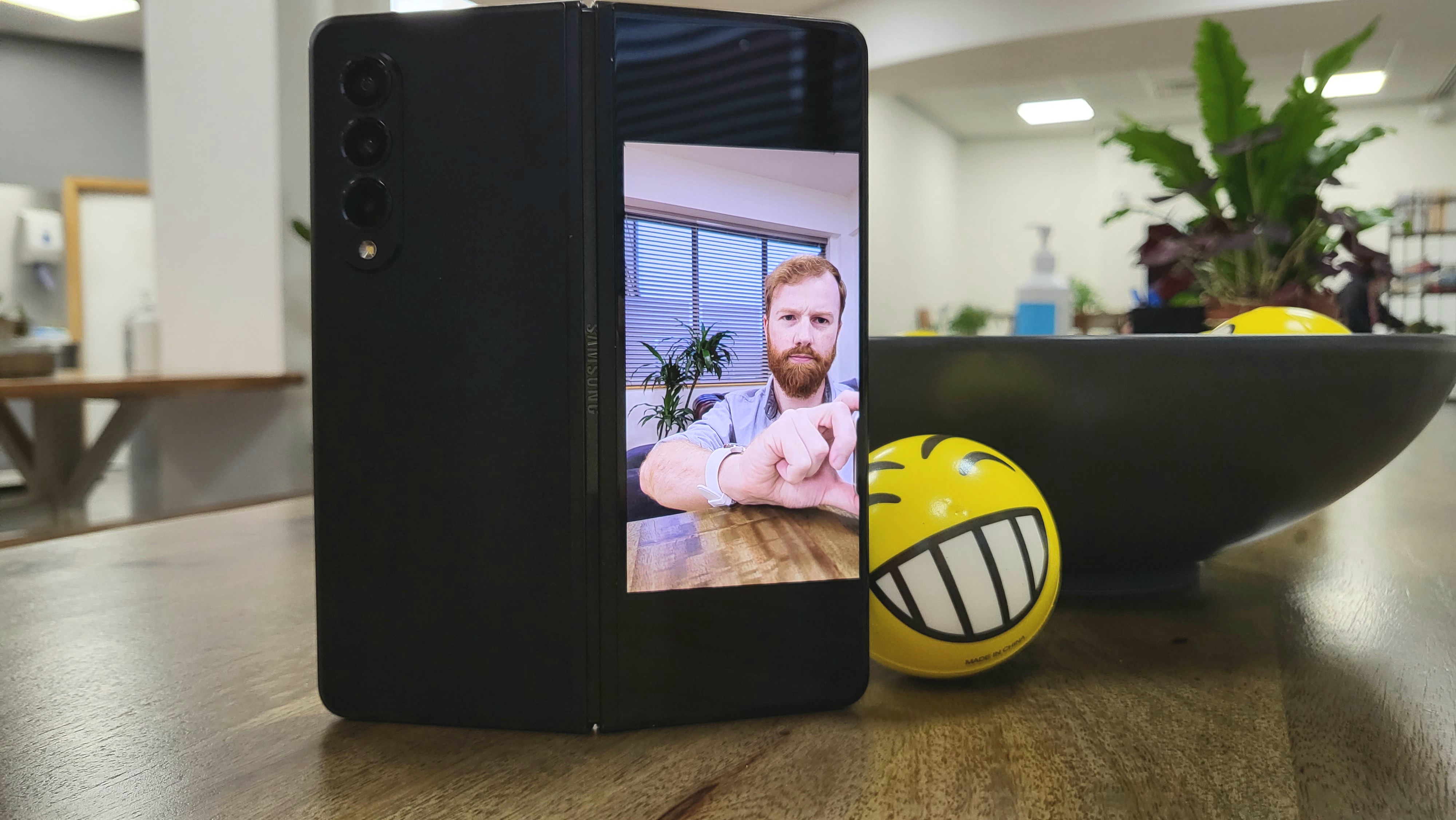
Samsung Galaxy Z Fold 3 cameras compared
The pinhole camera on the internal display has been replaced with a new under-display camera, which actually shoots between pixels on the screen. You can see a small mesh-like circle hiding the camera and it can be noticeable at first, but considering the system bar is usually black, you won’t see it and I soon forgot all about it when watching content. It’s an impressive innovation.
While the discretion is impressive, unfortunately, the quality of the 4MP shots from the camera hiding behind the screen is disappointing. So much so, I’d rather have the old 10MP pinhole design back. Images are much blurrier and darker than the Fold 2 and indeed most other Samsung phones. I’m not fussed about it from a selfie perspective as the 10MP lens on the cover display takes care of that, but for video calls, the internal lens got a universal thumbs down from my colleagues in various environments, with video quality being notably lower than even the basic webcam built into my work laptop. Flex mode not being supported in Google Meet is a bit annoying for using the phone half folded on a desk as well - you can still run the call, but the image of your colleagues is folded in half. That’s patchable, but the lens quality is not.
As for the three rear cameras, you’re getting a main, ultrawide, and telephoto (with 2x zoom) all at 12MP. All very good in themselves, but the S21 and modern iPhones offer better images and with stronger zoom features. But we’re only talking minor differences for most images unless you’re very serious about your phone’s camera capabilities. The modest downgrade makes sense given all the extra work the phone’s internal spec is being asked to run compared to the smaller S21 series.
What I really like about the Z Fold 3, though, is the easier functionality. Accessing the pro mode features can get a bit fiddly on a regular-sized phone, but this foldable phone gives these features and dials their own space in Flex mode. You also have the option of seeing a preview of your photo on one side of the screen without leaving shooting mode, which drastically reduces the back and forth trying to work out if you have the shot you want. Giving the in-depth pro mode controls their own space is much better for experimenting with them too.
And that’s not all, when using the rear cameras, you can turn on the front screen so your friends can see what you’re shooting which is a neat feature for making sure everyone is in the shot and can potentially reduce the number of retakes required.
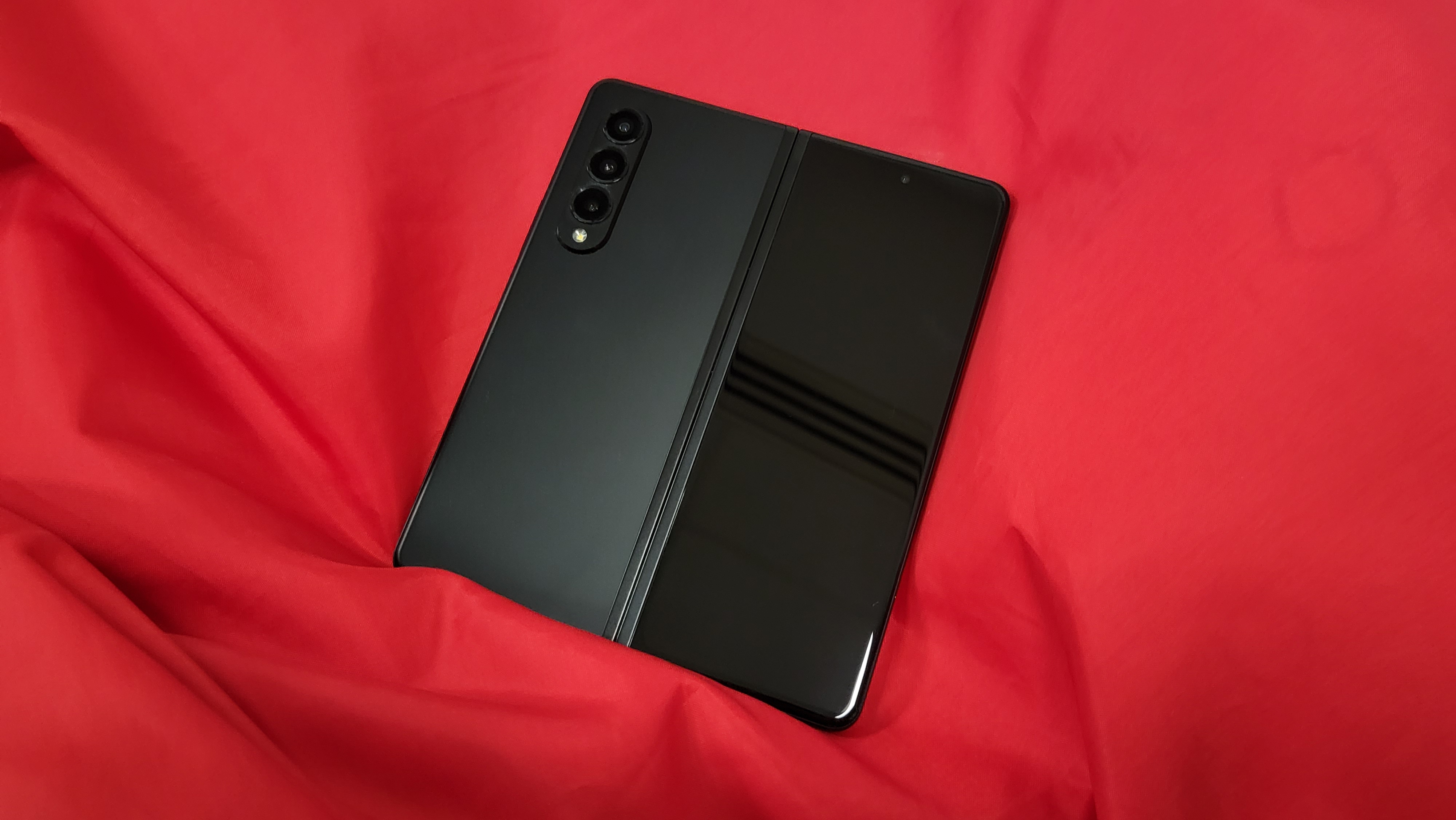
Gaming on the Galaxy Z Fold 3
The expansive canvas offered by the Z Fold 3 is superb for gaming on the go with the vibrant 120hz display capable of running Call of Duty mobile on high settings with ease. Unlike a lot of flagship phones, I found the Fold 3 didn’t really heat up that much when playing. I never ran into issues with cropping either as most titles seemed fine reformatting the image without any sort of distortion or chopped content.
It’s worth pointing out here how strong the Dolby audio is on the Samsung Galaxy Z Fold 3 as well (including general music and movie playback). The dual-speaker setup supports strong bass performance and the mids and highs carry themselves nicely too, providing plenty of detail and never feeling tinny.
FPS and racing games all felt solid on the foldable screen, but I did run into a slight issue with Sky Force, a retro-style scrolling vertical shooter. When using my finger to drag the ship around the screen, I’d sometimes briefly lose control, like I’d taken my finger off the screen, when passing over the crease. It’s far from a deal-breaker as I rarely play those types of games now and generally prefer using a controller for Call of Duty and the like. I didn’t find the crease to cause any issues in RPG or match-three games either.
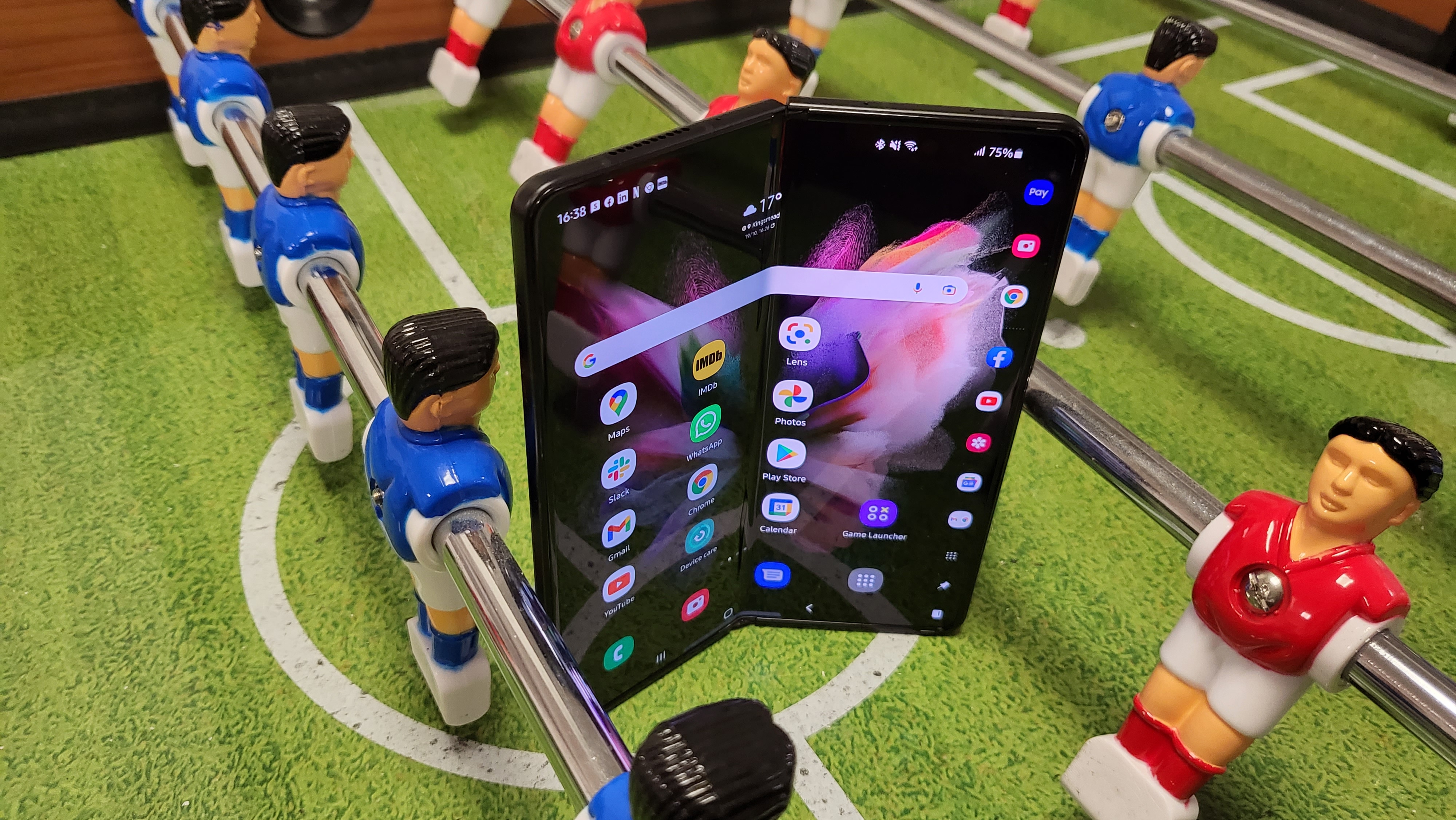
Samsung Galaxy Z Fold 3 battery test
The 4,400 mAh battery is smaller than we’ve come to expect from larger smartphones (the S21 Ultra has a 5,000 mAh battery), but you shouldn’t have a problem getting through a full day with it unless you’re really hammering some intense gaming or streaming on a lengthy commute.
The Z Fold 3 supports 25W fast charging and 10W wireless charging, but don’t expect to find a charger in the box, which is frankly ridiculous given the price, and we’re not buying the environmental excuses either. By all means, make it an optional extra and charge a few bucks less for not including one but it’s wrong to assume everyone has a USB-C fast charger already.
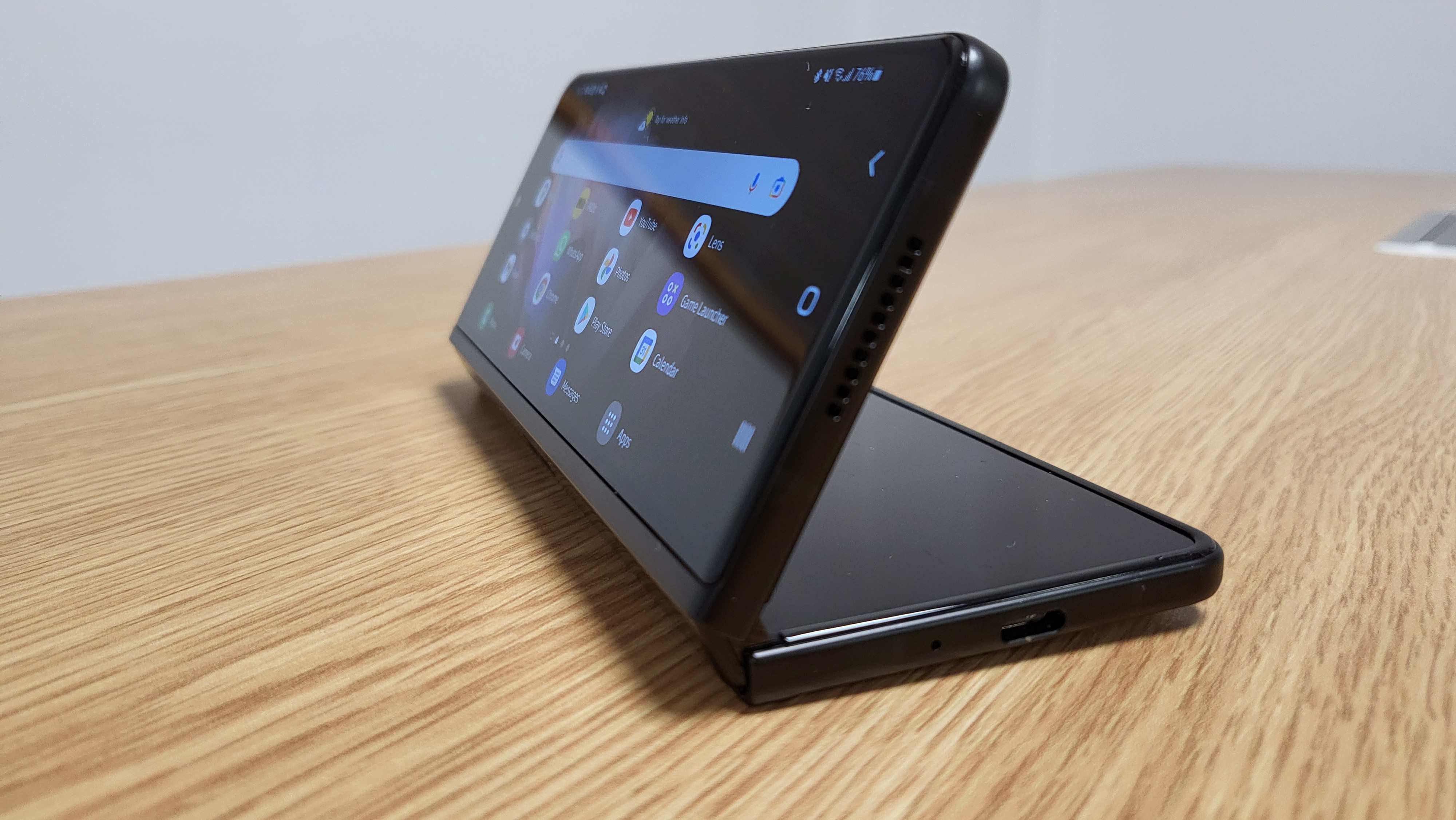
Durability of the Z Fold 3
Unlike the previous model, the Galaxy Z Fold 3 is now IPX 8 water-resistant so can survive 1.5 meters of water for up to 30 minutes. It’s impressive that Samsung has been able to produce this in the still very new world of foldable phones. There’s no rating for dust resistance though, so if you spend a lot of time on the beach, desert, or on construction sites, you might want to think twice before taking the Z Fold 3 with you. Small particles could get under the display’s surface and into the phone itself.
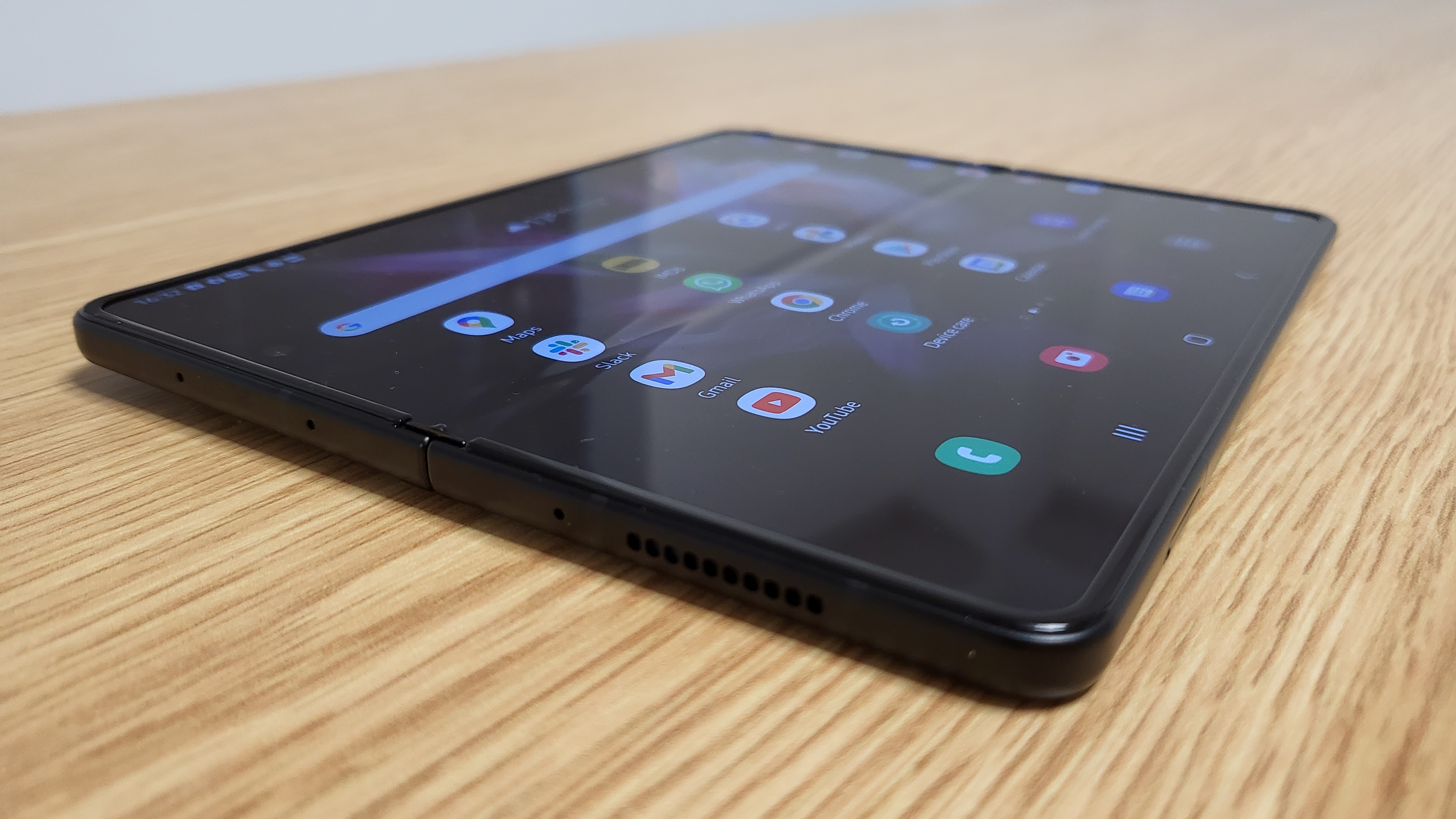
The new Armor Aluminum casing and hinge feel robust enough to last with frequent use, hopefully for a few years given the cost. The ‘snap’ you get from closing the phone feels enormously satisfying when you’re done with it too. Opening the Z Fold 3 is a little on the stiff side, though.
Samsung claims the screen is 80% tougher than before and can withstand a huge amount of use. Having only had the phone for a month or so, we can’t attest to its longevity, but we’ve not heard any complaints from writers that have had one even longer. The glass itself is Gorilla Glass Victus, which is the top end of the scale, but still glass nonetheless, so we’d implore you to pick up a decent case and save yourself some heartbreak.
Some areas still need work
There are a few rough edges with some apps that I hope can be patched out. Running Disney Plus in Flex mode stopped working recently and refuses to split the screen appropriately between the content and controls (Netflix and Youtube run fine though). And as already mentioned, there are plenty of apps that don’t yet support Flex mode despite being a great fit for it.
Outside of Flex mode, Gmail’s quick controls at the bottom of the screen to hop into Chat, Spaces, or Meet appear on the front screen, but when you open the phone up these shortcuts often disappear meaning you’ll have to open their own bespoke apps rather than access them within Gmail.
Bafflingly, Chrome tabs are laid out like they are on a PC browser when using tablet mode, making it difficult to navigate them if you have lots open, but when browsing via the front screen you’re able to press a tabs button (like you can on most mobiles) and view them all from a distance, making it much easier to get back to the one you want.
As for the hardware itself, there are various elements you’d hope to see improved with future foldables. It seems greedy to ask this, but you’ll almost certainly want a lighter version as the weight here is considerable at 271g/9.8oz, and you can really feel it when you drop it into your pocket - you might find some trousers suddenly need a belt when they didn’t before. When folded, the Z Fold 3 is a thick piece of hardware. In fairness though this is only about as thick as your average flagship smartphone when unfolded, so expecting anything super thin when folded is a big ask this early into foldable phones.
At this price, it would be nice to get the supported S Pen Fold Edition thrown in, but next time around it would be even better if a Note-esque stylus can be built-in from the off. And with the Galaxy S22 Ultra/Pro model rumored to be getting a stylus, we’ll be crossing our fingers and toes that this does indeed happen with the next page of the Fold’s story.
Should you buy the Samsung Galaxy Z Fold 3?
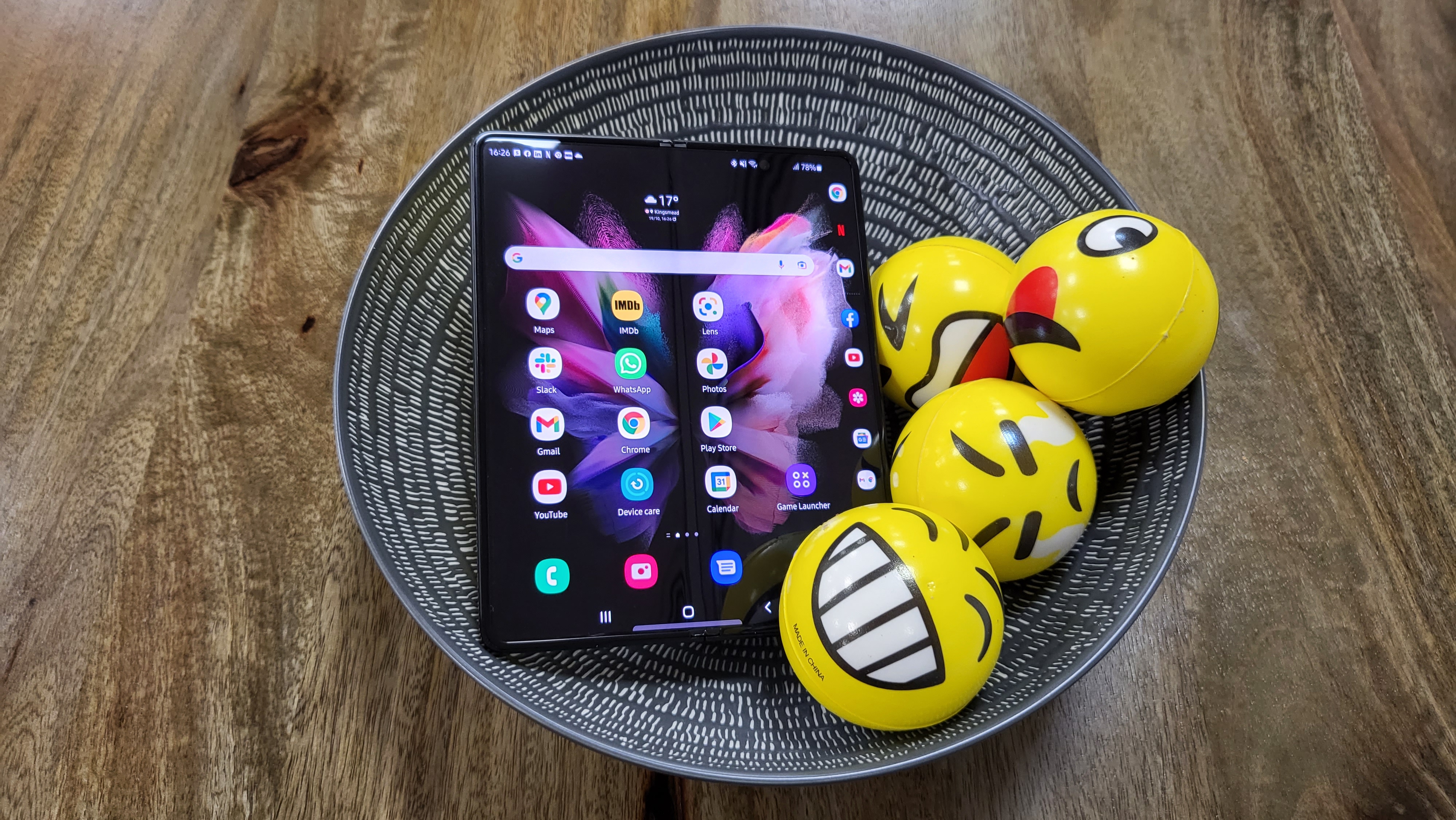
The Samsung Galaxy Z Fold 3 is undeniably a tough sell at such a high price, but hopefully, it’ll come down over time. If you can get a fair deal with your network provider, though, you might be able to make it work. If you can, this is genuinely a game-changing piece of technology that you’ll come to adore.
It’s a much easier sell if you’re an avid multitasker who has spent a lot of time trying to do too much with even the best in regular smartphones. That extra space of the Fold 3’s tablet screen, combined with split-view and the pinnable taskbar really opens up your options of what you can do without packing a separate tablet or turning on the laptop. And for many of us, that’s incredibly valuable and reason enough to take a pricey plunge into foldables - now that the tech has caught up with the ambition.
Brendan is GamesRadar's former Managing Editor of the Hardware & eCommerce team. He also spent time as the Deals Editor at our sister site, TechRadar. He's obsessed with finding the best tech, games, gadgets, and hardware at the lowest price. He also spends way too much of his free time trying to decide what new things to watch on Netflix, then just rewatches It's Always Sunny in Philadelphia instead. Nowadays you'll find him as the eCommerce Content Director for Future's mobile tech sites, Android Central, iMore, and Windows Central.
