Why you can trust GamesRadar+
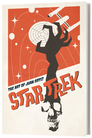
Star Trek: The Art Of Juan Ortiz book review .
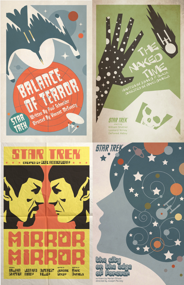
Star Trek hasn't produced much in the way of classic posters - The Motion Picture ’s “rainbow” design is really the only one that’s iconic. This collection of 80 pieces of retro-flavoured art corrects that.
Juan Ortiz set out to produce a poster for every episode of the original series (including pilot “The Cage”) - originally for his own entertainment; latterly as a commission for CBS. The results are superb, and with its large format and good quality paper stock this collection presents them handsomely.
An introductory interview explains how the project came about, while notes at the back explain the artist’s inspirations – everything from Russian film posters of the ‘30s, boxing match flyers and Yellow Submarine to the work of Saul Bass, Terry Gilliam and Spanish book cover illustrator Joaquin Pertierra.
The one annoyance is the “distressed” treatment given to the posters - fold lines, creases and grubby marks - a naff idea that distracts from Ortiz’s artistry. This approach reaches its nadir on the art for “Amok Time”, which looks like it’s been dropped in a country lane and stamped on. Why create 80 brilliant illustrations, then trash them? Highly illogical.

Ian Berriman twitter.com/ianberriman
Read more of our book reviews .
Ian Berriman has been working for SFX – the world's leading sci-fi, fantasy and horror magazine – since March 2002. He's also a regular writer for Electronic Sound. Other publications he's contributed to include Total Film, When Saturday Comes, Retro Pop, Horrorville, and What DVD. A life-long Doctor Who fan, he's also a supporter of Hull City, and live-tweets along to BBC Four's Top Of The Pops repeats from his @TOTPFacts account.


