The 10 most common game design mistakes
Yes, we would like some cheese with our whine – all this bitching has made us hungry
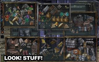
If there’s too much stuff, we’ll only get frustrated. We can’t possibly remember the details of everything you crammed in, so we’ve got no idea what is better than what. The result is that we ignore half of it, and all that hard work goes unseen. Instead, limit the number of weapons, upgrades, and whatnots, and make them more interesting. Give them more attributes, make them more fun, and make us want them.
Perhaps the only exception to this complaint is MMOs. MMOs can get away with having tons of stuff, because you’re meant to play them for a billion hours.

If you’re building strategy game, let us have a skirmish with any combination of variables we want, even if it breaks the “universe” you’ve established. If you’re making a multiplayer game, don’t force us into gimmicky modes. It’s fine to include them, but we always need the standard Free for All, Team Deathmatch, Survival, and Capture the Flag type stuff - don’t force us to play the way you want us to.
This is also true of many RPGs. If the main quest is over, but the story doesn’t involve the main character’s death, why can’t we go back and do the side-quests we missed? We just want to explore the world a bit more. Instead, we have to either load the save point before we “finished” the game, or start over from the beginning.

Granted, it would take some extra work to make sure the world still makes sense after the ultimate evil is defeated, but it just seems silly to load an old save just to go back and run through some completely unrelated quests.

Oh, we were supposed to jump onto that platform over there before the invisible “giant falling rock that crushes and kills you” timer that we had no way of knowing about ran out. Splendid.
Games are leaving out information – vital information – all the time. Part of it is the modern desire to do away with HUDs and interfaces that conflict with “immersion.” This leads to stat based games that never let us see the stats. The other part is just bad design. You do have to let the player know what they’re supposed to be doing, otherwise it’s all frustration and thrown controllers.
Sign up to the GamesRadar+ Newsletter
Weekly digests, tales from the communities you love, and more
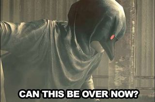
Resident Evil 5 doesn’t do this so much that it becomes un-fun, but it’s still guilty. A boss battle with a certain lady has you continually repeating the same action with no sign of progress. We need an indication that what we’re doing is working – something, anything! We can’t see the code, we can’t read the designer’s mind, and if what we’re supposed to be doing is completely arbitrary, then how do we know what it is?

This is the absolute worst.
Every cut-scene must be skippable every time. We don’t care how proud the animators are of them, or how important they supposedly are to our enjoyment. We’ll decide how to enjoy the game. And what if we’re playing it a second time? We still have to watch say... this?
Above: SLOOOOOOOOOW PAAAAAAAAAAAAAAANS!
Unskippable tedium isn’t just cut-scenes. It’s any repetitive task that could have been automated or eliminated. Don’t make us sell every bit of ammo we have one at a time with three prompts in between each transaction. Don’t stick locked doors all over your levels and then expect us to wander around trying each one until we find the one-in-one-hundred that’s unlocked. (Silent Hill: Homecoming, you scoundrel.) And definitely never make us grind for ten hours and call it “gameplay.”
May 22, 2009


10 features we want in online shooters
How the next crop of multiplayer bloodbaths can be even better than the last

The Top 7... Nintendo mistakes
How the videogame giant became the world's favorite underdog

