The 25 most ridiculously good-looking movies you'll see
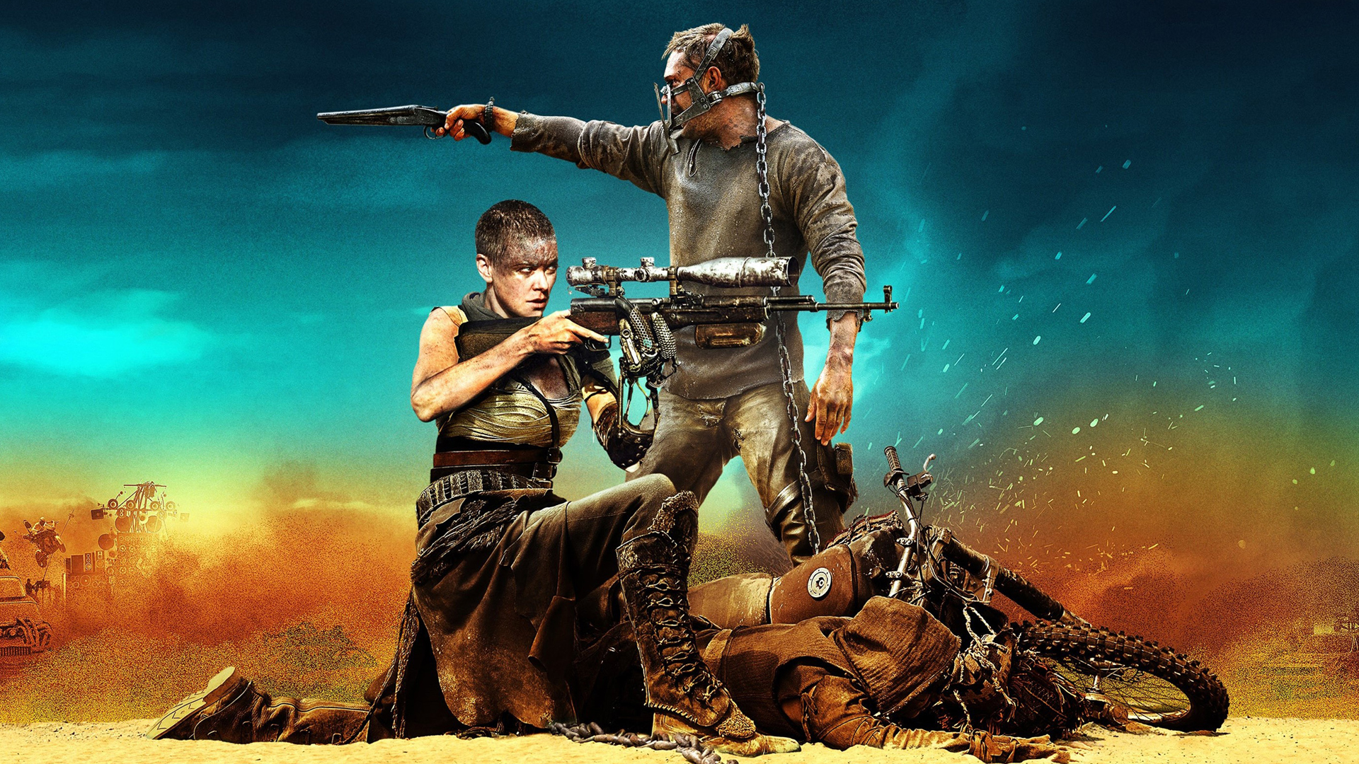
Some movies are unequivocally beautiful, making an impact as powerful viewing experiences which massage our eyes and burn their images onto our brains. We’re not just talking about special effects or beautiful vistas either - some movies make their shots beautiful in very smart, very artful ways. The following films stand out as 25 of the best-looking, most effortlessly attractive and atmospheric pieces of cinematic eye candy to have ever graced the big screen. Time to show off that new TV you just bought, right?
The Revenant (2016)
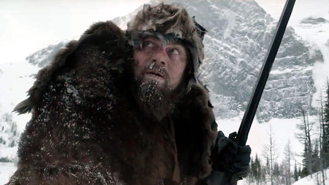
Alejandro González Iñárritu had already proven an eye for strong visual cinema with 2014’s Oscar-winning Birdman pic, but The Revenant raises the bar for what can be achieved through the cinematic form. Shooting the film on location across the Americas, Iñárritu employs his love for lengthy single takes to present the frozen frontier in all its harsh and unforgiving glory. Under the firm guidance of cinematographer Emmanuel Lubzeki, The Revenant uses largely natural lighting captured by digital cameras to lend the film a palpable sense of immediacy and intensity as a powerful epic of redemption and retribution.
Why it looks so good: You can practically feel the icy winds bursting forth from the screen thanks to Iñárritus purist approach to filmmaking.
Vertigo (1958)
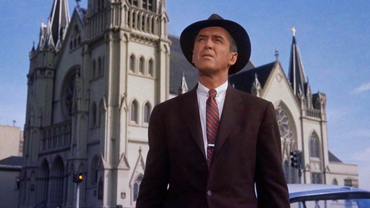
In his 1950s peak, Alfred Hitchcock enjoyed a uniformly high standard of aesthetics, thanks to the vivid cinematography of Robert Burks and the finest designers Hollywood can offer - who could forget Grace Kelly sashaying into Jimmy Stewart's life in Edith Head's elegant couture? But Vertigo is deeper, richer, and more ravishing than its predecessors, thanks to its vibrant VistaVision colour palette, swooning camera movement, and Kim Novak's model ice maiden. Best of all, Hitchcock captures the city of San Francisco as a dreamy, shimmering hotbed of stylish insanity, where nothing appears to be quite as it seems.
Why it looks so good: A powerful ambience which evokes a constant sense of dread - no wonder it’s called Vertigo.
Raiders of the Lost Ark (1981)
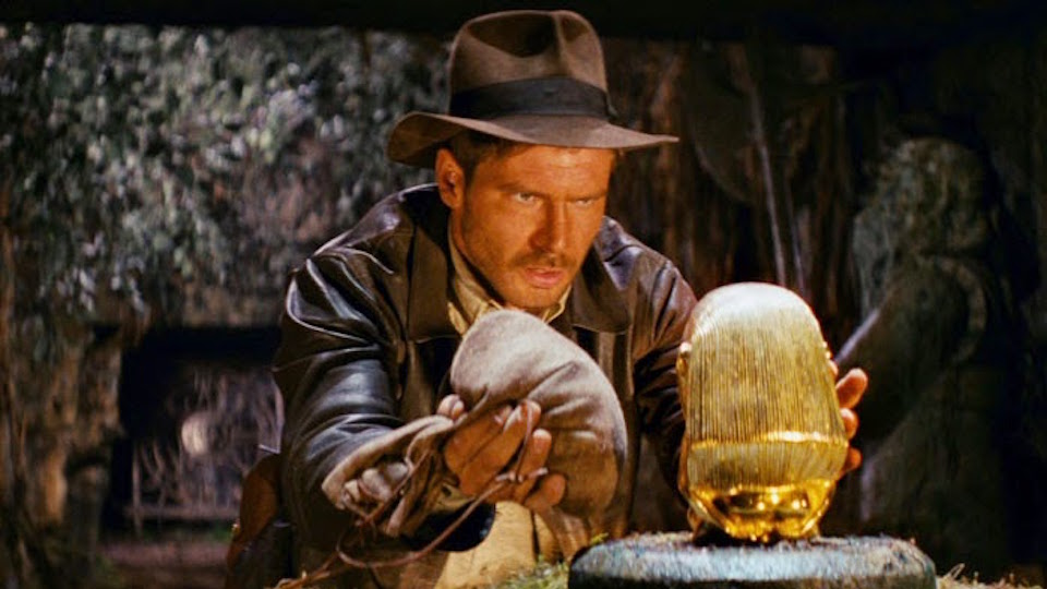
Steven Spielberg deals in such big, powerful images that pure aesthetic style sometimes passes him by. With an honourable mention to Catch Me If You Can, Raiders remains his best-looking film, an effortlessly classy piece of old-school derring do defined by Indy's weather-beaten but still enviable leather jacket and fedora, and the dazzling Lean-esque visions of the Egyptian desert. Hats off to costume designer Deborah Nadoolman and veteran cinematographer Douglas Slocombe for giving Raiders’ its pulp-action punch.
Why it looks so good: Spielberg modernises and revitalizes the ever-appealing look and feel of classic adventure movies.
Sign up for the Total Film Newsletter
Bringing all the latest movie news, features, and reviews to your inbox
Breakfast At Tiffany's (1961)
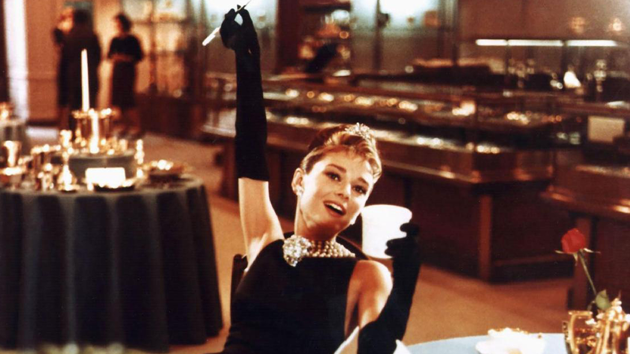
Blake Edwards' rom-com is still one of the most influential movies in terms of style, and that's largely down to Audrey Hepburn. Dressed by Givenchy and indulging her silky, feline grace, Hepburn's languid performance oozes class and made generations aspire to Holly Golighty's life of leisure. Later films have repeatedly attempted to replicate the grace and elegance of Breakfast at Tiffany’s, but none can match the same heights of perfection as this cultural landmark of a film. Presumably, Hollywood's efforts to disguise what Golightly does for a living were more successful than anybody had anticipated.
Why it looks so good: Hepburn’s infamous pose as Holly is cinematic iconography at its finest.
Mad Max: Fury Road (2015)
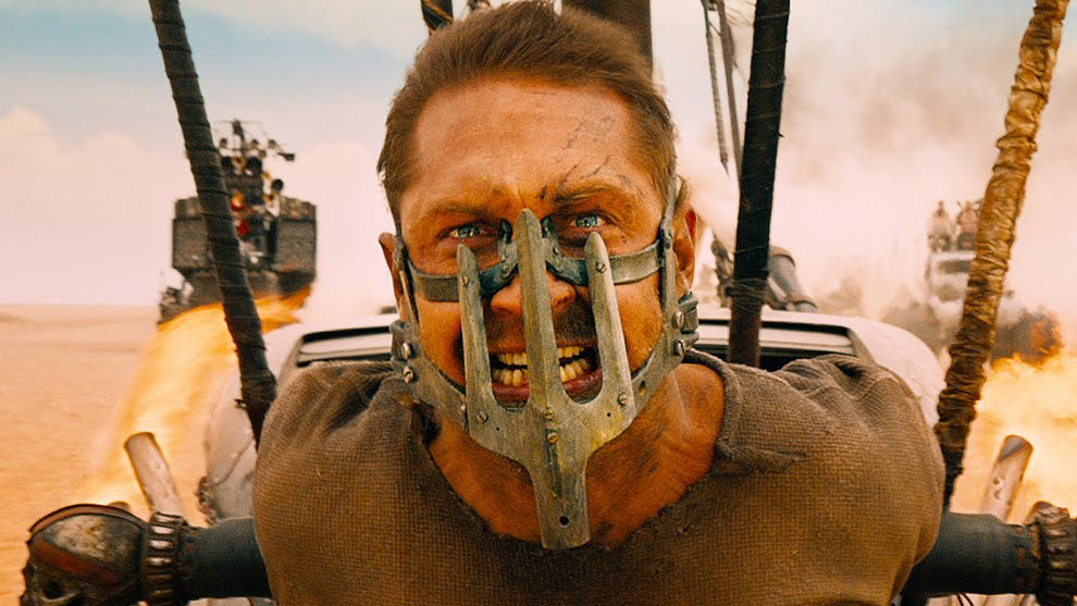
Whether you’re viewing it in 3D, black and white, or on your iPad during the daily commute, Mad Max: Fury Road is the optic equivalent of an all-you-can-eat buffet. George Miller spares no expense when it comes to presenting the absurdity and intensity of the Australian wastelands, and the intentionally threadbare plot places an admirable focus on visual storytelling. The decision to go with practical effects over green screen CGI was also a costly gamble for the production team, but it pays off hugely for the movie’s instantly recognizable style as an epic orchestra of vehicular mayhem. The world had seen nothing like Fury Road when it first arrived on the scene, and it's doubtful that we’ll ever see anything quite like it again.
Why it looks so good: Like the titular character himself, Fury Road keeps the talking to a minimum to focus on unadulterated carnage.
The Darjeeling Limited (2007)
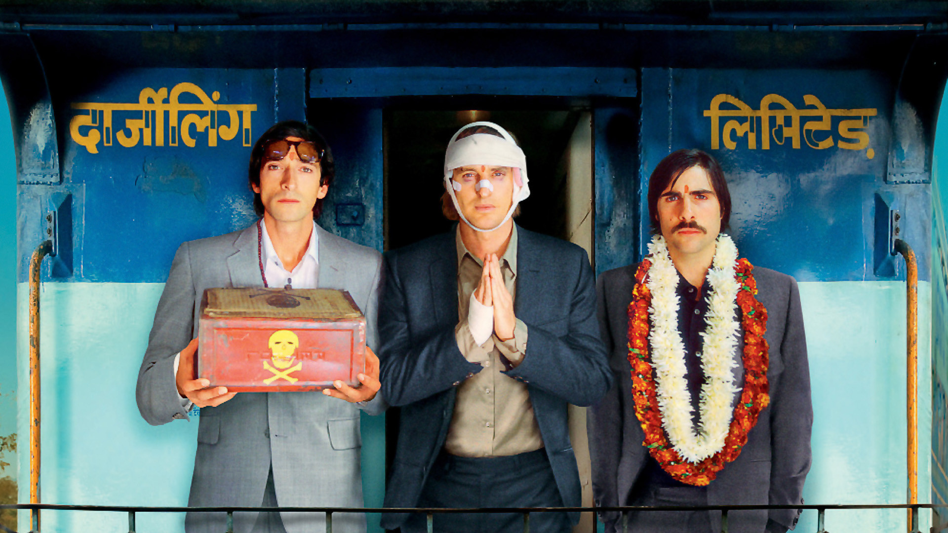
Wes Anderson's critics often accuse him of being more obsessed with his quirkily retro, fastidiously detailed production design than with seamless storytelling - like that's a bad thing. As the man behind some of the most consistently good-looking movies in America, it still took a trip to India (via Paris, in ace prologue Hotel Chevalier) for Anderson to raise his game. Visually, it's an eye-catching blend of indie whimsy and Bollywood panache, showing off the controlled perfection of Anderson regular Robert D. Yeoman's artfully posed compositions; a delicious concoction for any film-lover.
Why it looks so good: Anderson’s perfected, symmetrical direction is paired brilliantly against the rich colours and animated spectacles of India.
Edward Scissorhands (1990)
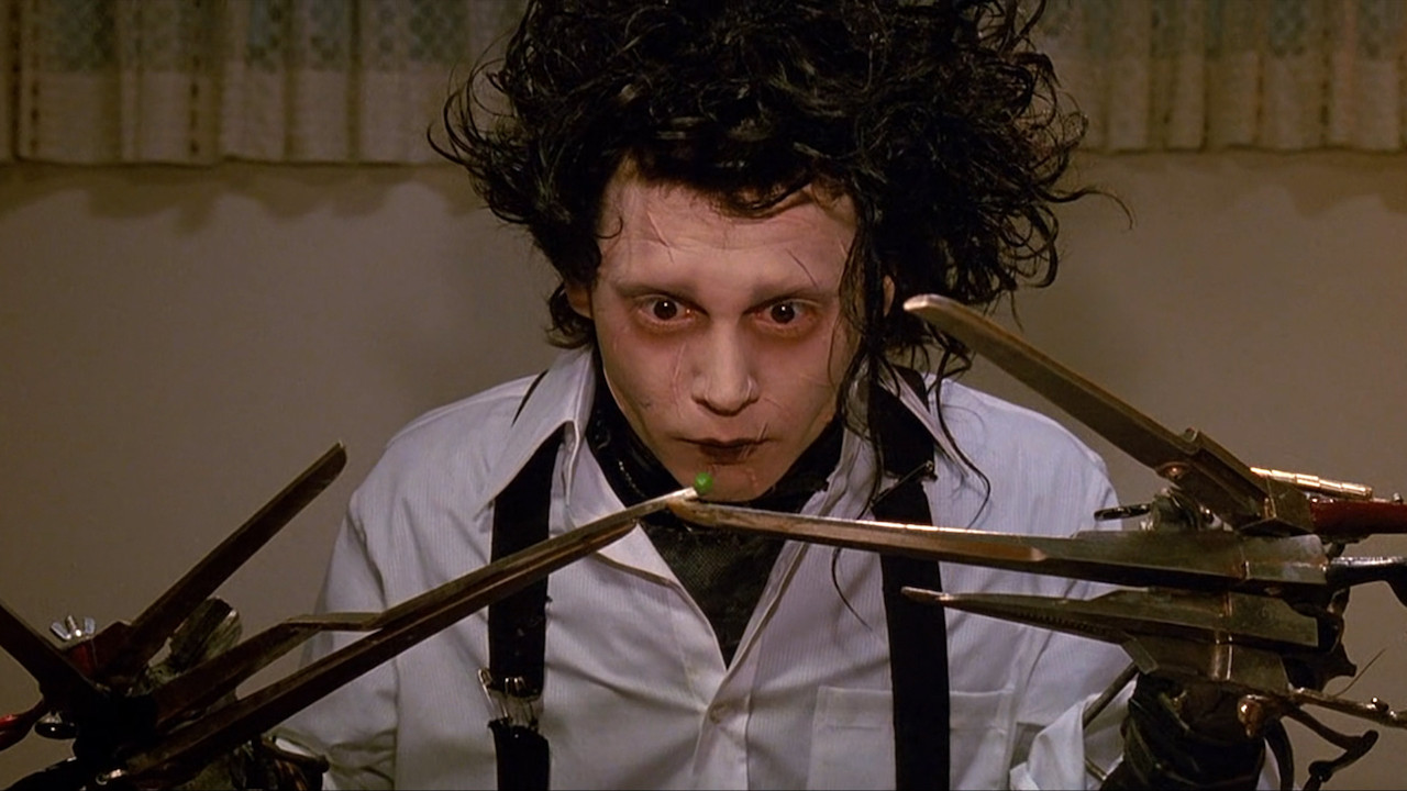
Like that of Terry Gilliam, Tim Burton's taste for the grotesque often counts against good looks in his movies. Edward Scissorhands stands out for being intentionally obsessed with this juxtaposition, with Johnny Depp (cast against pretty boy looks for the first time) playing the soulful weirdo who brings beauty to the gaudy taste of small town America. Light and dark colour palettes are constantly contrasted against each other to create a haunting parade of classically Burten-esque visual stimulations. Stefan Czapsky's wintry lighting is also sublime, but what really catches the eye is Colleen Atwood's expertly delineated costume design, especially Edward's eccentric get-up.
Why it looks so good: Burton at his absolute best, Edward Scissorhands looks weird and wonderful in all the right kind of ways.
Moonlight (2017)
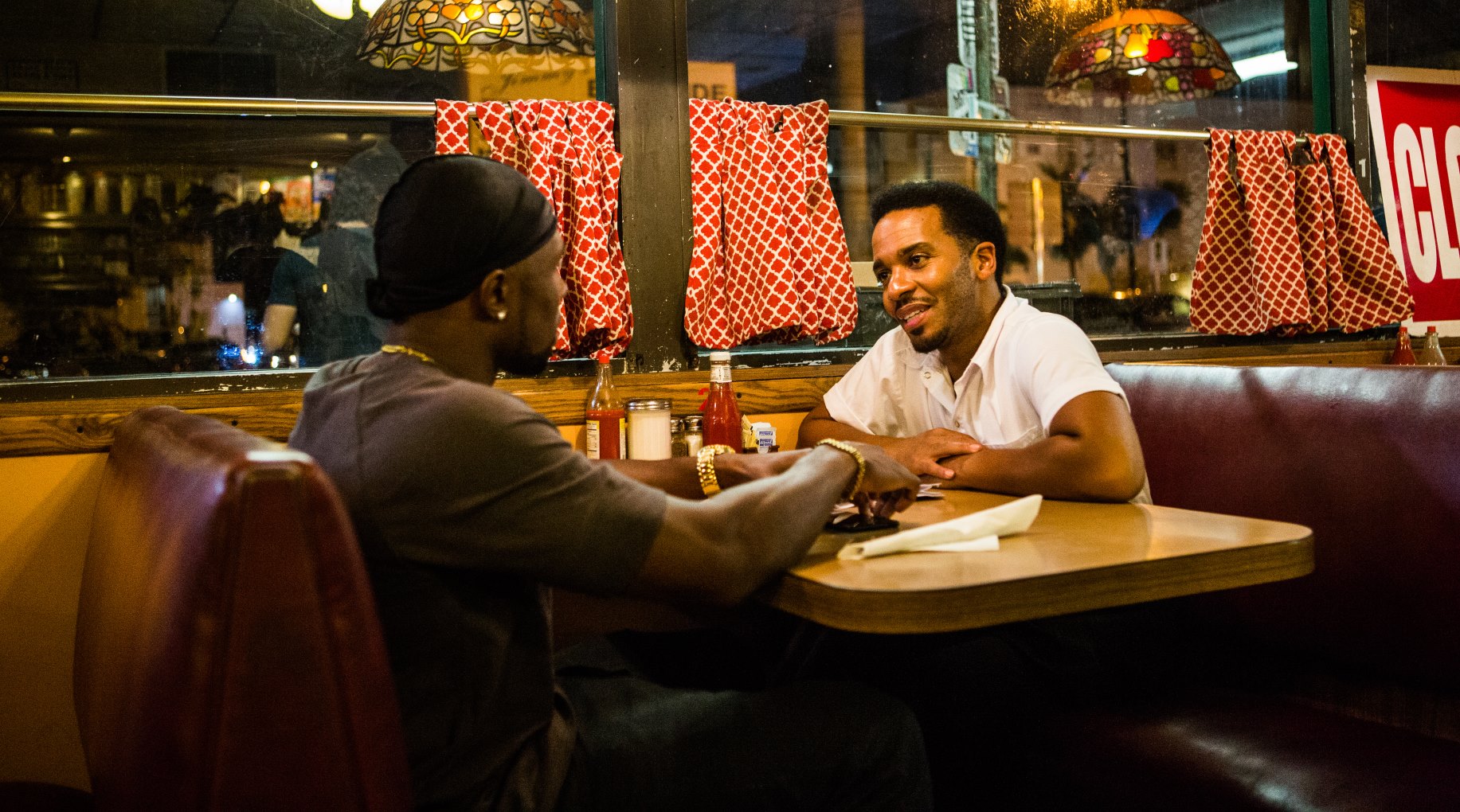
Despite its heavy subject matter, Moonlight is nothing short of beautiful. The film is dripped in a high contrast filter which enriches every colour, and the thematic foregrounding on bold shades of blues and greens lends a hypnotic quality to the viewing, as it masterfully demands the eye’s attention and refuses to let go. Director Barry Jenkins finds beauty in the small things, and even draws elegance out of the bleaker moments which surface throughout protagonist Chiron’s troubled childhood. A scene in which Naomie Harris screams at a young Chiron looks and feels like something out of Blade Runner, and it’s unexplainably powerful.
Why it looks so good: Bold, ambitious filmmaking imbues Moonlight with a miasmic quality that spellbinds the senses.
Lost in Translation (2003)
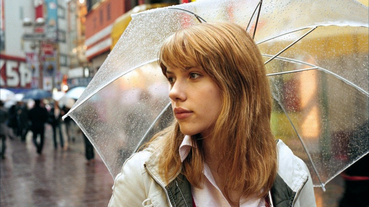
Its solipsistic story of the idle rich behaving as tactless tourists in Japan might divide audiences, but one thing's for sure - Sofia Coppola can frame a shot as beautifully as her parents. The film's woozy, fashion mag style - elegant hotel bars, Tokyo neon, Scarlett and Bill moping around in bed - is the perfect showcase for cinematographer Lance Acord, a photography student who first worked with legendary fashionista Bruce Weber. If Lost in Translation’s plot seems a little slow-paced, that’s because the film is more interested in captivating the audience through imagery over exposition, and it succeeds with flying colours.
Why it looks so good: Murray and Johansson make for great tour guides in a film that presents Tokyo as we’ve never seen it before.
Scott Pilgrim vs The World (2010)
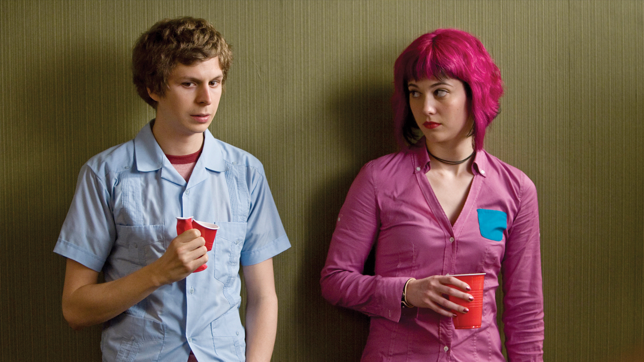
After tackling the zombie apocalypse and buddy cop movies, famed director Edgar Wright turned his creative ambitions to the weird and wonderful world of Scott Pilgrim. Staying true to his form, Wright doesn’t so much take inspiration from the comics as he does directly slap it onto the big screen, and our eyes couldn’t be more delighted. Not a single frame is wasted in Scott Pilgrim vs. the World, as all manner of visual trickery is employed to entertain the audience through showing rather than telling. The film’s colourful textures and stylings come together wondrously in each of Scott’s fight scenes with Ramona’s seven evil exes, which still set the bar for many modern action sequences even seven years later. It’s no wonder that the film remains such a cult classic.
Why it looks so good: By drawing heavily from the presentation of comic books and video games, Scott Pilgrim stands out from the crowd with ease.
I'm GamesRadar's Features Writer, which makes me responsible for gracing the internet with as many of my words as possible, including reviews, previews, interviews, and more. Lucky internet!
