The fugliest games ever made
U, G, L, Y, they ain't got no alibi...

Sometimes, games look good. Sometimes they look bad. Sometimes they look so bad, we want to stop playing them, take them out of the machine and kill them till they're dead. Occasionally, this happens completely out of the blue in an otherwise great-looking title, which makes us wonder if the work experience lad suddenly got 'creative' while the real devs were out for lunch.
Whatever the reason for these occurrances, we've broken them down into nine different flavours - all of which basically equate to praline and dick.

We didn't realise how garish this game is until we downloaded it off Virtual Console recently. Squiggly wiggles in scrolling backgrounds no longer say 'cool'. What they actually say is 'YEAH I'M SO IN YER FACE THIS MUST BE THE COOLEST FRIKKIN GAME YOU EVER SAW!' Pity, cos it was actually a lot of fun.
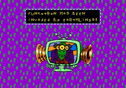
Above: Whaddya mean, purple and green don't go well together?
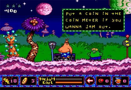
Above: Earl looks happy enough... Oh, but he is wearing shades

Remember Geometry Wars and how great it is? This plays almost identically. However, there is a slight difference. Where Geometry Wars is played out in the cosmos of virtual space, Nucleus is played out in bodily fluids. That's about as attractiveas it sounds.
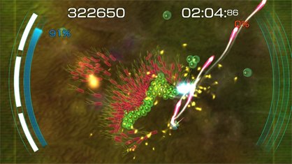
Above: If the action looks squelchy, you should hear the soundtrack
Sign up to the GamesRadar+ Newsletter
Weekly digests, tales from the communities you love, and more
Which means you're faced with a choice. You must decide which one of the following you'd rather play in...
Bonfire night explosions of colour and joy:
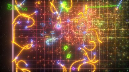
Or virus-infected blood:

Yeah, we thought so too.
You enter the disco level and immediately notice the pink spots and green laser beams. It's a bit of a clash.
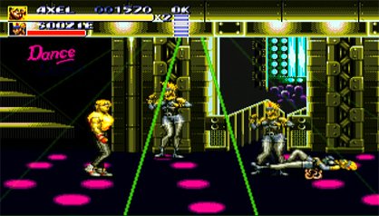
Then the screen starts to flash, in a manner we can only describe as 'violently'.
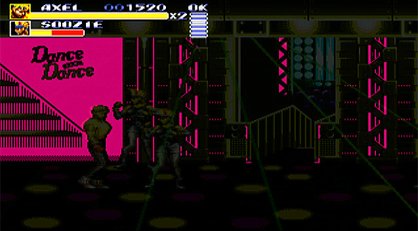
Finally, out come green lights which scroll quickly across the screen. Our image resizing software has softened the blow somewhat here, just as the old coaxial cable would have done.
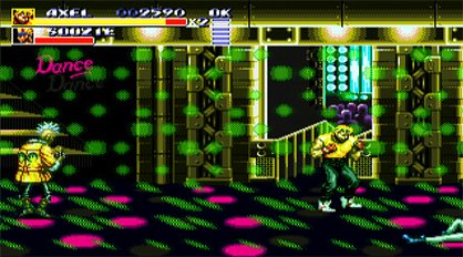
But shall we take a look at those magnificent transparency effects now?
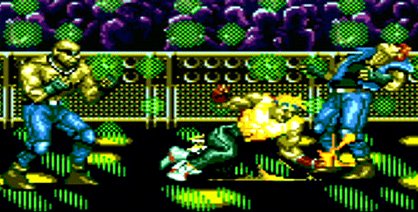
Above: Never stick a fork in a toaster. And NEVER play SoR3 through HDMI

Some games take great delight in restricting their colour palette. Earache Extreme racing couples this approach with the graphics of a PSone game (on PS2), making it look like Shadowman on wheels. Add in some terrible collision physics and an atrocious frame-rate and you've got yourself a real looker.
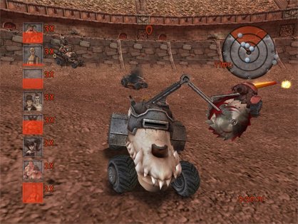
Above: This is a press shot, purposely chosen to do the game justice

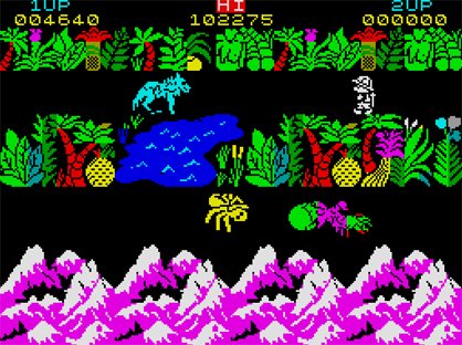
We could have picked any one of a thousand old games here. So we've used an incredibly detailed selection process which basically involved saying Sabre Wulf. At the time of the game's release, the screen was so busy we couldn't work out what was going on.
Now, of course, that lushness has wilted somewhat, especially in the face of games like Tomb Raider Underworld, to the point where its colour palette now looks like someone ate a load of cheap confectionery and barfed it all back up in 259x192 resolution.
Justin was a GamesRadar staffer for 10 years but is now a freelancer, musician and videographer. He's big on retro, Sega and racing games (especially retro Sega racing games) and currently also writes for Play Magazine, Traxion.gg, PC Gamer and TopTenReviews, as well as running his own YouTube channel. Having learned to love all platforms equally after Sega left the hardware industry (sniff), his favourite games include Christmas NiGHTS into Dreams, Zelda BotW, Sea of Thieves, Sega Rally Championship and Treasure Island Dizzy.

