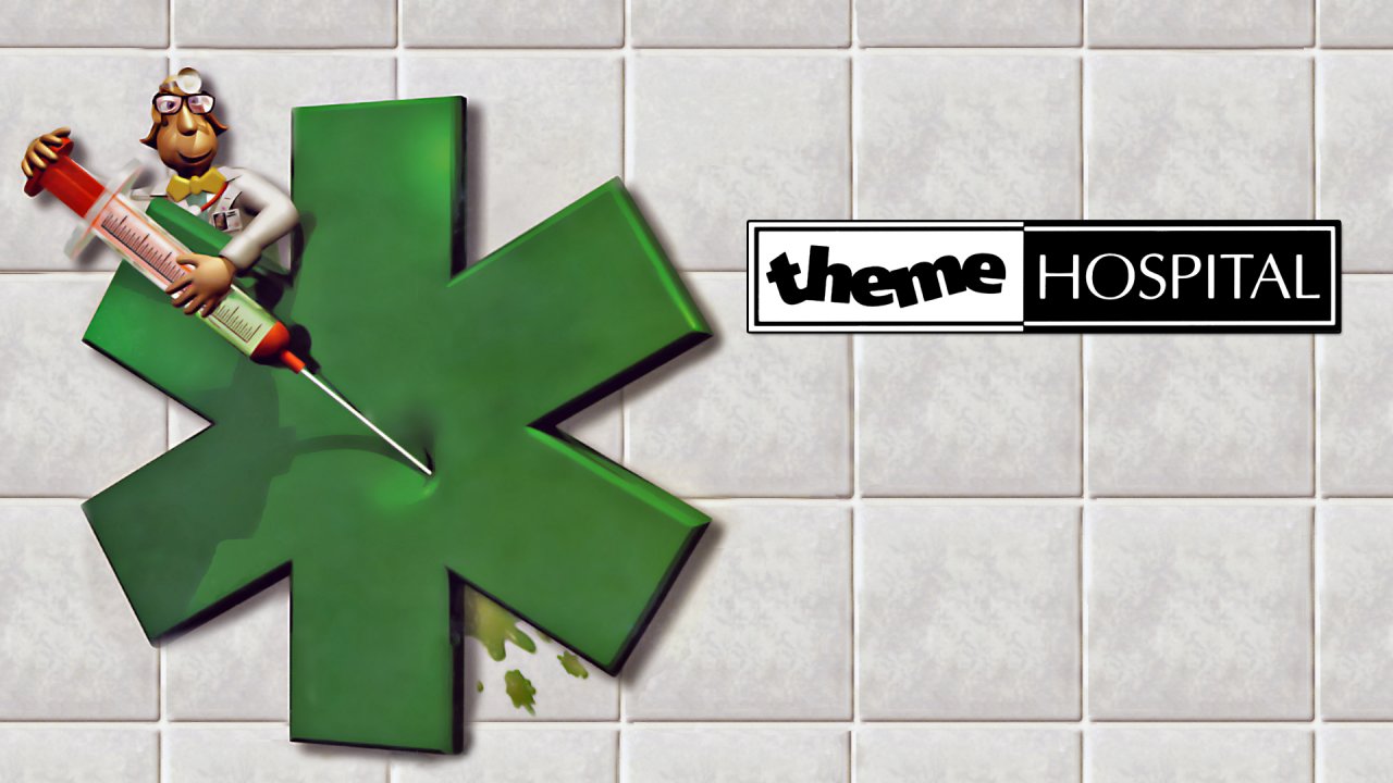
The making of Theme Hospital, the legendary sim that paved the way for Two Point Hospital
The original Theme Hospital team on the stories and secrets behind their brilliant medical science satire
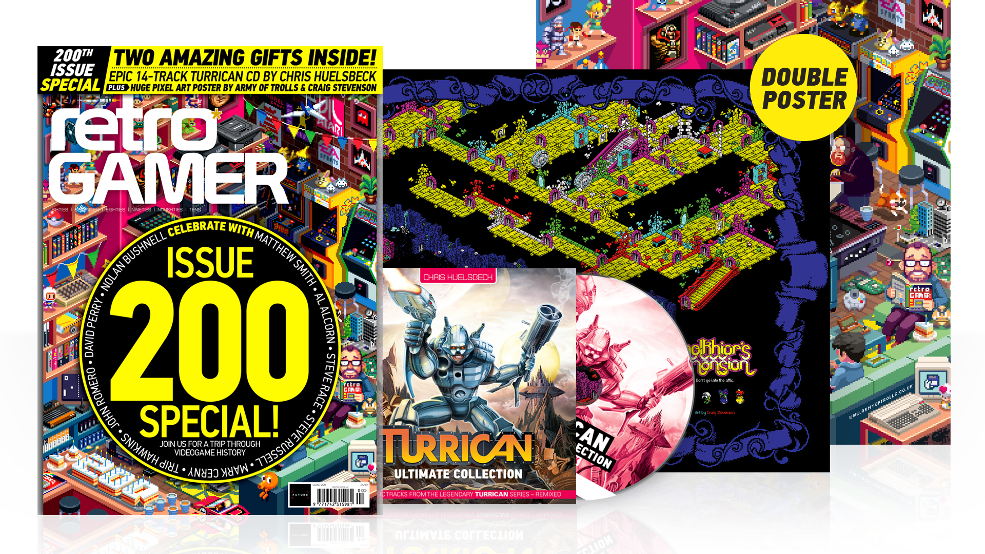
The Making of Theme Hospital feature originally ran in issue #130 of Retro Gamer magazine, 2014. If you want to read more excellent long-form features and developer interviews about history's best games every month, and you can save up to 57% on a print and digital subscription right now.
Scrapping drunk teenagers. Scared, diseased loved ones. Impatient patients. Road accident victims, transplants, tears. It's official: hospitals are not fun places to be. Unless, of course, it's Theme Hospital, Bullfrog's follow-up to its incredible best- seller Theme Park. In which case, hospitals are laugh-out loud riots of hilarity and very much a rich source of gaming material.
Mark Webley, the game's designer, was not initially convinced of this. Although he had chosen to make the game, having picked the title off a blackboard chalked up by Bullfrog co-founder Peter Molyneux, his research was yielding rather daunting results. Both he and lead artist Gary Carr spent many an hour walking the corridors of The Royal Surrey County Hospital in Guildford and lunching in its cafe, trying desperately to become inspired.
"But we found that hospitals are really dull," Mark recalls. "There were tile floors and boring walls and occasionally a desk and a vending machine. Our research was getting us nowhere." Needing a greater insight, they wrote to the hospital and asked if they could be shown around formally but negotiations didn't go too well. "They wanted a percentage of the profits of the game and that wasn't going to happen because we didn't even know if there would be any so that was kind of annoying," he continues.
Luckily, a second hospital, Frimley Park, greeted them with open arms. "They showed us around and it was great – we saw a lot of stuff," Mark remembers. "They even allowed us to put on the greens and watch an operation." Not that Gary had the stomach for it – when his cat bit his finger and a small amount of blood appeared he had fainted, so watching an operation in which "this guy was face down and they were sucking blood from his neck and there was this goo and noise" wasn't helping his stomach.
Mark and Gary were making so much noise that the surgeon ordered: "Get those bloody idiots out". By this time, though, they had seen enough. "I remember we watched a spinal operation one morning which was bad enough, then the person who had been assigned as our guide said 'alright, after lunch we can pop down to the morgue if you like'," says Gary wincing at the memory. "That was it for us, we needed to give this game a new angle."
"It was around this time that we started to believe we shouldn't be too realistic," continues Mark. "Although that was our original aim, Gary felt we should have made up diseases so we talked about it with the whole studio and the team and we had a vote. I guess dealing with a lot of illness is macabre and horrible and in retrospect it was the right idea. We began imagining made-up diseases instead."
The team didn't want to become political ("there was, still is and probably always will be this kind of sense that you've got the NHS and they're doing such a poor job," says Mark.) but they wanted to make the game challenging.
Sign up to the GamesRadar+ Newsletter
Weekly digests, tales from the communities you love, and more

10 games like The Sims that’ll help you live your best life
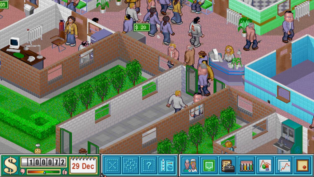
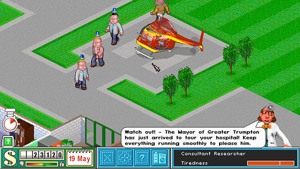
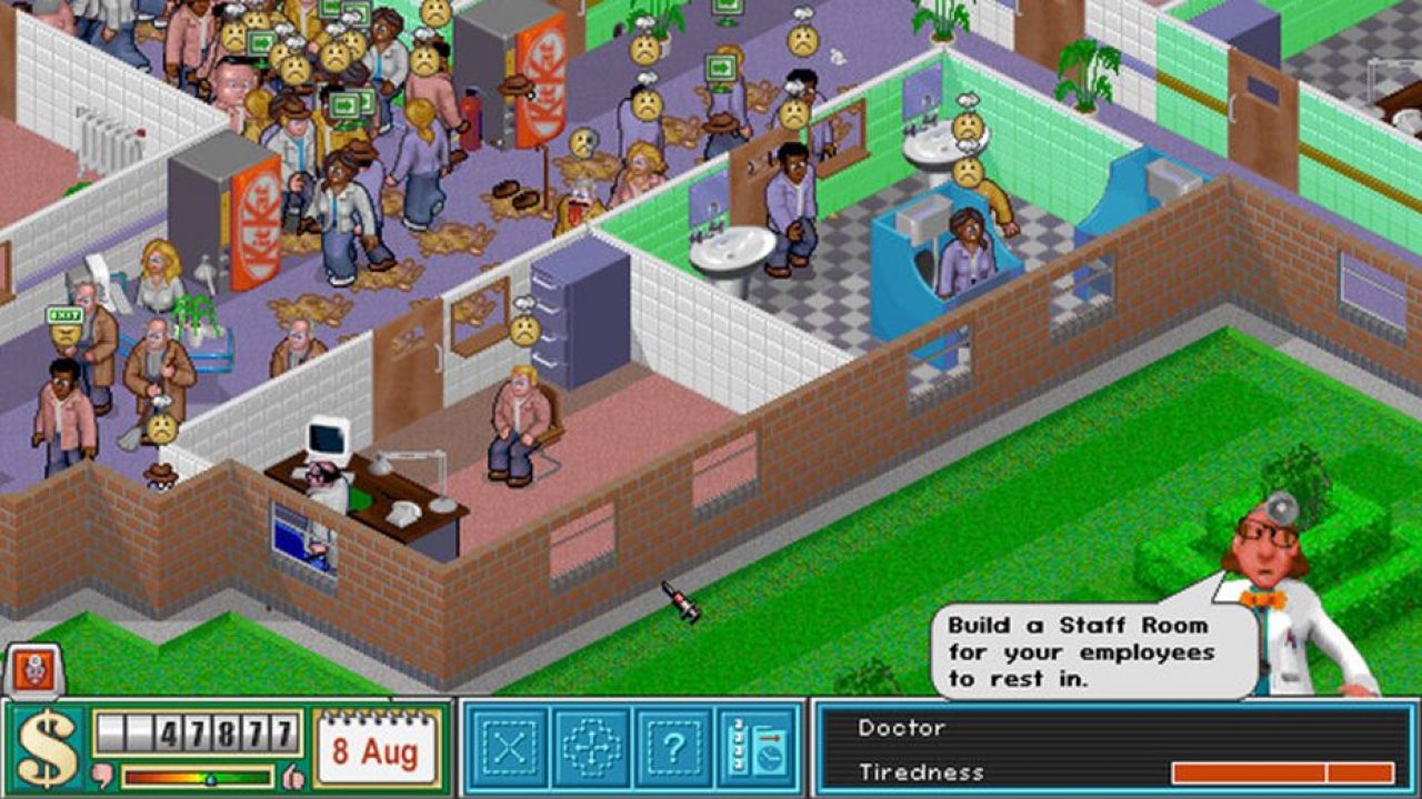
They ensured there was always something to do – always an emergency around the corner. Whether it was an inspection, a VIP visiting, messy wards, too few toilets, a wayward handyman, whether or not the temperature was too hot or cold or a chopper was bringing 15 victims of a crash; it was a matter of spinning plates.
Helping with the task of balancing real and unreal was stalwart journalist James Leach who had worked on numerous magazines including Amstrad Action, Your Sinclair and Amiga Format. Peter had visited him to demo Theme Park and the pair took lunch together to chat about the game. "As we talked, I suggested other things which might be fun to manage," says James. "I recall mentioning a mine or quarry, a prison and a hospital. He was most enthused by the hospital and prison and he asked me to write my ideas up and send them to him. I didn't hear back."
A few months later, though, and James was hired by Bullfrog. He turned up to find Mark and Gary in the initial stages of making Theme Hospital. But for graphic artist Gary, it wasn't entirely what he had planned. Having left Bullfrog to work for The Bitmap Brothers, believing Theme Park would not be the success it had become, he thought he was rejoining work on Dungeon Keeper.
"I really liked the sound of that so I swallowed my pride and ran back," he says. "I kept asking Peter about the game. 'When will it start?' Stuff like that. He just smiled and said he would tell me soon enough. Then he eventually gave me the news – I wouldn't be working on Dungeon Keeper at all. I was to work on a sequel to Theme Park called Theme Hospital. Great! A sequel to the game I left the company for in the first place!"
Mark's task was to head up the project even though he was rather new to making original games, having previously managed a department that converted Bullfrog's games onto other formats. Peter wasn't involved at all – "he had his hands full with the really cool sounding Dungeon Keeper," says Gary – but the ideas flowed. "We planned to make the game with four different time periods," says Gary of an idea that would need some major treatment later down the line.
Running on life support
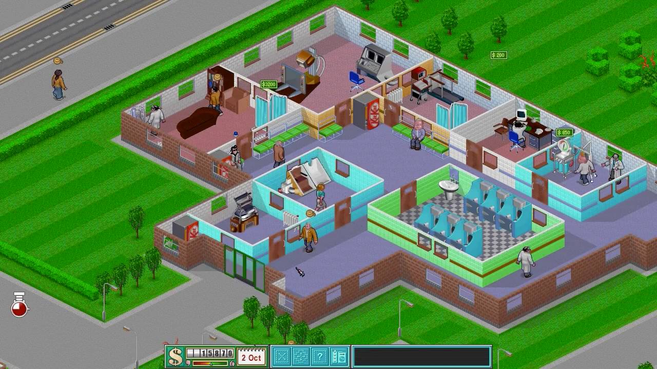
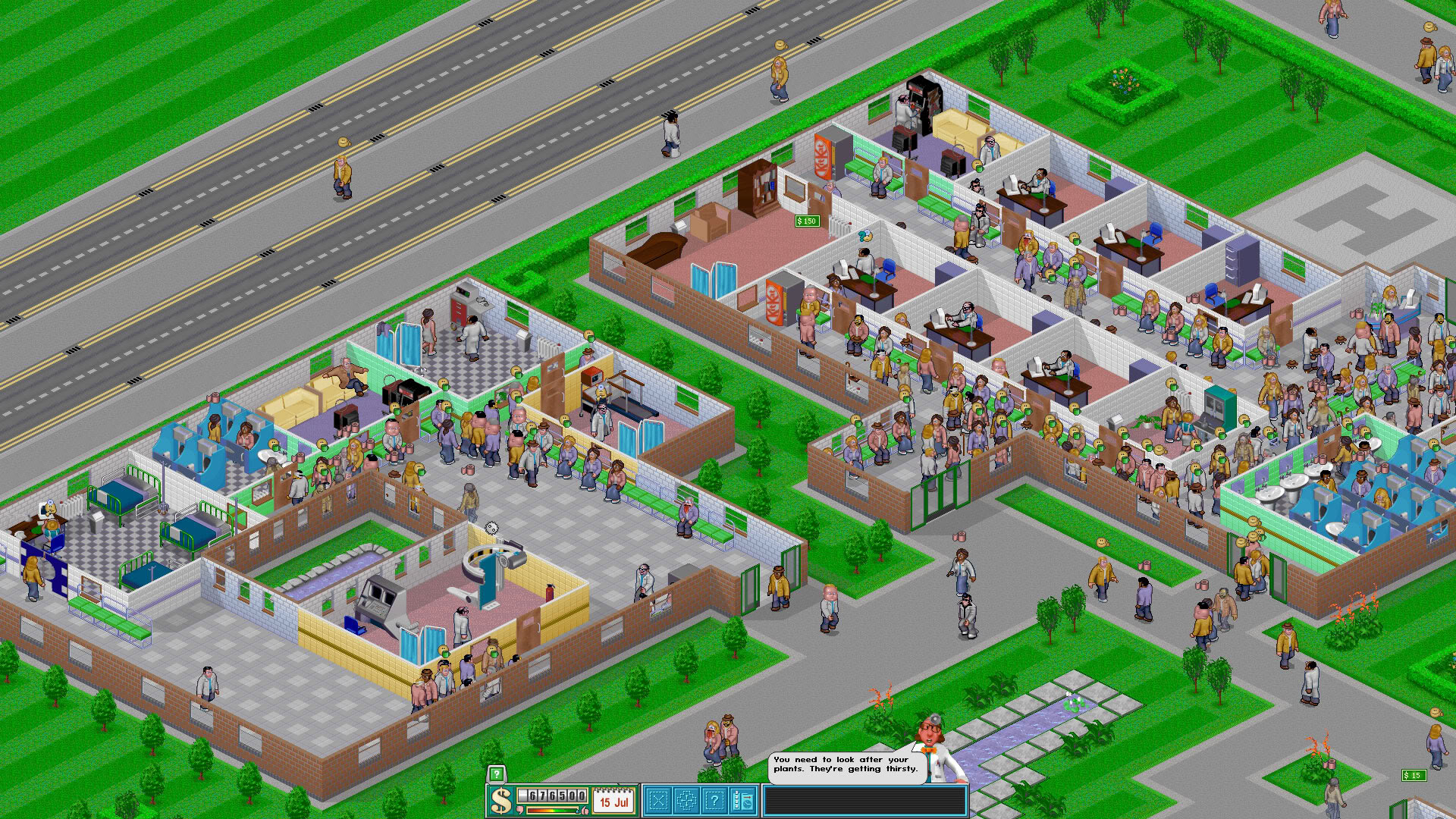
Mark and Gary decided the best approach was to strip away any sense of the real so the graphics were made deliberately cartoonish. The game also distanced itself from the NHS model. Theme Hospital was a game in which profit was important and players had to think of it as a business. A successful player would be able to move up the ladder and work on a larger and potentially more profitable hospital (each carrying the name of a famous computer from various films, TV shows or comics). In each case, they would build a hospital from scratch, determining the look of the building and the people working in it so that patients would be treated or discharged according to the whim – and education – of the doctors the player controlled.
"Many ideas came in and disappeared," says Mark. "We had a good idea of what we wanted to do with the game and it helped that it was a genre of game that I enjoyed playing but the important thing with games like Theme Hospital and Theme Park is that it is not about how a hospital, theme park or a business runs. It is about how people think they are run."
"The idea was that there was only so much you can do without assistance."
The small team, which ironically worked in offices next to The Royal Surrey County Hospital, began with some preconceived ideas of the medical process. People, they assumed, see a GP first of all. "The GP kind of makes a guess, maybe sends you for an X-ray or some blood tests, stuff like that, and then you go back to see the GP," says Mark. "So the kind of flow of what the patients were doing was kind of what we understood them to be doing. The reality might have been quite different but it was more important to go with what a man or woman in the street would expect."
To make life easier, the team drew spiritual inspiration from Theme Park – and took on board a healthy dollop of borrowed code. An editor which Peter had set up to allow for easier animation was built upon by Mark who called it the Complex Engine. The sprite drawer was almost the same too. In fact, the Theme Hospital team made some nice breakthroughs in its approach to sprites, cleverly combining them. If, for instance, there was a doctor, a chair and a desk as three sprites and the doctor was supposed to sit on the chair, the game would see the doctor walk to the entry point of the desk. The engine would then merge the doctor and the chair into one sprite, which would then be animated. It made life easier for the programmers and artists and sped up the workflow of the game, even though the player would be none the wiser of what was happening behind the scenes.
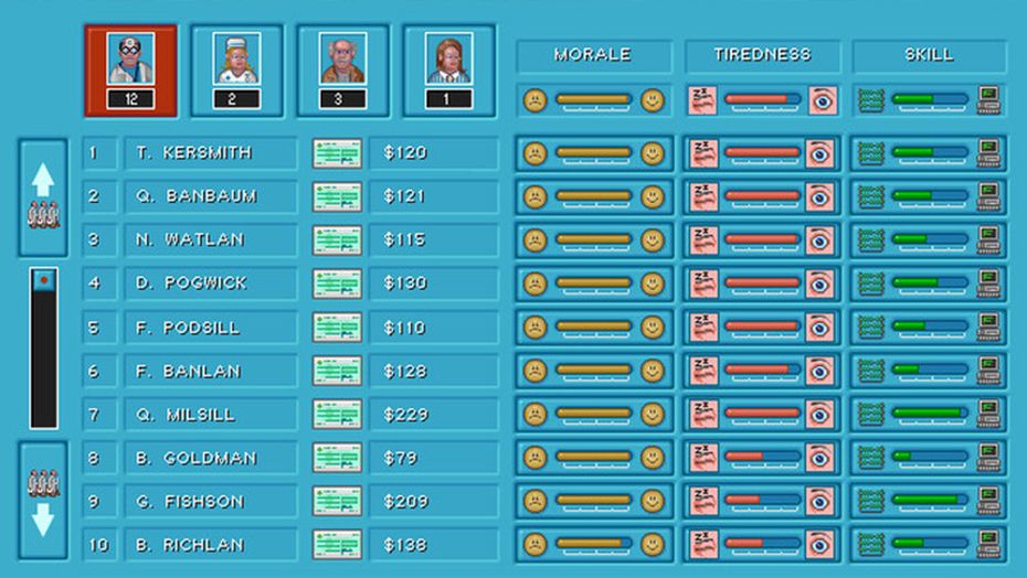
More noticeable was the setting up of rules. Players could decide how the decision-making process would progress. "You could have it set so that if you are 75 per cent sure what the illness is the cure could just go ahead, otherwise the player needs to make a decision," says Mark. "You could tweak that if you didn't want to be bothered with that kind of thing." Similarly, the player had to decide on the level of expenditure. "The idea was that there was only so much you can do without assistance," says Mark.
"You could diagnose or buy a diagnosis machine – some of which were really expensive – and those would throw up problems of their own. You may have had people waiting to use them and they may have died before you managed to get to a point where you were pretty much certain of a diagnosis."
The game threw in some curveballs too. "Someone with a hugely inflated head may or may not have had bloaty head disease," says Mark. "The bloaty head cure may not have worked because the diagnosis was a bad tooth. Suspending disbelief let players make decisions over whether to risk a cure or send a patient home. It added a nice dimension to the game."
To achieve all of this, you would expect the team had lots of meetings, but given the small size of the studio at the time, there were few formal get-togethers. Most gatherings would be around the desks of the artists and programmers and to have the artists and programmers together was something new for Bullfrog. It had traditionally separated them on either ends of the room, but assembling teams together made the tracking progress much easier.
20 best simulator games you can play right now
Mark took his team to the pub once a week with a sheet of paper listing the items that needed to be done. "We were a bunch of guys and a girl making a game and if one of us didn't do it or Gary didn't do something then it wouldn't have gotten done," explains Mark. "The way we worked gave ownership of the different parts to those working on the game."
James's role was to keep injecting a sense of fun into the game. "I wrote all of the text, came up with the diseases and I had a ball doing it," he says. "I recall you had to hire janitors and build toilets. If you failed to do so, people would poo on the floors. I remember writing the Advisor a line to remind you to provide toilets, saying that people were getting the turtle's head. I think I nicked it from Viz but it briefly became a Bullfrog catchphrase."
Symptoms of success
The made-up diseases made the game stand out the most. There was going to be an illness called Elvis Impersonator but EA's legal team advised the team that it couldn't use Elvis's name nor his likeness because Elvis's estate owned the rights. So, it was renamed King Complex. "We had others we didn't get round to doing," says Mark. "Animal magnetism, where people would come in with sort of lots of small animals like cats or dogs attached to them, had to be cut – the idea was to create a machine that would remove the animals. But I liked bloaty head disease, especially the cure – popping it and re-inflating. The animation was of the head pops and the doctor twanging the head like a balloon."
In terms of volume of work, James admits it was actually quite small. But it gave him time to think and come up with some wild ideas. He also took on board suggestions. "There were celebrities as well and I made those up but someone – I think a coder called Matt Chilton – had put placeholder names in for me to change. I kept a couple because I liked them, and one was Aung Sang Soo Kyi, the then exiled opposition leader of Burma. I didn't check to see if she was real, but I liked the name so it went in. Turns out she was indeed real."

The biggest problem the team faced, though, was having too many ideas, many of which couldn't make the final cut. One of the casualties was the four time zones that had initially been planned. "We thought we'd do a futuristic era with way out stuff as well as medieval and Victorian eras," says Mark. "Looking back at the time it took to do the modern era, you would think all we need to do is keep the same kind of machines and change them over but there just wasn't the time. I'm so glad we started with the modern era."
Another feature that was dropped was a screen that allowed players to mix chemicals – blue, red and green – and apply them to different illnesses. "It was a cool idea and a great screen but it was not fully formed and it didn't work well within the rest of the game, feeling like a very poor add-on," says Mark. Multiplayer didn't make the initial release and it had to be downloaded as a patch later. That infuriated Mark who kicked himself for not spotting earlier that the multiplayer mode was full of holes and incredibly buggy. Had they attempted to fix them, the game would have slipped so the decision was to go without.
But time wasn't the only thing preying on the developer's mind – it worried about making the game too inaccessible. Theme Hospital was complex, with the player able to change so much of the game via a system of menus. Gamers could decide which doctors they wanted based on their budget and needs and they had to keep on top of maintenance. Staff could tire easily and needed breaks. It could so easily have felt like work. "Much of my job was spent on simplifying the game," says tester Jon Rennie. "Mark and Peter were really keen to help players get straight into the game without a lengthy tutorial. We kept the Advisor speech bubble but used tabbed alerts to start piling pressure on the players. We then used those tabs as icons above patients' heads to make it as visual as possible."
"Suspending disbelief let players make decisions over whether to risk a cure or send a patient home."
In the first versions of the game, the queue panels were entire screens that made it difficult to see where people were in the hospital. "It was quite a big job to change that to become the pop-up version that allowed you to drag and drop patients and doctors but was well worth the effort," Jon adds. "The game ran on a complex arrangements of stats and triggers unlike some of Theme Park, which all had to be balanced through repeated playing of the levels to get it right."
As the game came together it was getting more and more internal attention, with people in the studio actively playing it. Many loved the voice acting by Rebecca Green, the then girlfriend of programmer Andy Coglan. "She was a budding voiceover artist," says James. "We simply got her in to say the lines. She did an amazing job."
And yet even though the game was supposed to be light-hearted, some people lost their sense of humour – even before the game was released. Mark was asked to appear on a local radio station because NHS bosses were complaining about the game. "They were saying we shouldn't be dealing with stuff like this," he says. "They said it was unfair to poke fun at hospital management and staff. But they hadn't played the game. If they had, they would have seen that it was saying, 'look, running a hospital is hard but if you think you can run one try this'. I think taking the decision of not [using] the real illnesses meant [we] weren't stepping into the territory of having a pop at medical professionals."
Not that the negative publicity did any harm. Much to the surprise of both EA and Bullfrog – but less so to those who had worked on it – the game was a massive success. It shot to number one and it constantly appeared in the top five of the budget charts thereafter. "It was just constantly selling," says Mark, of a game that eventually sold 4 million copies. "It was a beautiful thing and made all the better for not being a flop. There was no need to resuscitate it at all."
Save up to 57% on a Retro Gamer magazine subscription bundle and have the best retro gaming features and interviews delivered to your door each month
