The Overwatch 2 scoreboard is as at odds with the series' spirit
The minimalist UI rework of Overwatch 2 is a strange visual juxtaposition, and aspects of it could promote more toxicity in games
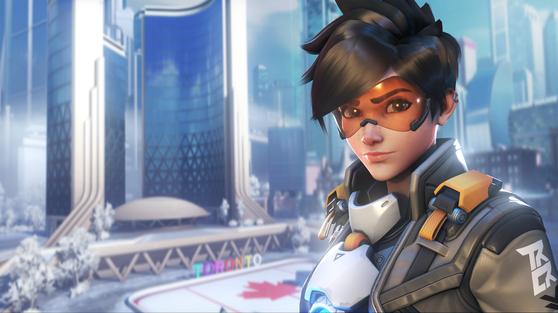
My Overwatch 2 beta hands-on has been defined by Orisa javelins, streamers dominating matches, and a perpetual disdain for the visual rework of the UI. During matches, I can't stop thinking about how hard it is to parse out what the hell the scoreboard is telling me. After matches, I can't stop thinking about how much I hate the minimalist redesign, and wondering what Blizzard's thought process was behind it.
Overwatch 2 feels like an extension of Overwatch 1 in many ways, but the UI design feels at odds with that – and the scoreboard opens up the floor for some potentially toxic teammates.
Minimalism in a maximalist world
You'd never normally use the word 'minimalism' when describing the world of Overwatch. It's a universe filled with brightly colored explosions going off in cartoonish versions of IRL locations, and a world where a genetically engineered gigantic gorilla can wear a baseball catcher's uniform while smacking you in the face with his supersized mitts. The vibrance and surrealness is part of the appeal of Overwatch, especially when compared to so many other games in the genre that favor grounded realism over cartoon hamsters.
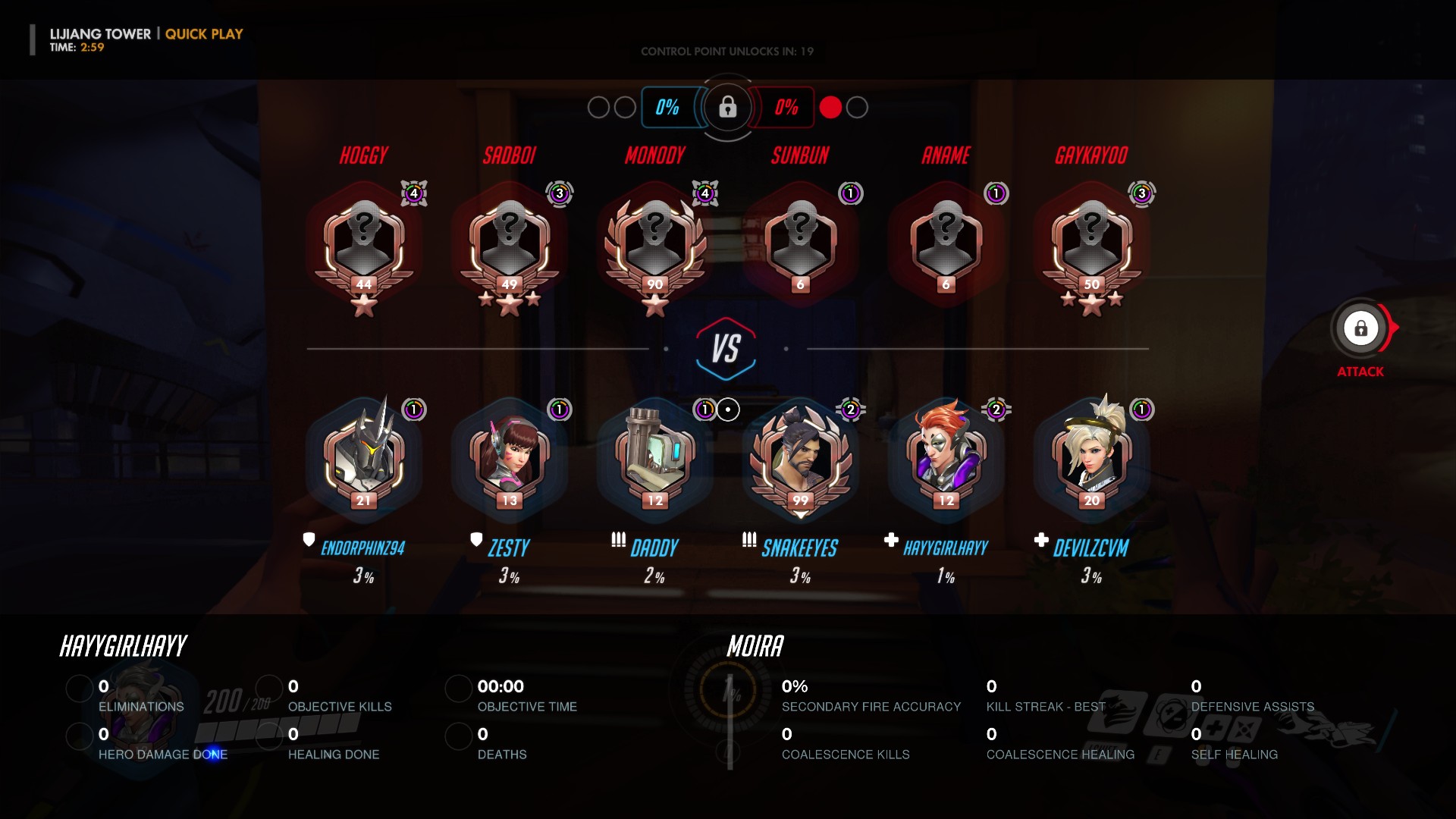
That's why it's so bizarre to boot up the Overwatch 2 beta and see a streamlined, colorless scoreboard and a pared-down HUD. In Overwatch 1, pushing select on your controller will bring up the current match's scoreboard. The enemy team is stacked on top of your team, all of which are represented by six hero headshots each. A percentage under each of your team's headshots indicates who is on their way to getting their ultimate ability, which makes it easy to strategize ult pops. At the very bottom are your individual stats, with the left side showing images of gold, silver, bronze, or no medals depending upon how well you're doing in eliminations, objective kills, healing, and so on. The right side offers up some numbers regarding your personal accuracy, healing, and best kill streak. It's incredibly easy to quickly pull up this scoreboard and get a whole host of pertinent information – as a healer main I often use it to snarkily remind the damager players that they need to catch up (if I've got a medal in damage), or remind my team that my healing thus far has been up to snuff.
But the biggest issue with the new scoreboard is this: once you figure out how to read it, you realize it could open up the floor for some serious toxicity.
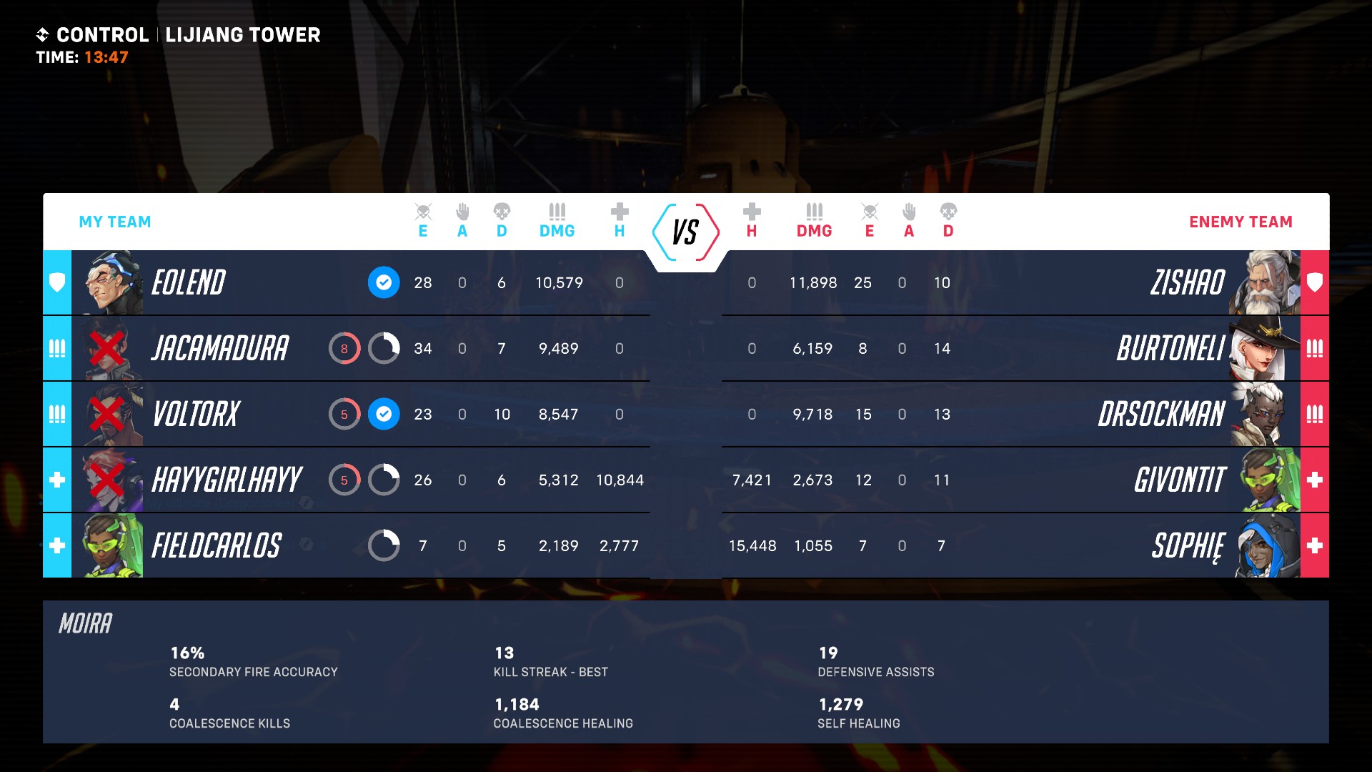
For me, the scoreboard in Overwatch 2 is the stuff of nightmares. The new scoreboard now resembles something from Halo Infinite or Warzone, with a rectangle split down the middle between teams, smaller player icons, gigantic gamertags, and a whole host of numbers laid out on a graph. At first glance, I'm immediately overwhelmed by the stacking numbers, and struggle to figure out what the small icons and letters at the top of the graph indicate. Instead of a percentage delineating how far along each player is towards getting their ultimate ability, there's a white circle with a thicker white bar indicating their progress. Yes, that means you can only guesstimate your team members' progress, unless you ask them outright. I also suspect the new board is very difficult for any colorblind players to understand.
But the biggest issue with the new scoreboard is this: once you figure out how to read it, you realize it could open up the floor for some serious toxicity.
The kill/death problem
If you've played Overwatch in any competitive capacity, you've probably run into a toxic teammate or two. It's an unfortunate reality for most competitive FPS games, and one that Blizzard tries to combat by letting you report teammates or avoid specific players. But the Overwatch 2 scoreboard feels like fodder for the toxic player, as it shows every players' stats, from assists, amount of damage, amount of healing, and the dreaded kill/death ratio. Overwatch 2 doesn't technically do the ratio math for you, but by showing both eliminations and deaths on the scoreboard, it's easy to figure out.
Sign up to the GamesRadar+ Newsletter
Weekly digests, tales from the communities you love, and more
"KD" (as most players call it) is a commonly used marker of a players' success or failure in a given match: a "positive" KD is when your kills outnumber your deaths; a negative KD is the opposite. While KD is an understandable metric to reference in games like Call of Duty or Valorant, it's a bizarre thing to display in a game like Overwatch, where all the competitive matches are objective-based. And with the new 5v5 team makeups resulting in more open, firefight-heavy matches that result in team wipes, everyone's KD in Overwatch 2 is going to be a mess.
As mentioned earlier, Overwatch 1's scoreboard still made it possible to judge other players, but Overwatch 2's data-heavy scoreboard is daunting. It also seems fundamentally at odds with Overwatch's overall vibe, which is one that is markedly different from other team shooters. As PCGamer's Morgan Park writes, "having all of your stats laid bare, as they are in CS:GO, Valorant, and Rainbow Six Siege, gives both teammates and enemies ammo to 'back up' abusive comments or other generally crappy behavior. Overwatch 2's scoreboard isn't unusual, but part of Overwatch's appeal has been that it doesn't try to be just like other team shooters." It's hard to imagine that this new scoreboard will make games less toxic, especially for solo players or any players who may be identifiable as marginalized community members.
Keep in mind that Overwatch 2 is still technically in beta, so Blizzard can go in and adjust the scoreboard to feel more distinctly Overwatch in both its visual presentation and the stats it's actually reporting. As of now, however, the new minimalist HUD and scoreboard design feels maximally wrong.
Want to give the game a try for yourself? Here's a guide on how to get into the Overwatch 2 beta.
Alyssa Mercante is an editor and features writer at GamesRadar based out of Brooklyn, NY. Prior to entering the industry, she got her Masters's degree in Modern and Contemporary Literature at Newcastle University with a dissertation focusing on contemporary indie games. She spends most of her time playing competitive shooters and in-depth RPGs and was recently on a PAX Panel about the best bars in video games. In her spare time Alyssa rescues cats, practices her Italian, and plays soccer.

