The secret messages movie camera angles send you (without you realising)
It’s no secret that a lot of work goes into making a movie. Some of it you never (or only ever briefly) see on screen. From costumes to lighting, there’s a multitude of people behind the scenes thinking about every little movie-making detail and making sure it all tells the same story. Sometimes it’s so understated that you don’t even realise that the way a character is shot is subconsciously telling you they are the hero + in danger + hungry, but it all adds to the overall message of the movie and is the difference between good storytelling and bad. One of the most powerful yet subtle tools filmmakers use to communicate with their audience is camera angles, and you’ve probably never noticed how much they’re secretly telling you.
Generally speaking, camera angles fall into five major categories: The bird's-eye view, high angle, eye level, low angle, and the oblique/canted angle. The simplified versions of these angles are as follows; the bird’s-eye view shows the action from very high up (as if a bird was looking down on the action - shocking, I know). The high angle also shows the action from high up, but not as much as when using the bird’s eye view. The eye level angle shows you the action from pretty much the same viewpoint as what’s happening on screen. The low angle shows the action from low down, and finally, the oblique/canted angle shows the action from a slightly skewed or tilted angle. You might have assumed that all these different camera angles are used to make a movie look good (and you’d be right), but that’s not all they do - they’re also sending you secret messages.
It's a bird... It's a plane...
The bird’s-eye view is the least sneaky of the camera angles and you probably don’t need me to tell you that it's often used in opening shots of rolling landscapes and cityscapes to set the scene before the main event. This isn’t all it can do though. Filmmakers also use the bird’s eye view angle to put the audience in a godlike position and make the action look insignificant and ant-like, which can be useful when trying to communicate the scale of what’s happening. Hitchcock was a big fan of this camera angle, and there’s a good example of it, coincidentally, in 1963’s The Birds. During the scene where the birds attack the gas station, Hitchcock uses a bird’s-eye view to show the destruction wrought by the birds as the fire spreads.
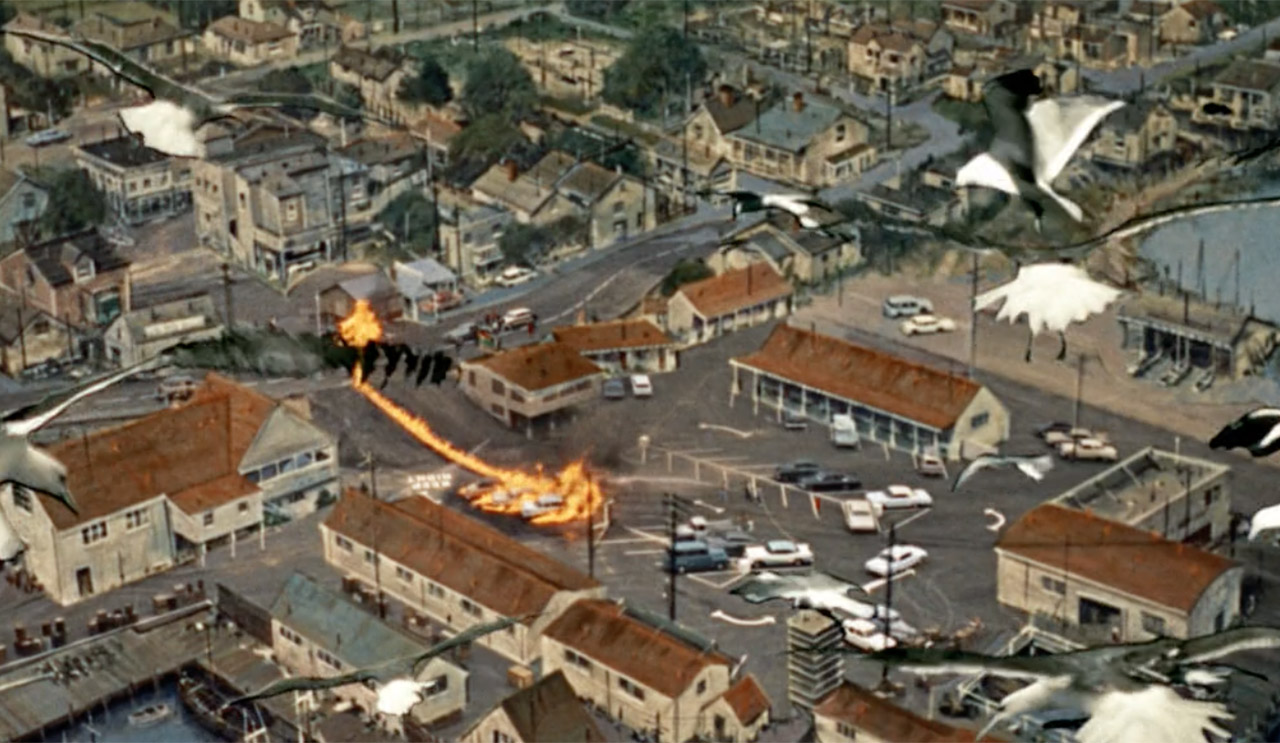
The way the fire stands out, while the surrounding houses and people look small and insignificant, makes the audiences feel like the destruction is much bigger than it really is. It also makes it feel like an inevitable occurrence - almost like an act of God - and the fact that the birds are shown high up with the audience and the camera, is no mistake either. It puts them in a powerful and godlike position too.
Similarly, in the final scene of The Matrix, after Neo threatens the machines and hangs up the phone, he looks to the sky and the camera zooms out in four separate shots, which take the camera angle wider and higher until the audience is looking at a large bird’s-eye view of the city (aka, the Matrix).
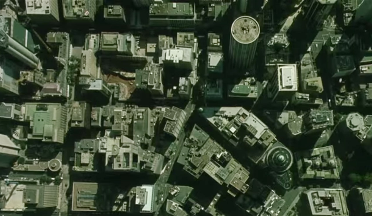
It makes you feel like the machine's world is small and insignificant, and that Neo can defeat it. Additionally, the fact that he then flies across the screen bringing his character in close again reiterates that the Matrix may be small, but he is not. He’s strong because he’s on the same level as the audience and the bird’s-eye view while the Matrix remains below. Everything about this shot makes the audience feel like the hero, Neo, is the winner even though the war has barely begun.
High or low?
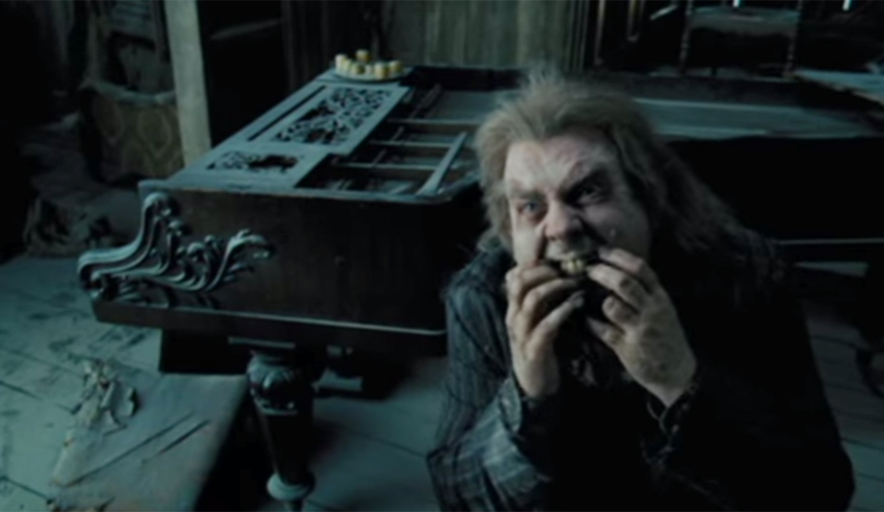
Next up is the high angle, which basically does the same as the bird’s-eye view, but to a lesser extreme. Rather than making the subject look completely insignificant and ant-like, it merely makes them look smaller and therefore weaker, which can be useful to filmmakers in a number of ways. Want the audience to feel sorry for a character? Use a high angle shot. Want them to look frail? High angle shot. Scared? High angle shot. It can even be used to make audiences feel disdain towards a character, rather than sympathy, such as with this shot from Harry Potter and the Prisoner of Azkaban:
Sign up to the SFX Newsletter
Get sneak previews, exclusive competitions and details of special events each month!
Clever, right?
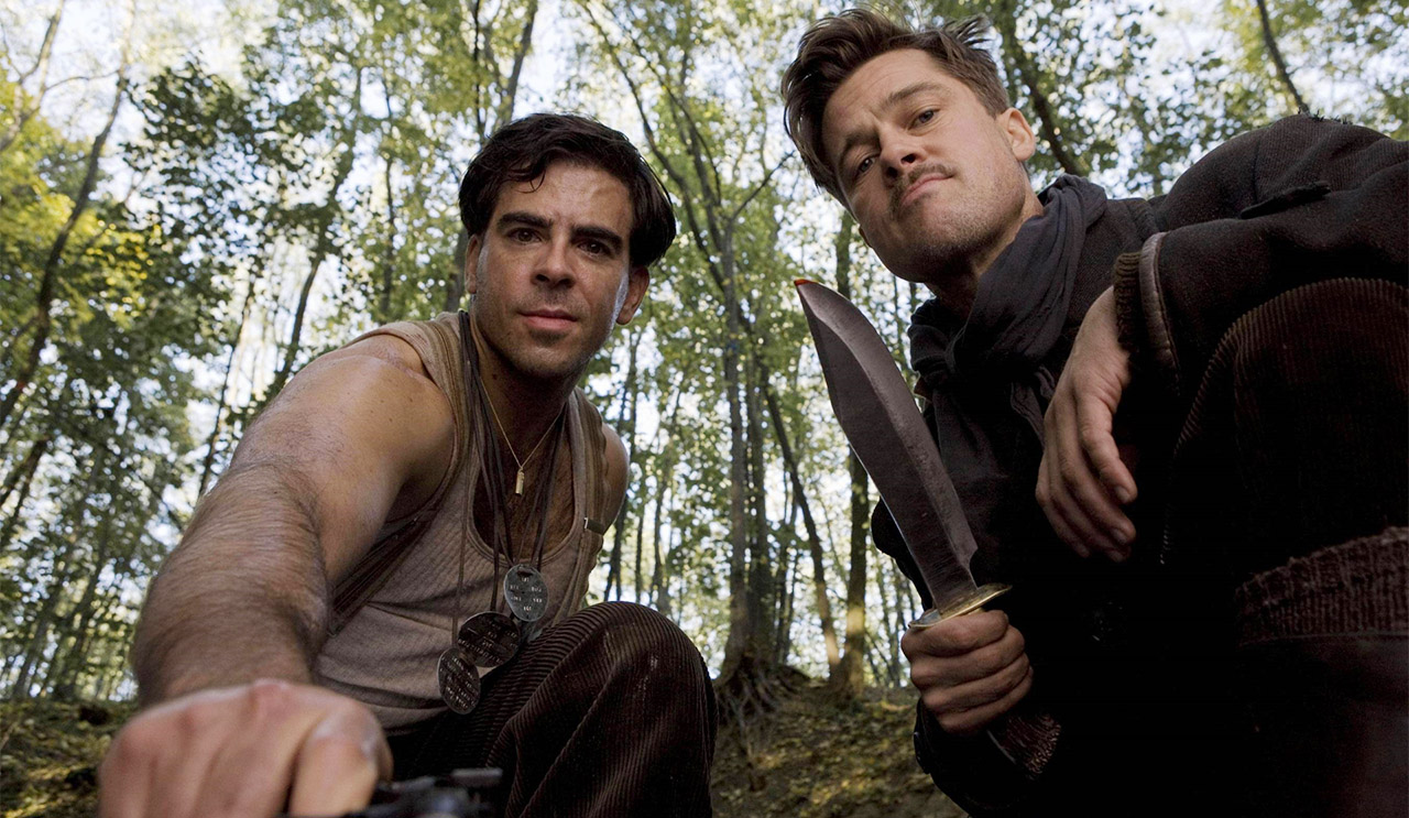
As you’ve probably guessed, the high angle is simply the reserve of this (I’ll get to the eye level angle in a moment). Using it will make the audience feel like the subject is strong, powerful, and in-charge, such as this shot from Inglourious Basterds:
But often both the low and high angles are used together to tell a story. For example, in this sequence from 1996’s Matilda, both the low angle and the high angle are used frequently and in conjunction with each other to secretly tell the story of Matilda without words. Watch it to see what I mean:
In the opening scene with her parents, the high angle shot is used to show how small and young Matilda is, leaving the audience with no doubt that she shouldn’t be left alone by her parents who are running out of the door. The next shot, which shows Matilda looking up the library in the phonebook, uses an even more extreme high angle shot to reiterate this message. At about 0.23, the camera switches to the low angle showing the action from Matilda’s perspective to make everyone around her look much bigger and again, the audience feels like she is too young to be out alone. As she crosses the road, the low angle shot continues to compare her to the massive truck, and as she arrives at the library both the high angle and the low angle are used to show her small size and the vastness of the library building. Upon entering the library and walking up to the desk, even more extremes of the low and high angles are used to support the story this sequence is telling, but it isn’t just about Matilda’s apparent weakness. The camera wants you to know she’s young, and small, and probably shouldn’t be on her own, but it also wants you to know that she’s brave, and resourceful, and strong. She may be looking up at a very high desk with a very high adult looking down upon her, but the camera isn’t shying away from this. It’s moving forward. Matilda is moving forward and asking for what she wants. The final shot which sees her walking away uses the eye level angle (more on that soon) which supports this message: they’re equals.
Almost all movies use this technique to instinctively tell you what’s happening without using any words. Even if you haven’t seen 2012’s The Avengers - or you watched it on mute - you can tell from the camera angles what’s happening. Look, I’ll show you...
In this shot the Avengers are clearly in trouble:
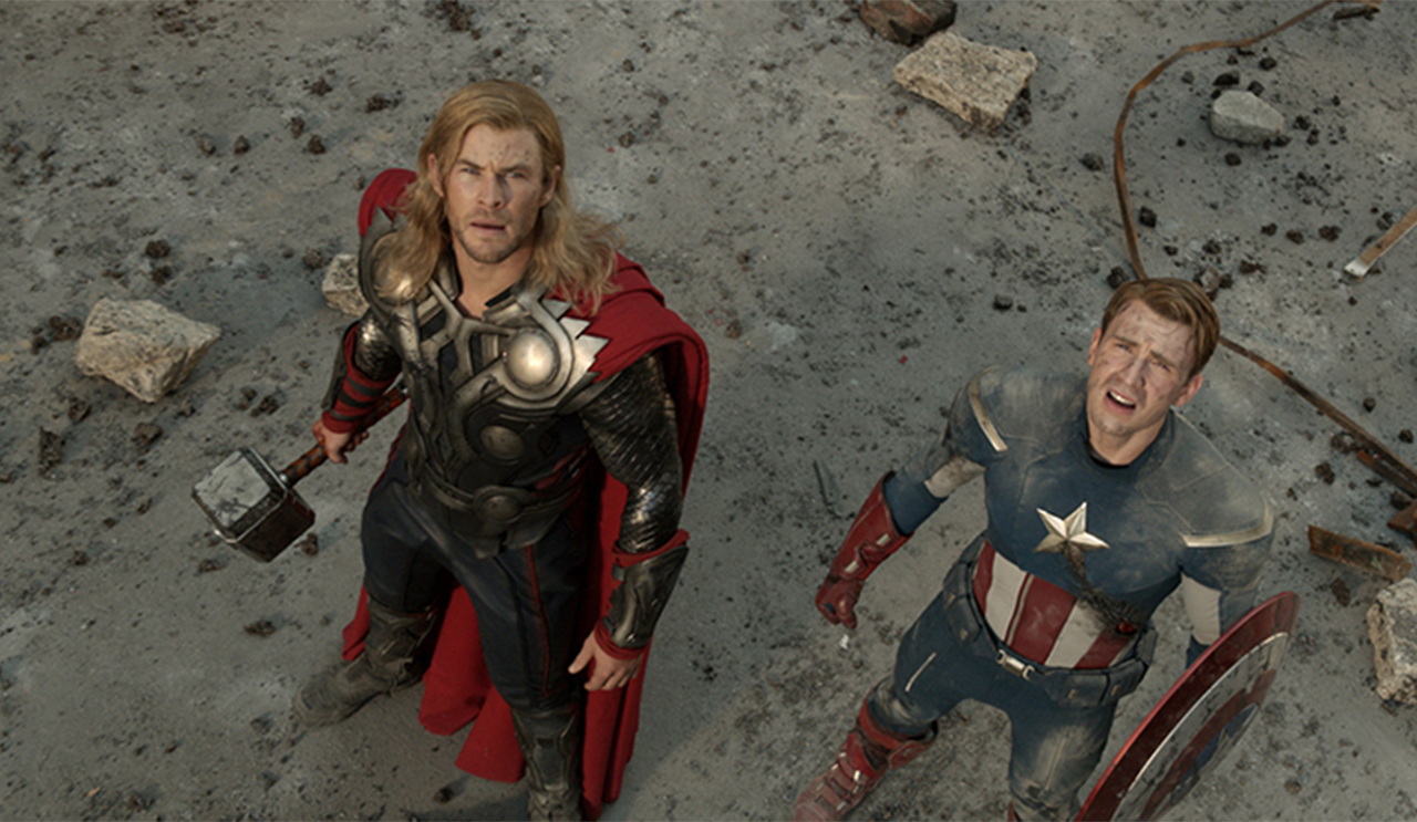
They’re intimidated, out-gunned, losing… any of the above. Take your pick!
But in this shot, they’re obviously winning (or have won):
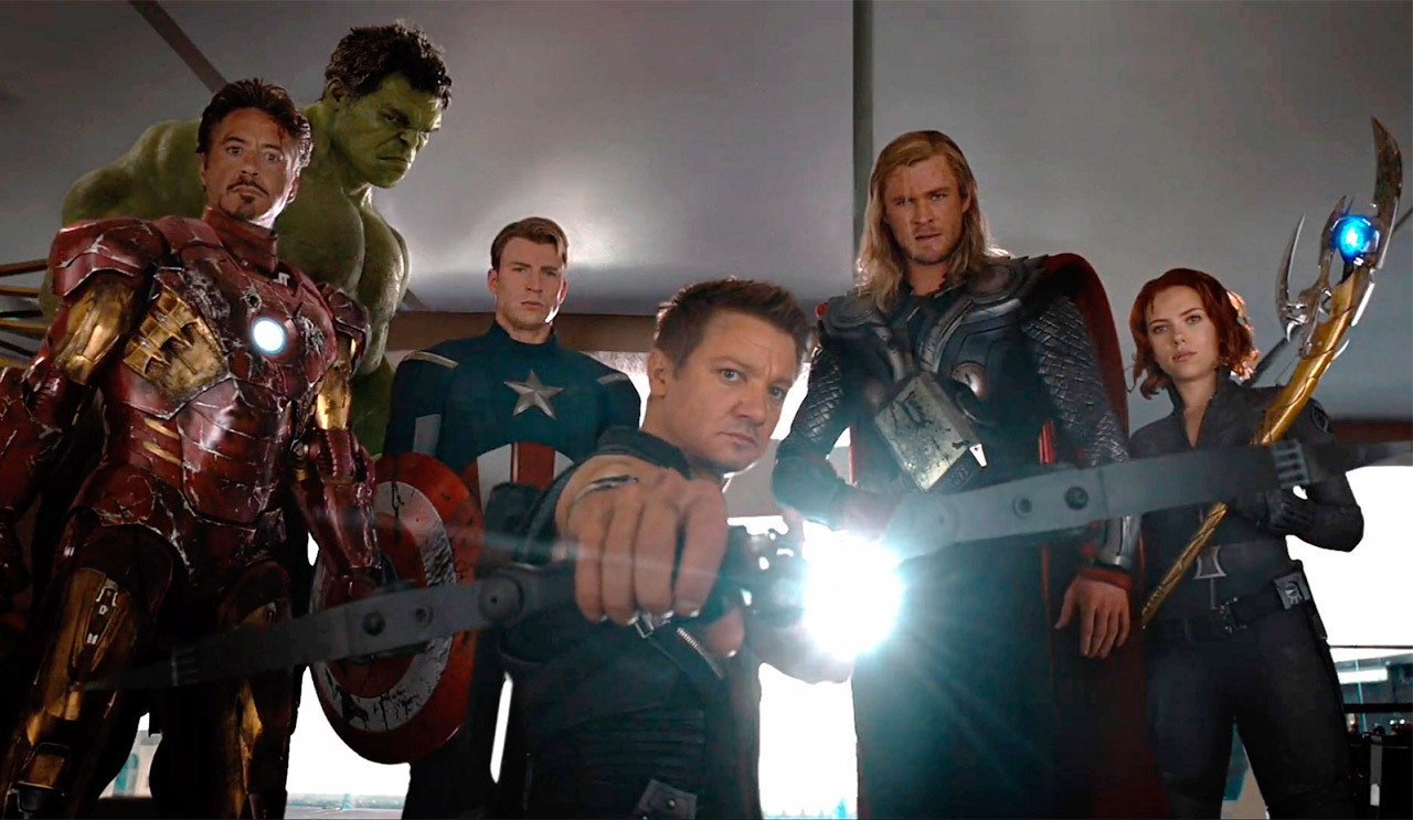
They look confident and in control.
High angles make the subject look weak and low angles makes them look strong - but more often than not, both are used together to tell a story.
Right between the eyes
Now onto the eye level angle. Just like the bird’s eye view, the eye level angle is a pretty straight-forward camera angle. It’s not trying to trick you, it’s just trying to show you the action from the same level as what’s happening. That doesn’t mean this camera angle has nothing to say, though, and it’s often used to make the audience feel a bond or a connection with a character. By shooting the subject straight on they look more honest, friendly, and personable, such as in this shot from 1994’s Forrest Gump:
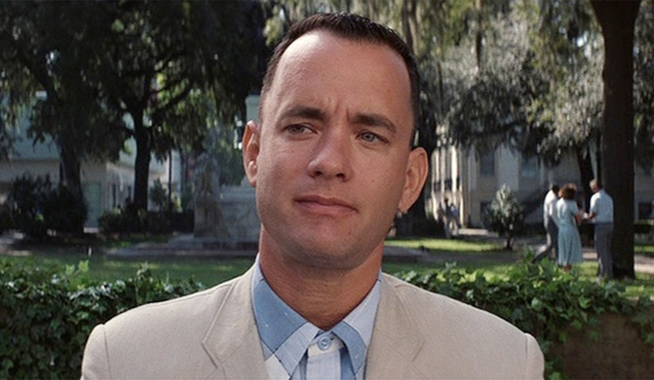
Anyone who’s seen Forrest Gump knows how much of the movie is based on the main character’s sweet nivevity and by shooting him in this way, the camera makes you feel like you’re right there with him on the bus stop bench listening to his story… which of course, is exactly how you’re meant to feel.
Using the eye level angle lets the audience get a good look at the character’s emotions and facial expressions, all of which is designed to make you feel a connection with them. And unlike the high or low angle shots, the eye level angle is all about the character (rather than what’s happening around them), which usually tells the audience that it is their story and lets them set the agenda for what’s about to happen.
You spin me right round
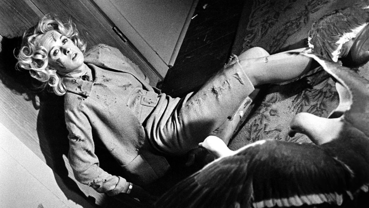
The final camera angle I mentioned is the oblique/canted angle (also known as the Dutch angle) which shows the audience the action from a slightly skewed or tilted angle. This gives the impression of imbalance, instability, or tension, and, unsurprisingly, is often used in thrillers or horror movies. Filmmakers can use it to make audiences feel uncomfortable about what they’re seeing on screen because it often makes more pleasing or balanced visuals, such as symmetry, impossible. Because of this, it’s not the most enjoyable camera angle to watch, but it's definitely effective in what it’s trying to say.
If we look at The Birds again, this shot of Tippi Hedren - after a harrowing scene in which she is attacked my multiple birds in an enclosed room - is shot using the Dutch angle to indicate how devastating the attack was and how lost and confused she feels afterwards. If you’ve seen the movie, you know that after this attack her character goes into an almost catatonic state of shock and barely moves or speaks for the rest of the film.
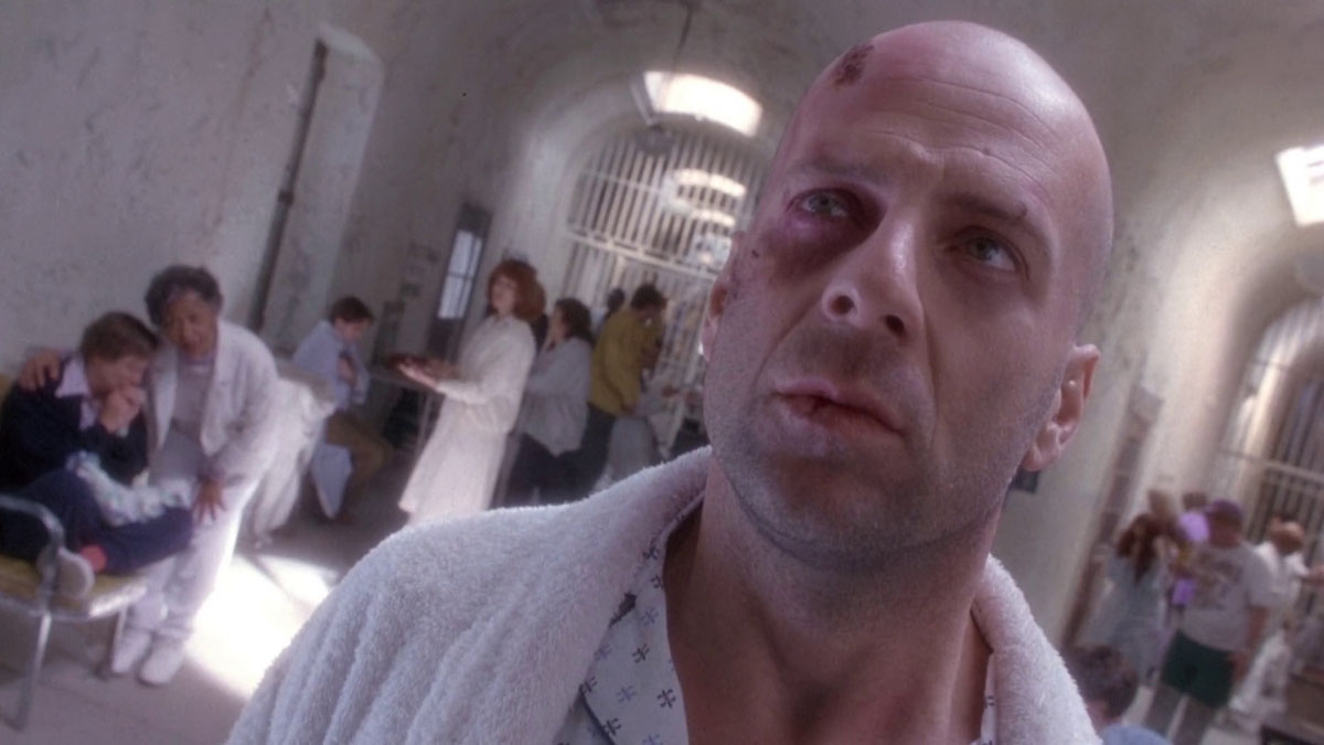
But it doesn’t always need to be an action shot. The Dutch angle can also be used to show the instability of the situation, such as in this shot from 12 Monkeys:

At this point in the movie, Bruce Willis’s character has been thrown back in time to stop a catastrophic world-ending event from occurring, but instead finds himself trapped in an asylum because everyone thinks he’s mentally unstable. While he’s not (depending on your interpretation of the movie) the people around him most definitely are and the fact that he’s trapped with time running out to save the world, means the situation is very precarious. While his face remains calm, the Dutch camera angle communicates (to the audience) the turmoil and helplessness he’s feeling.
The Dutch angle can also be used to quickly communicate to the audience that something isn’t quite right or not of the norm. For example, in this clip from ‘60s Batman TV show, as soon as the characters enter the Joker’s lair everything is shot using the dutch angle so we know the heroes are in immediate danger. It can also be used to show that the setting is otherworldly, such as in Doctor Strange which uses the dutch angle to indicate when he enters the mystical world or is using his powers. Filmmakers beware though, this camera angle is powerful and should not be overused! It’s shocking how much the Dutch angle is used in the first Thor movie and what should have been used sparingly to communicate moments of danger or other planets, is all over the film which means it loses its impact:
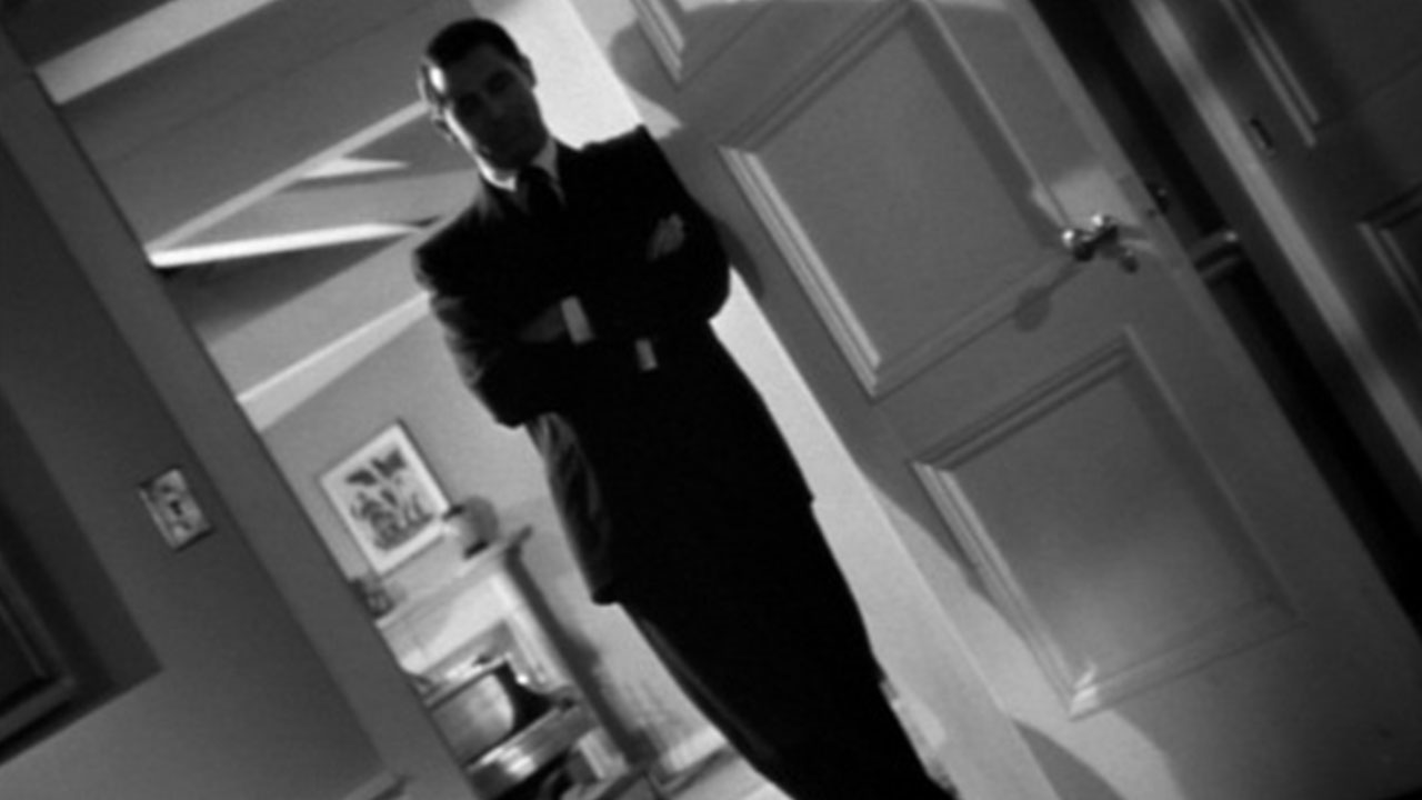
The Dutch angle isn’t just used to frame a character though and is much more effective as a point of view angle. What better way to communicate to an audience that a character is in distress than by having them see the action through their tilted viewpoint? There’s an example of this in Hitchcock’s 1946 Notorious when Alicia is waking up from a hangover. The viewer sees Devlin standing in the doorway at a tilted angle, as if they’re looking through Alicia’s eyes, and it immediately communicates to the audience that she’s vulnerable.
So there you have it. These are all the different ways filmmakers use camera angles to secretly tell you things about their movies without you realising it. And the amazing thing is that this is just the tip of the iceberg and these camera angles are often used in conjunction with different framing techniques, shot lengths, and camera movements as well. Whether it’s communicating who’s winning a fight, what’s about to happen, or that someone is in trouble, camera angles are always secretly trying to tell you something… so make sure you pay attention.
Lauren O'Callaghan is the former Entertainment Editor of GamesRadar+. You'd typically find Lauren writing features and reviews about the latest and greatest in pop culture and entertainment, and assisting the teams at Total Film and SFX to bring their excellent content onto GamesRadar+. Lauren is now the digital marketing manager at the National Trust.
