The Sonic video we've been waiting 16 years to see
Why can't Sonic Team make a game that looks and moves like this?

"Oh my God" - that was the first thing I said when the title card disappeared from view and Sonic appeared on the screen. Nothing can prepare a Sonic fan for the awesome contained within this humble YouTube window. It's Sonic & Knuckles, exactly as you remember it, only in amazing 3D. Not crappy 'wear some stupid glasses to see it' 3D, but the kind of 3D you bought your Xbox 360 for. Watch it here and then read on for why this is the most important Sonic video for 16 years.
I - and people like me - have been criticised for being too nit-picky about Sonic the Hedgehog 4. "It's what you wanted", they say. "So what if the physics are slightly different, or Sonic doesn't spin so quickly when he jumps? Get over it - move on". Well, words alone cannot convey exactly how Sonic should look on current-gen but, thanks to this YouTube member's astonishing technical wizardry, I can show you exactly what I mean. THIS is the Sonic game I've been wanting since 1994. THIS is how Sonic should move in 3D. THIS is how the scenery should look on an Xbox 360 or PlayStation 3.
But (and it breaks my heart to say it) this is not a Sonic game. As far as I can tell, it's simply a 3D pre-rendered video that someone's programmed, most likely traced over the movement from a video of the real Sonic & Knuckles. So you won't be playing this any time soon, or probably ever.
But we can grab Sonic Team by the scruff of the neck and forcibly make them watch this video. This is what we want. Look at the wonderful yet simple touches that make it beautiful:
Motion blur on the title card

A simple effect, which is used sparingly and vanishes to reveal HD lettering in the original font.
3D animated scenery
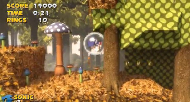
All those mushrooms are rendered in 3D and smoothly animated to bobble like they did in the original Mega Drive classic. They even spongily react to Sonic's feet before springing him into the air. Note the detail in the 3D tree roots and dry leaves underfoot. This is clearly a labour of love. Take some time to watch the video through again and look at the trees in the background. The undergrowth on the forest floor, all rendered flawlessly in 3D, yet faithful to the original game.
Glorious incidental touches
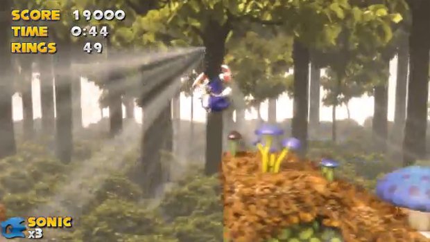
Look at the way beams of light come through the trees at the 00:35 mark. It's so beautiful, it makes me want to cry.
Sign up to the GamesRadar+ Newsletter
Weekly digests, tales from the communities you love, and more
Shiny metal effects
The bonus ring that would take you to the Special Stage is so shiny. Quite how the guy resisted the urge to jump into it is beyond me.
Even the music is great - familiar MIDI but with CD-quality digital reverb applied to it.
But then...
Noooooooooo! This is the last frame of the video and, perhaps, the last glimpse we'll ever see of the Sonic game we've always wanted.
The point is, Sonic & Knuckles wasn't even the best 2D Sonic game, but it looks absolutely phenomenal like this. The thought of Ice Cap zone from Sonic 3 being playable like this, or Aquatic Ruin from Sonic 2 is just too much to dare to imagine.
Sega, if you're listening, you could sell a game that looks and moves like this, that's only an hour long (like the old games) for £50. Nay, £60. And we would buy it. Please, please make it happen.
That is all.
25 Aug, 2010
Justin was a GamesRadar staffer for 10 years but is now a freelancer, musician and videographer. He's big on retro, Sega and racing games (especially retro Sega racing games) and currently also writes for Play Magazine, Traxion.gg, PC Gamer and TopTenReviews, as well as running his own YouTube channel. Having learned to love all platforms equally after Sega left the hardware industry (sniff), his favourite games include Christmas NiGHTS into Dreams, Zelda BotW, Sea of Thieves, Sega Rally Championship and Treasure Island Dizzy.

