The Worst Box Art of 2008
Cringe at 20 of the year's best examples of awful packaging
14. Rubik’s World (DS, released Oct. 28)
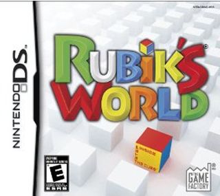
Yes, this is pretty much exactly what it looked like when we took our Rubik’s Cube, smashed it, bleached all but one of the pieces and spent hours meticulously arranging them in a stark, white room to convince a jury that we were insane at the time of the murders. But we don’t know why someone would make a game out of that.
13. Garfield’s Fun Fest (DS, released Aug. 6)
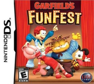
Jon looks like something painted on the wall of a day-care center, Garfield’s feet are nowhere near that tiny and there’s brown everywhere you look. The only thing that would make this depressing little scene fun or festive is if it were tied to the end of a shovel and applied forcefully to Jim Davis’ face.
12. Kidz Sports: Crazy Golf (Wii, released Sept. 16)
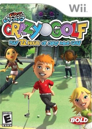
That kid’s got “date rapist” written all over him.
11. Command and Destroy (DS, released Feb. 16)
Sign up to the GamesRadar+ Newsletter
Weekly digests, tales from the communities you love, and more
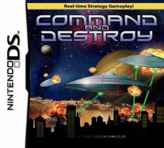
These shitty, shitty flying saucers are the CG equivalent of the hubcaps on strings from ‘50s B-movies. Actually, hubcaps on strings would have been more convincing than these lens-flared saucers and Photoshop-filter planets, which together with that giant crosshair make the game look more like a cross between Space Invaders and Missile Command than the Command & Conquer ripoff it actually is.

Left 4 Dead (PC/360), Prince of Persia Collector’s Edition (PS3/360/PC), Dead Space (PS3/360/PC)
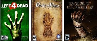
Close-ups of hands probably aren’t the best way to market a new game during the busy holiday season, but no fewer than three high-profile games decided that great big hands were exactly what buyers needed to see on their covers. How could this happen? We have a theory:
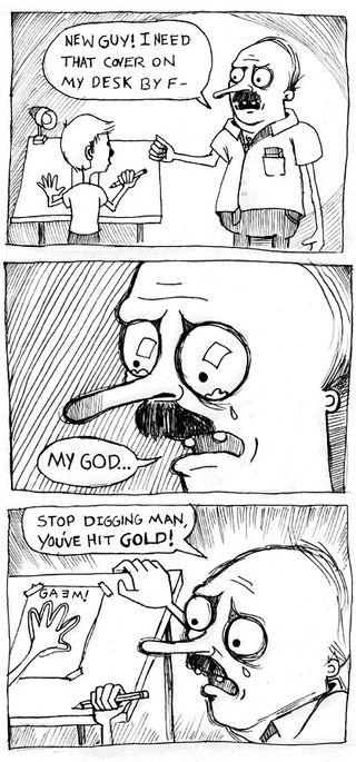
Comic by Tyler Wilde
Just, you know, repeated three times across three separate developers.

From the Abyss (DS, released Aug. 26)

Although there’s nothing compositionally or even aesthetically wrong with this, we’re troubled by the thought that somewhere, there’s an artist who has no idea that pants and belts aren’t the same thing.

