The Worst Box Art of 2008
Cringe at 20 of the year's best examples of awful packaging
Championship Pony is watching you masturbate.
OK, seriously? Take a look at these other pony games:

This one’s dumb, yes, but it’s also colorful and happy and actively communicates the idea of “OMG PONIES” to its little-girl audience.
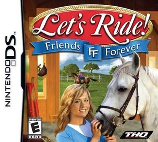
This one, meanwhile, is a little creepier, and Wax Girl there seems intent on stuffing her fingers into her pony’s nostril. But it still has a relatively peppy vibe to it. Not like this:

That’s one sad pony, and the floating stars that were half-heartedly added to the severe art and photos aren’t doing him any favors. This may be the only box art we’ve ever actually felt sorry for.
9. Wordmaster (DS, released Aug. 5)
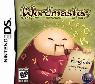
“Confucius say: ‘Nothing serr videogame about wold puzzre rike hollibre egg-shape lacist calicatule.’ Prease to buy!”
Sign up to the GamesRadar+ Newsletter
Weekly digests, tales from the communities you love, and more
8. Safecracker (Wii, released Dec. 3)

Achievement Unlocked: SHITTY
7. Bratz Super Babyz (DS, released Feb. 26)

We know, we know: singling out the box art when the whole horrible concept is to blame is like picking on Quasimodo for having a lazy eye. But that still doesn’t make it right to squeeze a gaggle of fat toddlers into skintight costumes, slather them in whorepaint and teach them that words are pluralized with a “Z.”
6. Puzzler Collection (DS, released Aug. 5)
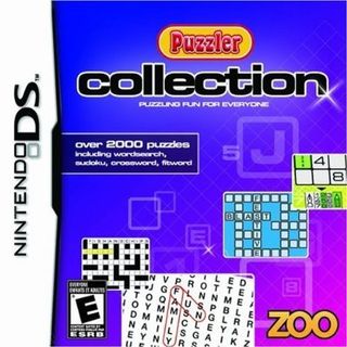
“Family?” “Fun?” “Festive?” “Blast?” “4?” “8?” None of these words even remotely describe the boredom on parade here.

SCORE International Baja 1000: The Official Game (PS2, PS3, PC, 360, Wii, released Oct. 28)
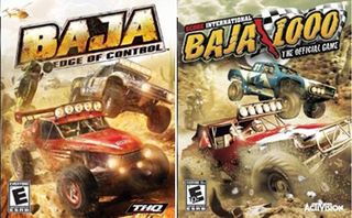
Activision isn’t a publisher we’d normally peg as eager to deliberately confuse its product with that of a competitor, but it’s hard to draw a different conclusion when comparing the art for its Baja racer with that of THQ’s Baja: Edge of Control, released a full month earlier on Sept. 23. Look at them: the colors, models and even positions of the vehicles are all practically identical. It’s like the same image taken from a slightly different angle. It’s impossible to know what Activision was thinking here, but after a lawsuit from THQ, it finally relented and agreed to switch to a different packshot.
That said, both of the above images were prominently on display the last time we were in a game store. So maybe the agreement hasn’t taken effect yet.

Okami (Wii, released April 15)
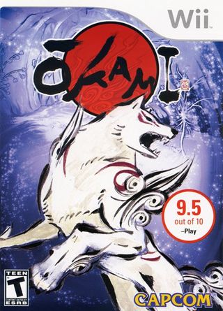
Nothing wrong with this, right? It’s pretty, it’s elegant and it gives a tantalizing glimpse of what the game’s about. It’s everything a box should be. But what’s that over on the right?
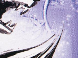
Still not seeing it? Fine, we’ll make it obvious:

For whatever reason, someone at Capcom decided that - instead of directly mining the company’s own considerable collection of Okami artwork - their box-art needs would be better served by grabbing a piece of artwork off IGN. Which might have worked out OK if they’d remembered to scrub IGN’s watermark out of the image. Instead, IGN was surprised, Capcom was embarrassed, consumers got free replacement covers out of the deal and everyone had a good laugh at one of the weirder box-art eff-ups in years.

