The worst box art of 2009
25 of the year's ugliest attempts at game packaging
Interestingly, this recession-choked year squeezed out a lot of wonderfully awful gems, as budget publishers competed to see who could use up the world’s entire blank-DVD supply first. In fact, the field’s been so fertile that we’ve had to expand our usual 20 entries to 25 just to accommodate the overflow, along with a few “special” awards for boxes that, while not particularly ugly, were each terrible in their own small ways.
As always, please bear in mind that we’re not making any judgments here about the games themselves – just the terrible boxes they came in.
25. Petz Hamsterz Bunch
Released: Oct 27
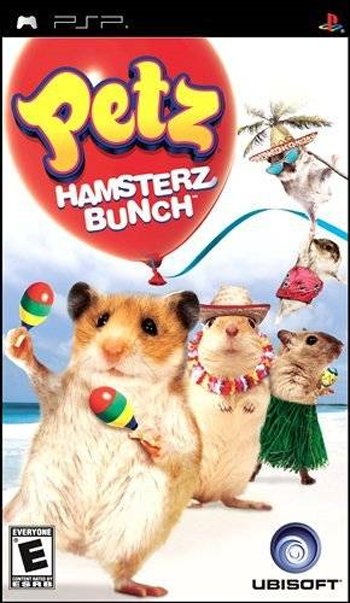
This one’s right on the cusp between cute and horrible, but that gerbil-looking thing in the grass skirt, coupled with the earless hat-hamster in the center, push this from mildly demeaning cartoon fantasy to creepy fever dream about malevolent rodents that walk like men. And also that know how to wield club-like maracas.
24. The Dark Spire
Released: April 14
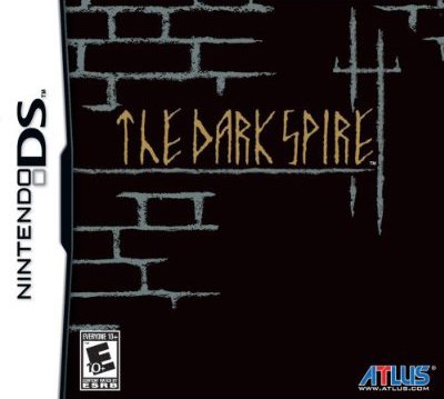
Believe it or not, box art plays an important role in the retail process. Its job is to catch the eye of the consumer, instantly give him or her an idea of the experience lurking within and, in casual-shopper cases, close the sale with its extreme awesomeness.
So it’s sad to see a game asunique-lookingas The Dark Spire represented by a bland, gloomy logo and some outlines of bricks. It’s not just below the bare minimum – it’s the same kind of shit high-school sophomores scribble on their desks.
Sign up to the GamesRadar+ Newsletter
Weekly digests, tales from the communities you love, and more
23. Water Sports
Released: Oct 27
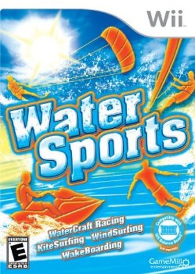
Meanwhile, the box for Water Sports does a decent job of showing viewers exactly what it’s all about. However, it does a much better job of looking like it’s made of Fruit Roll-Ups cut to look like clip art and thrown haphazardly against an “ocean” backdrop made of even more Fruit Roll-Ups.
Also, the game’s name is either a painfully straightforward description of the activities on offer, or a direct reference to a urine-soaked sex act. Nice.
22. The Book of Unwritten Tales
Released: Nov 24
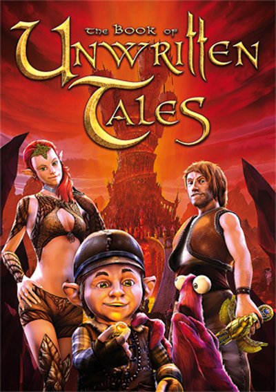
Admittedly, this adventure-game parody sports one of the more competent boxes on this list, and at first glance, there’s very little wrong with it. Except for maybe the oxymoronic title. And the eerily childlike face of that elf-girl there. And the allusions to Lord of the Rings that toe the line between “parody” and “blatant ripoff.”
But what really gets to us is the crab-like muppet thing. Not only is he completely out of place, but we can’t shake the nagging feeling that we’ve seen him somewhere before…
Oh, right:
21. Hysteria Hospital: Emergency Ward
Released: June 16
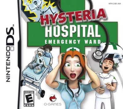
Jesus, what a mess. While some poor sap gets electrocuted in the upper left, the shifty-looking orderly ignores him to lavish some attention on a dumb kid who got his foot caught in a fishbowl. Meanwhile, Foreground Nurse can’t be bothered with either of them; she’s too busy losing her shit because the EMT is laughing at her for distracting him with her huge breasts and making him crash the ambulance into the game’s logo again.
But still: way better than socialized medicine, amirite?
20. Petz: My Monkey Family
Released: Nov 21
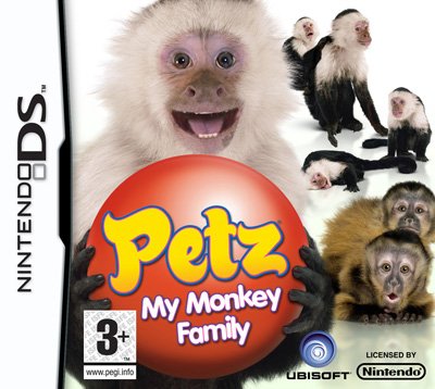
Aw, isn’t this sweet? Just animals being cute, with no ridiculous hats or maracas or… uh… hang on…
Um…
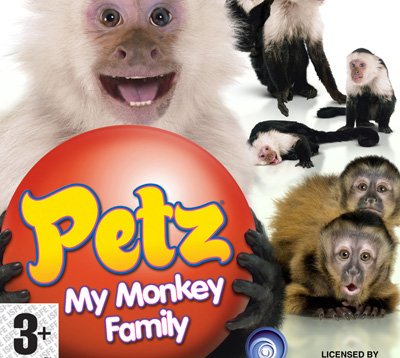
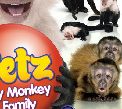
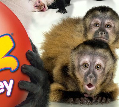
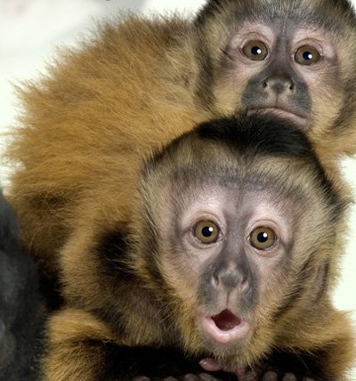
What.

Left 4 Dead 2
For the record, this is what Left 4 Dead 2’s US box art looks like:
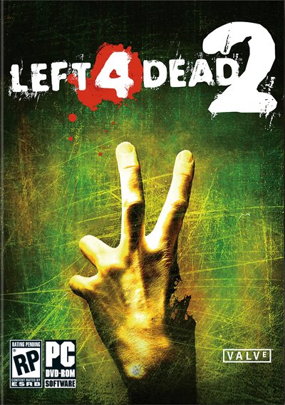
Above: Strong. Evocative. Gnarled as all hell
And this is what UK gamers see on store shelves:
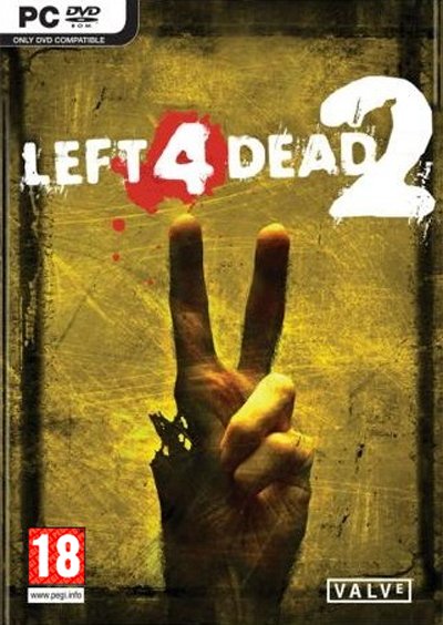
Above: Weak. Flaccid. Possibly declaring victory
For readers outside the UK, the “controversy” behind the packaging change stems from the so-called “two-finger salute,” a rude gesture common to the UK that’s roughly analogous to flipping the bird.
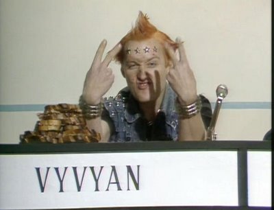
Above: Sort of like this, yes
Apparently the idea of neat rows of zombie hands flipping off a nation’s grandmothers from the bully pulpit of store shelves was just too much for the game’s European distributors to bear. Whatever their reasons, couldn’t they have at least come up with something more threatening?

