The worst box art of 2009
25 of the year's ugliest attempts at game packaging
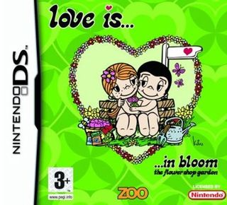
Normally, we try to avoid picking on licensed games in these features. For starters, it’s too easy, and the horribleness is usually the fault of the licensed property itself, rather than of terrible design decisions. However, while licensing a game from Love Is… – the comic strip once described by Homer Simpson as about “two naked eight-year-olds who are married” – is a bad idea in and of itself, it’s not to blame for that nasty green background. Compared to that, the presence of nude, sleepy-eyed kids is like acne on a leper.
Sign up to the GamesRadar+ Newsletter
Weekly digests, tales from the communities you love, and more
Ahead of GTA 6, Take-Two CEO says he’s “not worried about AI creating hits” because it’s built on recycled data: “Big hits […] need to be created out of thin air”
Getting Over It creator Bennett Foddy threatens the world once again: If you want Baby Steps to be a brutal rage game, "you can inflict that on yourself"


