The worst box art of 2010
Features
By
Mikel Reparaz
published
40 of the year's ugliest attempts at game packaging
Released: Oct. 14
We’ve never been fansof Just Dance’s box-art choices, although this year’s are just a bit better than 2009’s. However, there’s something about the UK version that just rubs us the wrong way.
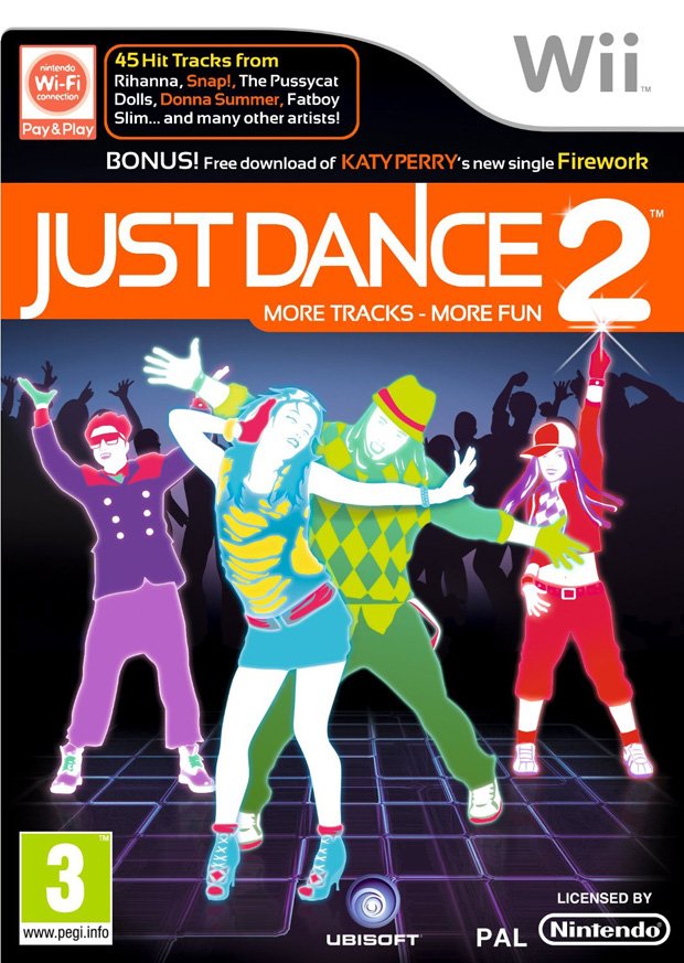
It’s kind of hideous to begin with, but there’s… hold on, there it is…
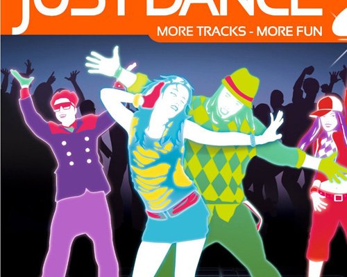


Is it just us, or…?


Nope, definitely Kim Jong Il.
Sign up to the GamesRadar+ Newsletter
Weekly digests, tales from the communities you love, and more
CATEGORIES
After graduating from college in 2000 with a BA in journalism, I worked for five years as a copy editor, page designer and videogame-review columnist at a couple of mid-sized newspapers you've never heard of. My column eventually got me a freelancing gig with GMR magazine, which folded a few months later. I was hired on full-time by GamesRadar in late 2005, and have since been paid actual money to write silly articles about lovable blobs.

