The worst box art of 2010
Features
By
Mikel Reparaz
published
40 of the year's ugliest attempts at game packaging
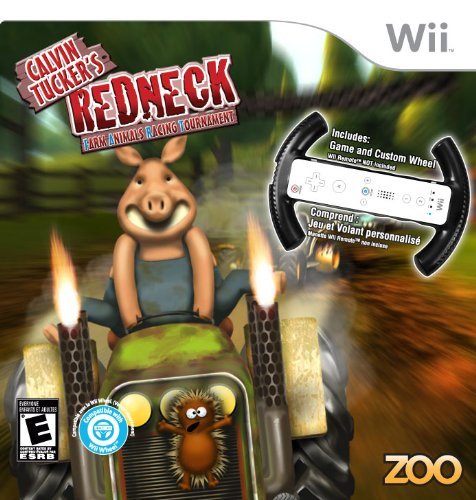
Released: Aug. 3

We get it. It’s supposed to be a goofy lowbrow game for kids. But does that excuse the blur filter and grimy colors? Does that mean we should ignore the pig’s obscene grin, or the unnatural contortion that enables him to bang his crotch against the steering wheel? Or the fact that the box looks pretty much like what you’d expect from a title that abbreviates to “Calvin Tucker’s Redneck FART?”
Sign up to the GamesRadar+ Newsletter
Weekly digests, tales from the communities you love, and more
CATEGORIES
After graduating from college in 2000 with a BA in journalism, I worked for five years as a copy editor, page designer and videogame-review columnist at a couple of mid-sized newspapers you've never heard of. My column eventually got me a freelancing gig with GMR magazine, which folded a few months later. I was hired on full-time by GamesRadar in late 2005, and have since been paid actual money to write silly articles about lovable blobs.


