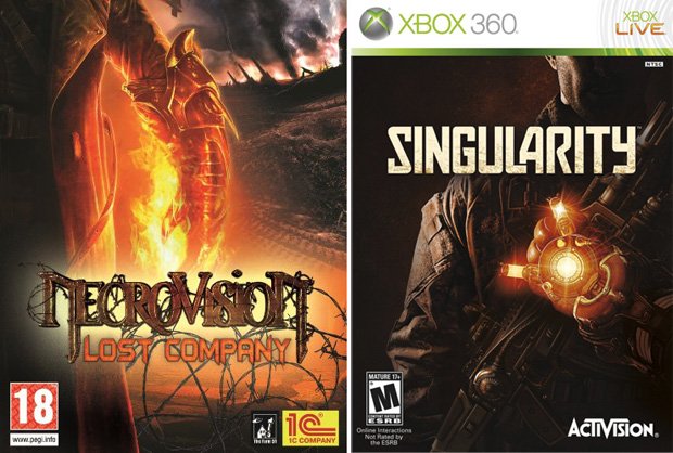
The worst box art of 2010
Features
By
Mikel Reparaz
published
40 of the year's ugliest attempts at game packaging
Add us as a preferred source on Google
Sign up to the GamesRadar+ Newsletter
Weekly digests, tales from the communities you love, and more
By submitting your information you agree to the Terms & Conditions and Privacy Policy and are aged 16 or over.
You are now subscribed
Your newsletter sign-up was successful
Want to add more newsletters?
Join the club
Get full access to premium articles, exclusive features and a growing list of member rewards.
An account already exists for this email address, please log in.
Subscribe to our newsletter
Released: Feb. 19 and June 29

We can understand how one game this year could feature a dark, incomprehensible image overpowered by a glowing orange hand, but two? How is that a thing? Who comes up with these designs? Is their dank burrow choked by the smell of rotting flesh, or do they do a good job keeping the place clean so as to better lure in the unsuspecting?
Sign up to the GamesRadar+ Newsletter
Weekly digests, tales from the communities you love, and more
CATEGORIES
After graduating from college in 2000 with a BA in journalism, I worked for five years as a copy editor, page designer and videogame-review columnist at a couple of mid-sized newspapers you've never heard of. My column eventually got me a freelancing gig with GMR magazine, which folded a few months later. I was hired on full-time by GamesRadar in late 2005, and have since been paid actual money to write silly articles about lovable blobs.
LATEST ARTICLES
 Join The Community


