The worst screenshots of E3 2009
AND YET we still get sent screenshots that look like someone deliberately picked them to make the game look bad. Look at these amazing examples of failfrom this year's show - most of them from good games too.
Cars: Race-o-Rama (Xbox 360)
Last time we checked, 360 was able to render detail. The car itself is fine, but look at the background. We know it's a multi-platform game, but even Wii can do better than this.
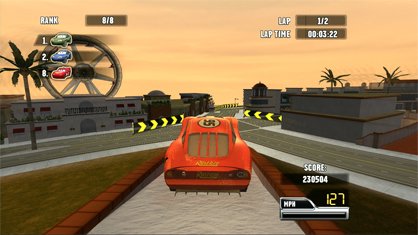
Above: Blocky isn't the word. PS2 can do better than this. Shall we have a close-up look?
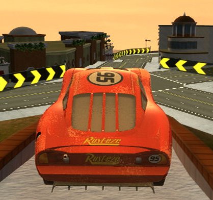
Above: Shudder
Echocromo (PSP)
There's nothing quite like alevel menu to get gamers wet with anticipation.
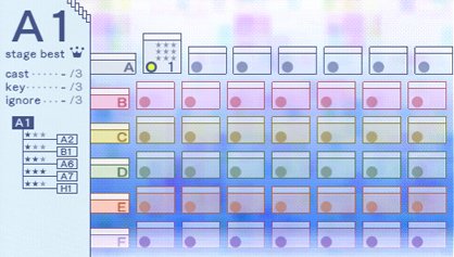
Thing is, it doesn't end there. Can't get enough of level selection screens? Maybesir would care to try it in yellow?
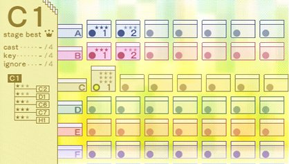
Look at all those coloured circles! Can't wait to get stuck into them. Whoever said Echochrome was monochome monotony? Oh, but wait - there's more...
Weekly digests, tales from the communities you love, and more
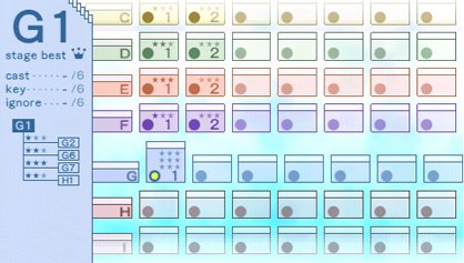
Hang on... isn't this the same as the first one? Oh, apparently not. This one is 'G' tier. Obviously completely differe... zzzzzzzzzzzzzzzzzzzzz
Grand Slam Tennis (Wii)
Rule number one when learning to play tennis: Keep your eye on the ball.
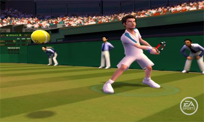
Above: Andy Murray would win more games if he wasn't so easily distracted by the guy selling donuts in the crowd
Metal Gear Solid: Peace Walker
Even the best games can fall foul of the screenshot monkey. Never mind the gorgeous forest, the detail in Snake's face (he's even got 3D ears for Jeebus' sake). It all comes undone if you point the camera at the worst texture in the game.
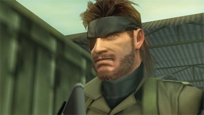
Above: Even Snake's annoyed - tailed all this way by a PSone texture
Shin Megami Tensei: Persona (PSP)
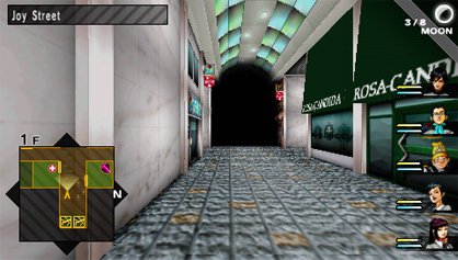
Above: Joy Street must be an ironic name
Pitfall: The Mayan Adventure (Wii)
Step one: Take a blurry screenshot of anold game.
Step two: ?
Step three: Profit
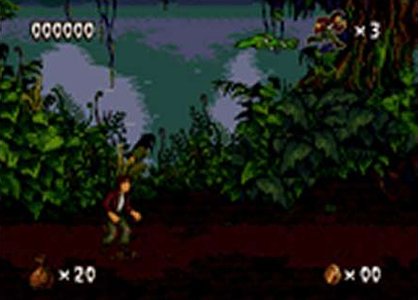
Above: We assume this is to advertise the Virtual Console release
Pixeljunk Monsters Deluxe (PSP)
It's not enough to wait for wireless stuff in the game. Now we have to do it in press releases too:
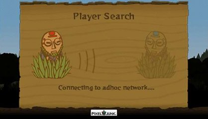
Above: Why advertise the fact you'll need to wait for techy stuff?
Pokemon Mystery Dungeon: Explorers of Sky (DS)
Take a look at the following screenshot:
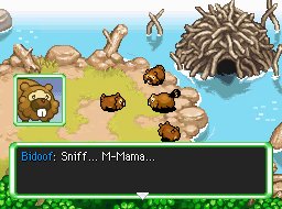
What' wrong with it? 1: Pokemon aren't supposed to be able to talk (though we suppose it's a necessary evil ina game where you play as one). 2: Pokemon lore says that nobody's ever seen a Pokemon lay an egg, therefore Pokemon surely don't have'mama's. 3: Anthropomorphising a fricking Bidoof does not make us want to play this game. 4: If Bidoofs could talk, we're sure they wouldn't be so wimpy. 5: Or stammer. 6: Or use ellipses.
This is why we'restillplaying too much 'proper' Pokemon.
Puzzlegeddon (PS3)
No point buying the game - you're only going to fail.
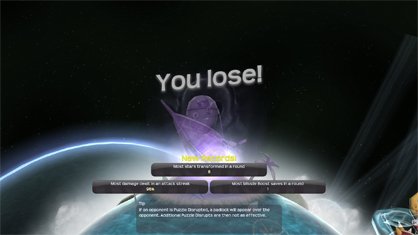
Above: Wahey!
Red Steel 2 (Wii)
Motion Plus control? Check. New graphical style? Check. Lead character the size of a chicken? Check, and double check.
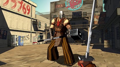
Above: The enemy may be tall, but look at the ground and the barrel too
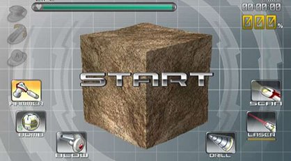
Spectrobes: Origins (Wii)
You will play with your cube. And you will enjoy it, dammit!
RUSE (Xbox 360, PS3)
Here's a classic. Look at the screenshot first, which is, in itself, dull as ditchwater with a Morrissey CD floating in it:
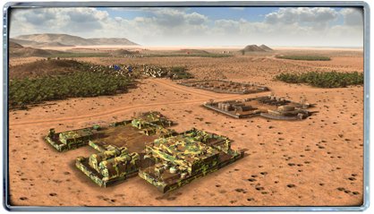
You know a screenshot's dull when the PR company has put it in a frame to make it more interesting. But there's more. Each one of this game'sscreens came with a commentary file. Here's the one for this shot:

So that building's now invisible, is it? You mean the most conspicuous thing in the picture that even a particularly myopic mole couldn't fail to spot from 1000 yards? Riiight. Note to real soldiers: Camouflage only works if its colours match the environment.
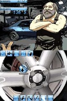
Touch Mechanic (DS)
We don't need to say anything here.
Vandal Hearts: Flames of Judgement (360)
Wow, this one gets two entries it's so good. First up - a nice two-generations-old-looking game screen. Fair enough as the game is a follow-up to a PSone 'classic'. But still, there are more interesting things to show than a brown field with a rock. And a green... thing.
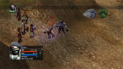
But then there's the cut scene art style:
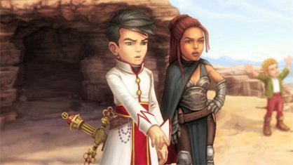
Oddly enough, that's exactly the look we had on our faces when we saw this screenshot.
Watchmen: TheEnd is Nigh(360/PS3)
Want people to buy your game? Show them a gimp man with big nipples!
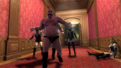
Not big enough? OK, then - just for you...
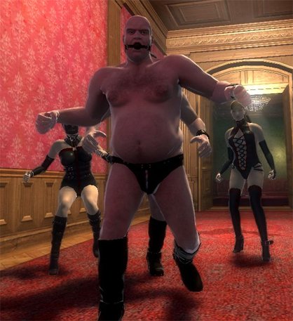
Above: Surely the only thought this image conveys is 'RUN!'
You, Me and the Cubes (Wii)
And finally, the most exciting game select menu we've ever seen. You can play alone, with a friend, or practise either of the above. That's variety.
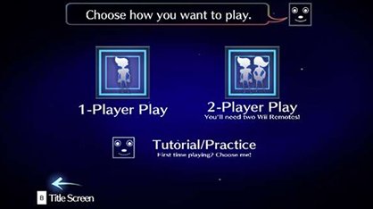
Above: Oh, wait, you can goback tothe title screen. That's another whole option. You do want to see the title screen again, don't you? I miss it
09 Jun, 2009

Are you addicted? Find out here!

Did someone get the cm and inches muddled up?

Screenshots so bad they're good

Justin was a GamesRadar staffer for 10 years but is now a freelancer, musician and videographer. He's big on retro, Sega and racing games (especially retro Sega racing games) and currently also writes for Play Magazine, Traxion.gg, PC Gamer and TopTenReviews, as well as running his own YouTube channel. Having learned to love all platforms equally after Sega left the hardware industry (sniff), his favourite games include Christmas NiGHTS into Dreams, Zelda BotW, Sea of Thieves, Sega Rally Championship and Treasure Island Dizzy.
