Top 10 Entries on Top 10 Lists
You can’t read a videogame feature without at least one of these
Weekly digests, tales from the communities you love, and more
You are now subscribed
Your newsletter sign-up was successful
Want to add more newsletters?
Lists found on: Rapiest games, Worst affronts to Native American culture, Bad Ideas in Gaming,Game Babes: A History
Why is it on so many lists?
Every once and a while, we journalists like to take a break from writing about the best breast physics in games and get up our own asses about social responsibility - but only if the game in question is not only completely offputting, but a cautionary tale for the games industry as well.
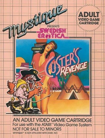
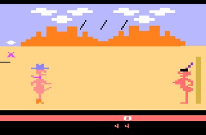
Enter Custer’s Revenge, a perverted take on the eradication of the Native American. Revenge tasks you with navigating a well-endowed (read: giant boner) cowboy across a desert landscape complete with arrow hazards. The ultimate goal is to have your way with the well-endowed (read: big boobs) Native American woman tied to a cactus on the other side of the screen.
The game was designed for the Atari 2600 by an offshoot of a porn company, developer Mystique,which had also previously come under fire for other pornographic games like Beat ‘Em and Eat ‘Em and Bachelor Party. ProTip: equating rape with revenge is disgusting and degrading towards women. Toss in some obviously twisted White dominance/Manifest Destiny themes and we’re talking a stickier situation than a bucket of syrup. Only worth mentioning if it’s in a relatively negative light coupled with snarkiness towards the onscreen representations of a boner.
Remedy
Uh… we hope there aren’t any more games like this in the pipeline.

Lists found on: Worst secondary characters, Characters We’d Beat Up, Worst Pieces of Shit
Why is he on so many lists?
First making his appearance in The Legend of Zelda: Majora’s Mask, Tingle is a rupee-hoarding, map-making, fairy-obsessed son of a bitch - at least in America. Apparently in Japan and Europe, he’s not so much an object of abject hatred considering he’s the star of two games released specifically to those markets.
Weekly digests, tales from the communities you love, and more
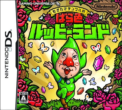
His skin-tight green bodysuit, red Speedos, rosy cheeks and dainty manner hint towards a curious sexual orientation and overall creepiness we haven’t felt since watching Rocky Horror Picture Show. Seriously, who dresses like that?! What really drives us insane is that we have to interact with this horribly forced, bizarre character.
As soon as this red-nosed twinkletoes appeared in Mask, we chalked that up to him being the only nut in all of Hyrule. But when he charged gamers an incredible amount for maps in Wind Waker - to go on a fetch quest - that just added more fuel to our hatred. It was nice of Nintendo to create a tangible symbol to attribute what’s irritating about cumbersome gameplay. Great job!
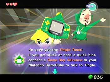
Remedy
Shoot a Light arrow into Tingle’s throat in the Twilight Princess follow-up.

Lists found on:Top 7 Worst Parts of Best Games, Most Frustrating Levels, When Developers Get Lazy
Why is this on so many lists?
We really like the Halo franchise for its wide-open environments, creative weaponry and intelligent AI. The original sold an ass-ton of copies and proved the Xbox was a viable contender against the PS2. However, two-thirds into part one’s campaign, the game flips and instead of clever enemies to brain your way through, you have to shotgun past mongoloid zombies in boringly cramped underground tunnels.
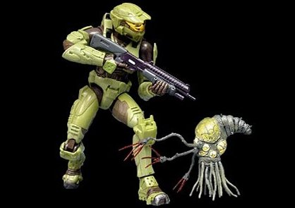
Even if you haven’t played Halo, we’re sure you’ve read about the Flood level repeatedly to the point of exhaustion. Is it that bad? Very much so. It’s roughly one hour of mind-numbing tedium. Not to mention, the annoyingly courteous 343 Guilty Spark leading us into slow gun battles like some kind of asshole C-3PO. Whatever the point, the game feels like someone turned on the lazy switch to negate everything that came before it.
And because gamers get irritated easily and love to talk about exactly why something sucks, we went looking for the biggest soapbox we could find to share our woes. If we cull together other awful levels from great games andadd some sarcasm, then baby -we got ourselves a feature going.
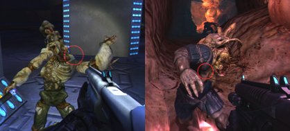
Remedy
Diamonds are forever and memories fade. Gamers, however, remember all. Sorry Bungie - you’re screwed.

Lists Found on: Horrible US Box art, Largest Bulges in Gaming,Ultimate Mega Man Retrospective
Why is it on so many lists?
As much as we love “Best of” lists, they’re nowhere near as exciting or nut-bustingly fun as lists in the “What the shit were they thinking?” category. And the US cover for Mega Man 1 on the NES is a perfect example. Compared to the Japanese cover that accurately depicts the game’s characters, the US box art appears as though it’s rejected concept art from Disney’s Tron, had it been set in Oz.
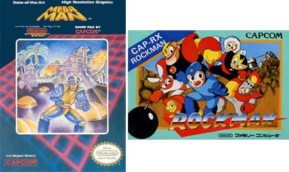
We wonder if Capcom and Nintendo’s marketing campaign for Mega Man was to design a cover as unappealing as possible that symbolized absolutely nothing from the game. For starters, Mega Man was never really a grizzled forty-year-old with a pistol. Secondly, we have no idea what the hell else is happening in that clustershart background. Check out those 3D vectors, though - rad!
We can understand redesigning a cover that might appeal to a broader audience raised on shoot-em-ups from the ‘80s, but it’s a ballsy approach that we wouldn’t recommend and is probably why Mega Man 2’s art was a step in the right direction. Still sucked, though.
Remedy
It’s so bad, it’s retro now. Check out Capcom’sMega Man 9 cover.
