Transformers: Dark Of The Moon Scott Farrar ILM Interview
We speak to ILM’s special effects whiz about bringing giant robots to life on the big screen, and how Michael Bay makes movies for his mum
We speak to ILM’s special effects wiz about bringing giant robots to life on the big screen, and how Michael Bay makes movies for his mum
SFX: What was the most demanding aspect of the special effects work on Transformers: Dark Of The Moon – destroying Chicago or the giant robots?
S cott Farrar: I would say they’re both demanding. I’ve had a lot of the same team together for six years as we’ve been developing the look of the Transformers universe. We’ve essentially been polishing an illusion. We can tell the difference. I think that the robots look better now. We always start with real whenever possible. We shoot real locations, puffs of smoke and debris; which was wholly different from what most of us who are practitioners of effects used to do. You always used to shoot everything absolutely clean and then put all the pieces in bit by bit separately. Shoot it against all blue screen and then pack it in like a sandwich layer. And I’ve learned that one reason why the way we do it now looks so much better is because of the colour and composition and tonality of all these different naturalistic effects, you learn from that. You would not believe how complicated a puff of smoke can be regarding self shadowing and colour and movement and the way the sun filters through it, so if you have something like that in the shot it gives you a much better guide as to anything you’re going to add after the fact.
I also like to start, wherever possible, with real photography. So I looked at a bunch of movies for the third act in Chicago. There are certain films where they’ve scraped away the entire city and recreated the whole city in computer graphics. That’s one solution. But I thought if we can shoot the real city and then use that – because there’s nothing like the complexity of the texture, either grain or pixel wise of a real photograph – so if we can shoot it with moving cameras or still photos let’s do that, and that’s what we did. And then you track the shots, and the tracking abilities of everybody have gotten a lot better than they used to be. It’s complicated because it’s stereo but you track it and then you put the damage in and then you put the layering and the textures and it looks more real.
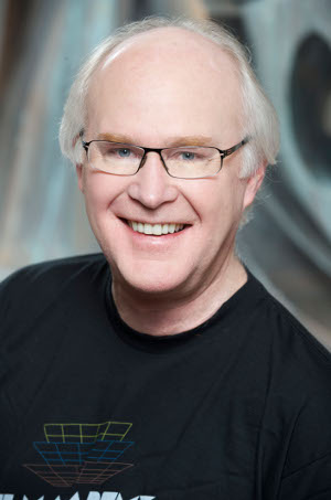
[caption id="attachment_58341" align="alignright" width="250" caption="Scott Farrar. Not a robot. We think."]
[/caption]
How much do the Transformers change from film to film?
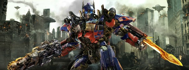
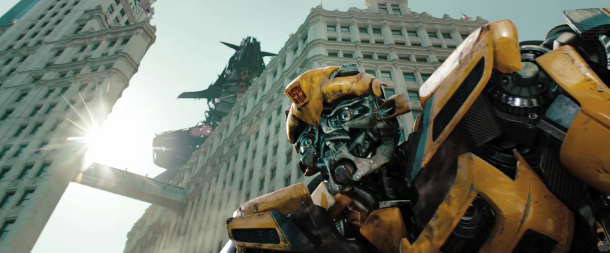
Quite a bit. If we could show you visually, the comparisons. Michael Bay, the director, we have a good time with him and he always says: “Make stuff look cool. Don’t be boring, make it cool.” What happened this time, very simply speaking, was he wanted Bumblebee to be more buff with a larger chest like a strong man, and bigger shoulders, literally like a weightlifter. And he literally wanted Optimus Prime to have a six pack, so if you look at the movie there’s actually little indents in the machinery to plus him out. So that’s what we did. That’s going on with the car companies as well. Every year they tweak the design and change things to make it a little more cooler, more windswept, what have you. So we’re doing the same thing with the robots. Then, of course, we have the attending damage and so forth. On Revenge Of The Fallen , during Optimus Prime’s fight in the forest we had five different levels of damage which it’s just like being on set – you wreck the set. It starts out clean and as the fight goes on we have to make the damage, make the bent metal, charred, painted, so there’s a progression. You may not notice but it’s a very laborious process. You’ve got to set it all up so you’ll tell that story as it goes along.
So you have a continuity editor for battle damage, things like that?
That’s exactly right. We have meetings about how to track the damage. And every day in dailies we do that in the morning when I see the shots having been rendered overnight. You can get tricked because it’s real easy to forget to put these things in, so we’ll have a checklist and we’ll have a timeline on where does a shot fall based on the present cut from editorial. So you’ve got to be really careful and go, “OK, give me the checklist for this shot… tick, tick, tick… wait, we forgot the thing on the chest.” We didn’t put the bullet hole in or whatever it is. But it can be simpler than that. On Dark Of The Moon it’s really obvious when, during the final battle, [redacted for spoilers!] loses his [redacted for spoilers!], so we built that, got it all ready and put it in the shot, but it wasn’t obvious when it got cut. It wasn’t reading. He wasn’t presenting to camera. I go through that a lot. You’ve got to make sure that the audience sees it. I always say to myself if you don’t see it on the first time through it’s not working. And Michael Bay has this rule. He uses the Mother Rule. If his mother doesn’t understand the shot, we’ve got to redo it. So we kind of use that. I think it’s a really good approach to any shot, especially with this highly kinetic movement all the time, it’s easy to lose track. It’s really important cut to cut and you’re looking over in the upper left hand corner on one shot and then cut to lower right hand, well if there’s an effect you want going on or something that’s important to the story you’re going to miss it. So you’ve got to be mindful of those things.
Sign up to the SFX Newsletter
Get sneak previews, exclusive competitions and details of special events each month!
Was it your intention to include more wide shots of the action in Dark Of The Moon compared to the first two films?
Michael tends to shoot quickly and he tends to cut quickly with lots of motion. Things like panning right and suddenly cutting to a panning left shot, or jumping the line. It may or may not make a difference depending on what it is. On Dark Of The Moon though we came in with some requirements if we we’re gonna shoot this in 3D. I had some meetings with Jim Cameron, who’d done Avatar , and Michael got together with Jim to talk about 3D. It’s important to slow it down because the brain can’t register fast enough with 3D. You’ve got to give it the moment. You can have a fast pan but it’ll all blur and you won’t see any 3D while it’s doing fast pan blur. You’ve got to pause and hold the moment, so that’s what I would be out there reminding Michael when we were shooting. But he got really good about it. He changed his technique, changed a lot of things. He’s a big lover of shooting anamorphic. Only shoots anamorphic. Well now you’ve got HD cameras which shoots in stereo and I use spherical cameras when I’m shooting the aerials and we create a widescreen format after the fact. But he was really good about embracing the tech. We have every kind of camera mixed together. We have 2D and 3D cameras, we have converted shots which went out to outside vendors that came back to make them into 3D, it’s like a checker board of things. And then after Revenge Of The Fallen … I know I don’t like such high speed movement and we had issues that there’s so much motion blur some of the time the audience can’t quite tell who the characters are, especially if they’re similar colours, and we’re really aware of all this stuff.
At the beginning of Dark Of the Moon I showed Michael this reel, and this is how ideas get into a movie. I’d collected 1000 frames per second shots like a bullet hitting a water balloon or a glass of water, or something coming down and breaking wood or metal sheering, what have you, really slow speed and I showed him that and said, “Let’s do something wholly different on this movie where we go from fast to really super slow, where we throttle down on the speed.” And we can do that, it’s pretty easy to do it in computer graphics. He said “Yeah, yeah, that’s good.” I said we’ve shown the audience everything, let’s go darker and moodier with the lighting, and we did that. Not in all cases, depends if you’re exterior you have to bide by the light, so those simple ideas absolutely go into the story, the design of the shot, so I think it’s really fun because you’ve got these moments where it’s super slowed down, you see all the spit coming out and all the liquids coming out, I love that stuff myself and I hope the audience does.
How do you make sure the audience can tell the difference between fairly similar looking transformers during the fight scenes?
You usually know in terms of a battle scene, before you get to it, you do a lot of artwork and you do a lot of pre-visualisation. So right away we’ve got a confrontation on the intersection in Chicago and we’re going “This guy’s black, this guy’s dark metal but this guy’s kind of silver and black, what can we do?” So we did change some of the Decepticons, they had this long hair and we did these different things so that when they’re fighting with Ironhide even though they’re a kind of similar colour scheme, I think you can tell the difference because we made sure that Ironhide moves a certain way and the other guys have a style of movement which was more delicate.
So, Sentinel’s beard. Does that have any practical purpose?
[Laughs] It was just do something cool! It’s funny you mention that, nobody else has. He had sort of a scraggly beard, and in the artwork it had beads, but we didn’t really figure it out until we started to do some animations and some real renders of him. We thought “Let’s get some more colour on the beads and really start to trick it out because we think it might look good.” And Michael did too, he thought we need to enhance this. It’s funny how you start doing a shot and you just start doing what tickles your fancy, you start to improve and that was one of those things. The other problem
we had was when he’s in a fight and the helmet part gets knocked off his head and it’s supposed to look like brain circuitry or whatever. There again it was one of those things where, once it was revealed, it wasn’t painted well enough. It’s a model just like any model but it resides in the computer. I went back in and said “I don’t think the audience can really understand what they’re seeing, we’ve got to put some more colour in there.” It was all uniform colour, brassy copper and you didn’t know what you were looking at, so we went in and put more googas in there, “greeblies” we call them and little differentiation of colour and there you go.
How much do you cheat when animating the transformations?
The essence of the transformation is real. Now, do we have to modify parts? Yes, unlike a Hasbro toy where they design them so they really can open and close and fold. They go in and it’s very, very accurate modelling, form casting and all the machinery that goes into making the parts and it’s all generated from computers. It’s got to be super-accurate. Do we cheat? Yes, because it’s expensive to render something on the backside that you don’t see, so it all has to do with playing to camera. Sometimes the original action really isn’t that interesting, so if we’re seeing an angle that isn’t working so hot we’ll add some more stuff. So that right when he finishes a move, a flourish, maybe part of his arm coming across or his face coming across, you want to have an extra little deal, well, we’ll add things like that. In a wide shot the essence of the transformation is correct and we’ve got people who do this stuff. There’s only a handful of people. There’s this one fella who’s from Japan who’s just got this puzzle mind and his name is Keiji Yamaguchi. He can understand how to do it. Takes him a while but he makes these things so tricked out and beautiful nobody else can quite see it that way.
In terms of designing the Transformers, how does that relationship between you and Hasbro work?
There’s a back and forth. We usually start out with two dimensional artwork, the front and the back and then a big part of our job is to turn that into a 3D object that everybody can view from all sides and they let us go. There’s a lot of back and forth with Michael, he’s really good with design, after all he went to art school and studied design and I think that’s why he’s such a fan of great architecture and design, he’s extremely visual. Hasbro listens to a lot of that input and certainly when we work on our models we might be in advance of what they’re doing for the 3D models, so it helps them to define what they’re character will be in the toy.
Do you find it odd that it took so long for a giant robot movie to get made?
It’s true isn’t it. We got that first script and if you boil it down to just a story it’s relatively simple and honestly we weren’t sure what we were going to do with it. We had to turn it into something and you’re basically facing a blank slate. A lot of the original designs we did, we got pretty far along before we realised that, like Bumblebee, he was yellow, yes, but it was more bony pieces, like alien bones, those were some of the original designs. And we started building to that and looking into the movement. As I recall Michael and I both got to this point at about the same time where we thought this alien I-don’t-know-what is in the category of “CG fake”, so we reversed engines. Big time. Stop. We re-engineered everything.
My lead model maker Dave Fogler originally comes from the Model Shop, physical model shop. So what do we always do with models? We start with photographs, so we assembled just about 6000 photographs of engine parts and car pieces so we could start modelling to a real thing that everybody knows. Boy or girl, man or woman knows what the top of an engine looks like. They may not know it’s a manifold, or a disc break, or a U-joint or what have you, but they know nuts and bolts and they’ve seen machines. Everybody has, so we went that way. And because it was more identifiable to a human being in their real normal world I think that was an incredibly important step that we almost missed. It’s stupid stuff like that, as a studio on the leading edge of creativity; it’s real easy to get it wrong. You always have to step back and say “Does this make sense?” That’s the hardest part about anything we do.
Why do you think the effects on some films, such as Jurassic Park which you worked on, still hold up decades later, whereas others can look dated before they’ve even made it to DVD?
It’s surprising. There are a lot of films that don’t hold up. We’ve talked about matte lines and things like that which make it look cheesy. The density of the shot, when things were assembled from different cameras, different film grain and different colouration, it goes back to very aesthetic stuff. The tone and the shape and the shadowing and the colour and the contrast. Like the podrace in Episode I. You’ve got backgrounds which are simulating a south-western desert scene in the United States and then you’ve got these colourful pods, but they’re a little beat up, but the lighting is uniform, the shadowing is uniform, the shadow density is… all shadows have colour in them, it might be a blue shadow, green shadow or a yellow shadow, but all those things are important in an additive way to say “Does that shot hold together?” I think that’s what computer graphics have brought. You’ve also got to have the artist noticing that makes a difference but if you go down that colour scheme and keep everything reined in, I think that’s why they hold up.
.
Read our Transformers: Dark Of The Moon review
I'm the Deputy Editor at Total Film magazine, overseeing the features section of every issue where you can read exclusive, in-depth interviews and see first-look images from the biggest films. I was previously the News Editor at sci-fi, fantasy and horror movie bible SFX. You'll find my name on news, reviews, and features covering every type of movie, from the latest French arthouse release to the biggest Hollywood blockbuster. My work has also featured in Official PlayStation Magazine and Edge.
