Studio MDHR clearly had no idea what it was getting itself into. That we can say now with some degree of certainty. Founders Chad and Jared Moldenhauer had never made a video game before, nor did they know how to, they only knew that they liked playing them. Many of the artists brought into the fold had also never been involved in active game creation before, but they were experts in a particular style of animation that had long been considered dormant; each of them headhunted to help create something that this industry has never seen before. And, truth be told, it will likely never see again.
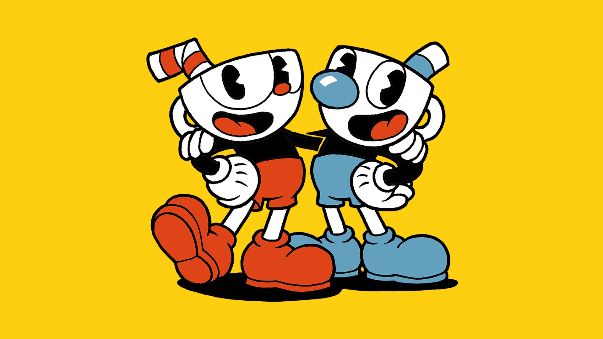
Cuphead isn't like anything else out there and for good reason. Created by a team of passionately-inexperienced game makers, Cuphead pays homage to the likes of Gunstar Heroes, Contra 3, and the Thunder Force series, built – quite literally – from scratch, by hand. Heavily inspired by cartoons of the '30s for its look and feel, wherein the visuals and music would be painstakingly created with the same traditional design techniques that defined an era of visual animation and twisted the imaginations of a generation. To achieve this, every frame of Cuphead would have to be a traditionally hand-drawn animation cel, every action looped over meticulously-painted watercolour backgrounds. Why did Cuphead miss so many of its deadlines? I'm betting that you're beginning to get an idea.
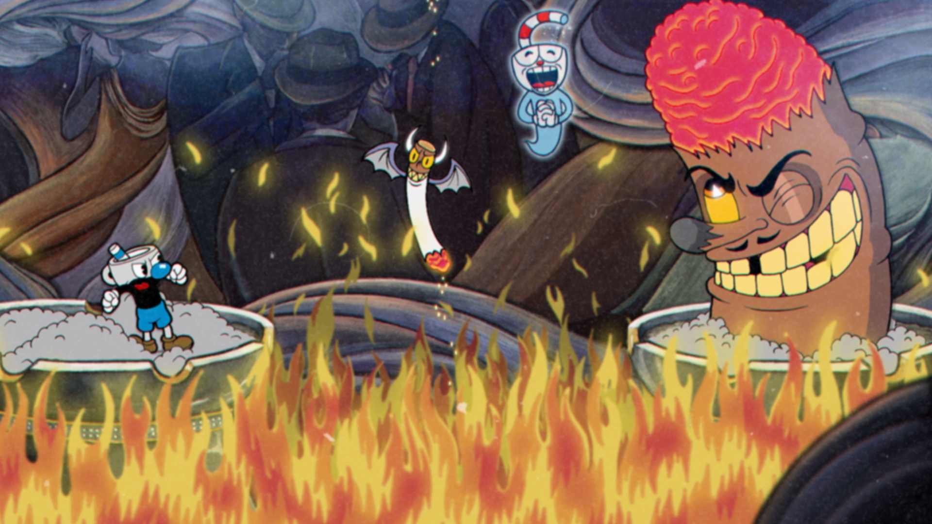
"It was definitely a labour of love, and a lot of paper"
Marija Moldenhauer, Studio MDHR
But Studio MDHR persisted, through the difficulties, the delays, and the reams and reams of paper necessary to bring Cuphead to life. It is a true project of passion, driven by an entrenched creative vision and a labour-intensive approach to production, but the end result is as unforgettable as it is visually disarming. For Studio MDHR, it was going to do Cuphead right or it wasn't going to do it at all. "We kind of went all-in on this," laughs executive producer and inking artist Marija Moldenhauer. "We were more excited than worried about making this leap of faith. We figured that this was our opportunity, our one shot to make a game that we loved – that we were proud of. We didn't want to be in our retirement years wondering what could have been."
When you see Cuphead in motion, when you learn about the process and expertise behind its transformative '30s art-style and retrograde action, you'll begin to wonder how Studio MDHR ever made it through to the end. But what you will come to understand is the truth in one particular idiom: that the devil truly is in the details.
Method behind the madness
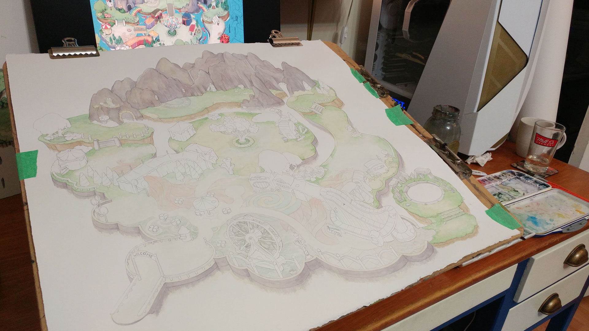
It could take, on average, 25 minutes of work to produce a single frame of Cuphead's gameplay. To give that some context, back in 2015 the Moldenhauer brothers had estimated that Cuphead would feature around 15,000 individually hand-drawn frames when it shipped; years after that estimation was made, long after the game's scope expanded wildly from boss rush to fully-fledged platformer, I'm told that it is in fact closer to 50,000. "It's pretty wild, right?" Chad would say, his rampant enthusiasm driving the art direction forward throughout development.
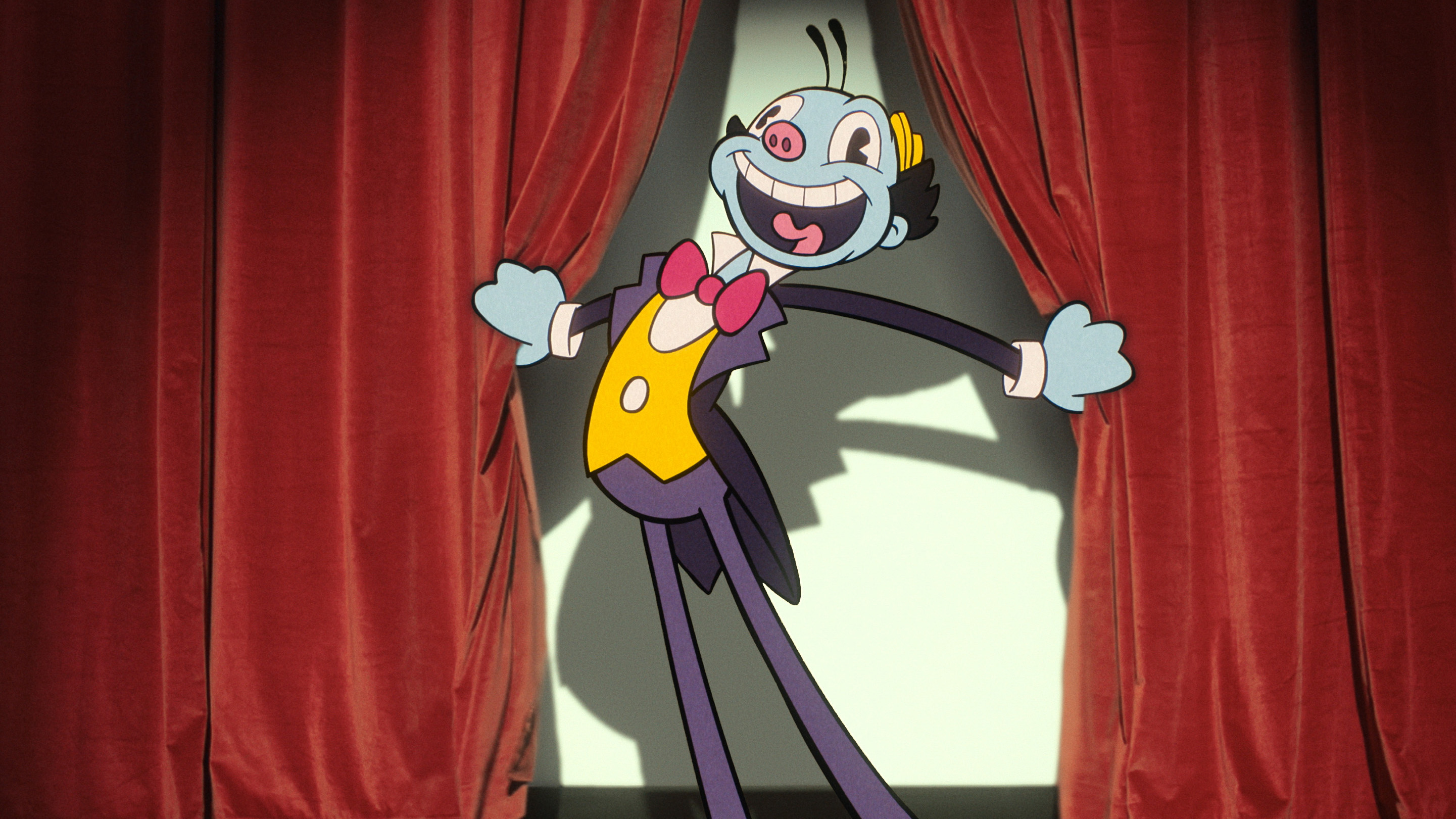
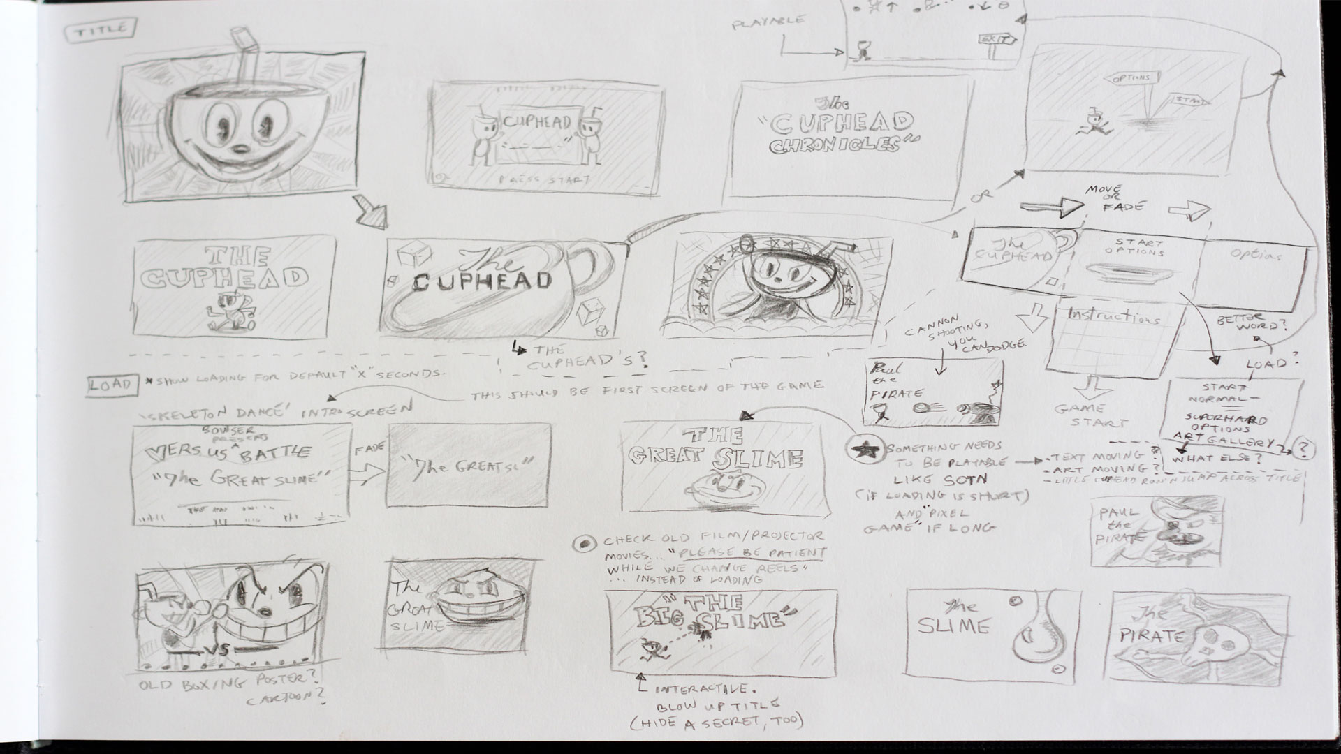
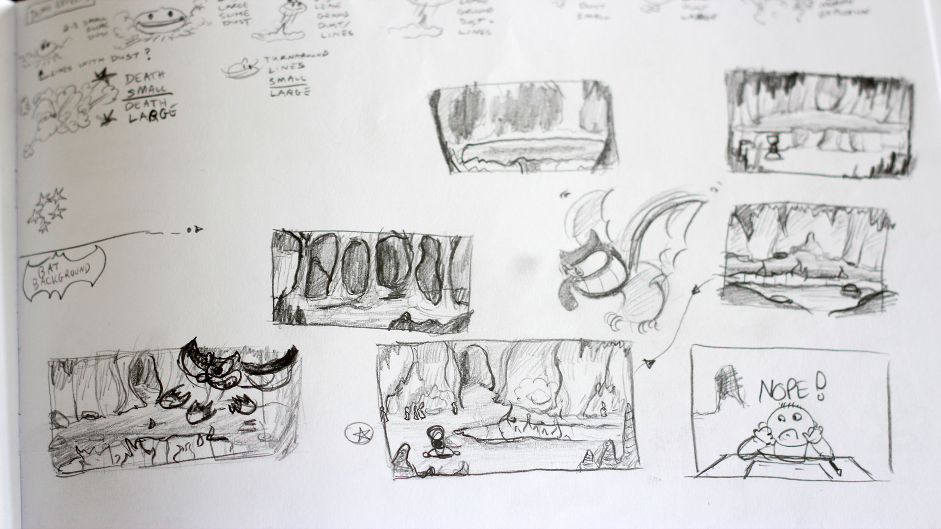
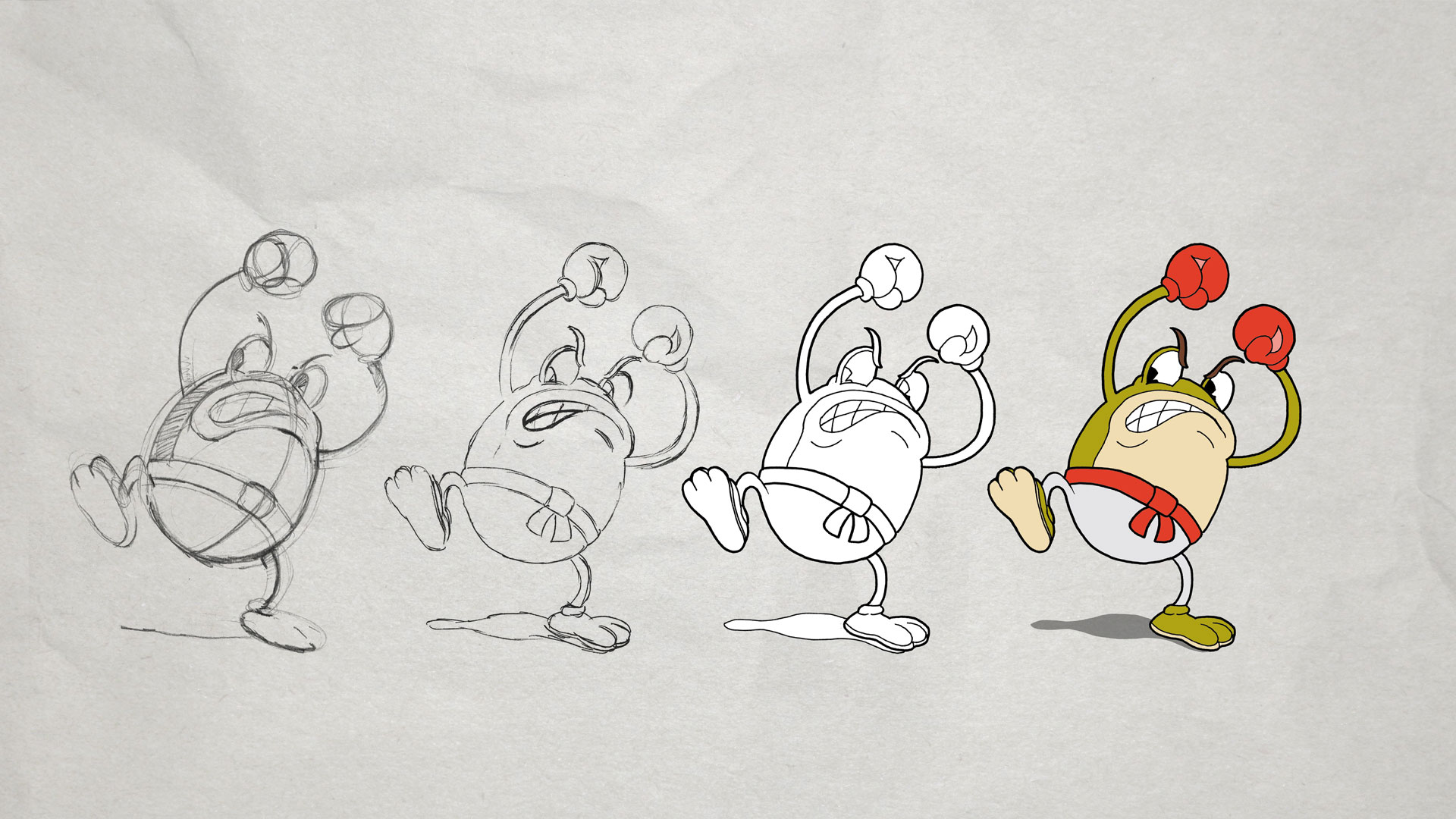
But the reality is that this process is painstaking. Cuphead is heavily inspired by vintage Fleischer Studios and Disney hand-drawn animation, by the works of ComiColor, Van Beuren, Columbia Pictures, Copley Pictures and many more. In order to really nail that aesthetic authentically, Studio MDHR would adopt the same production techniques that Fleischer and Disney popularised in the early '30s; every single asset and animation – motion, movement and action – that you see in the game started life as a pencil drawing on a piece of paper.
Levels, characters, bosses, attacks and their animations, everything, is done by hand. If you were to see a maniacal carrot bearing hammers for hands spinning 360, for example, that isn't a 3D image being spun artificially in software, that's individual frames for each stage of the rotation – each of them needs to be individually drawn, inked, and coloured before being inserted into the game for that animation to be constructed and, eventually, played. This is not how video games are traditionally made; this isn't even how cartoons are made anymore. There's a somewhat disruptive, anarchistic feel to the development of Cuphead. "It's definitely been a labour of love," Marija laughs, an understatement if I've ever heard one, adding, "oh, and a lot of paper."
Sign up to the GamesRadar+ Newsletter
Weekly digests, tales from the communities you love, and more
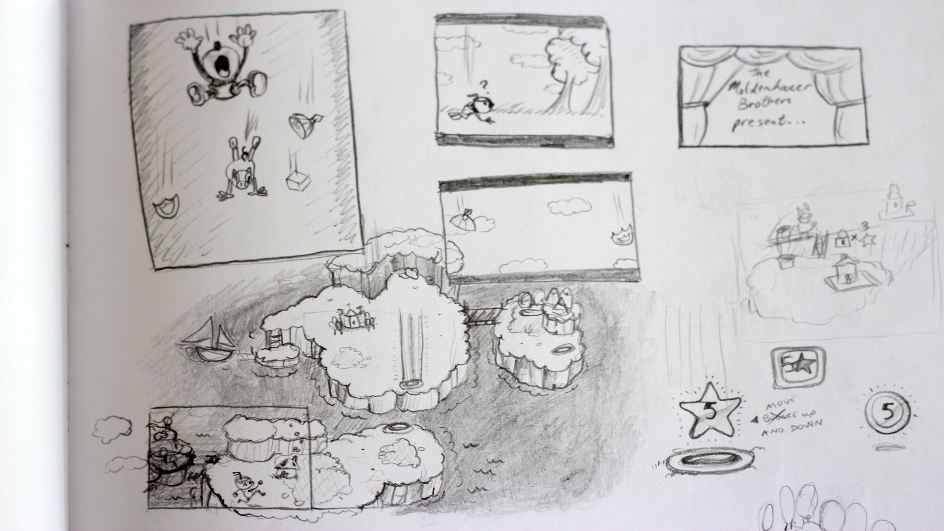
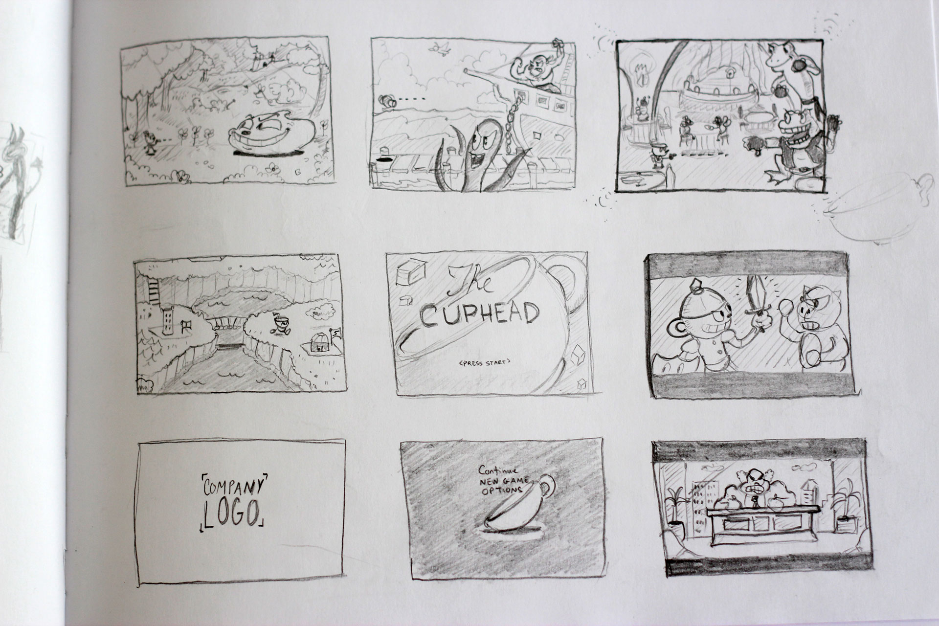
"We said 'all right, let's go all in! Let's go big or go home"
Marija Moldenhauer, Studio MDHR
"We just wanted to make a game that we loved, that we could be proud of. We never wanted to submit to the desire to just rush it, to do the work quickly to get Cuphead out there," she continues, going on to note that some attacks could involve upwards of 30 frames of animation to execute. Which, given the speed of the moment-to-moment play and the rapid pace that the screen will typically fill with all manner of projectiles, is pretty wild. "If there is an attack in the game that is fully animated but it isn't fluid or it doesn't fit well it will get scrapped and we will start over."
Complicating matters further is the way in which Cuphead deals with framerate. Studio MDHR splits the rate in which the game's animations actively play (24 frames per second, the speed of traditional film and era-appropriate cartoons) from the actual framerate that the game runs and plays in (60 frames per second, to ensure smooth, fluid and precise action). "In wanting to remain as authentic as possible to how they did things in the '30s we thought it was really important to be animating at 24 frames per second. So, for every one second there will be 24 individually-drawn frames, and they would just loop within that to make it 60 frames per second," she says, which is how Cuphead is able to get that strange, unhinged, almost David Lynchian-vibe to its movements. Most modern games will feature animation loops, but AAA studios do their best to hide them, Cuphead does the opposite, revelling in the chaos that such a combination creates. It's a truly impressive work of art; complex and delivered with care, in every aspect of its very being.
Performance Orientated
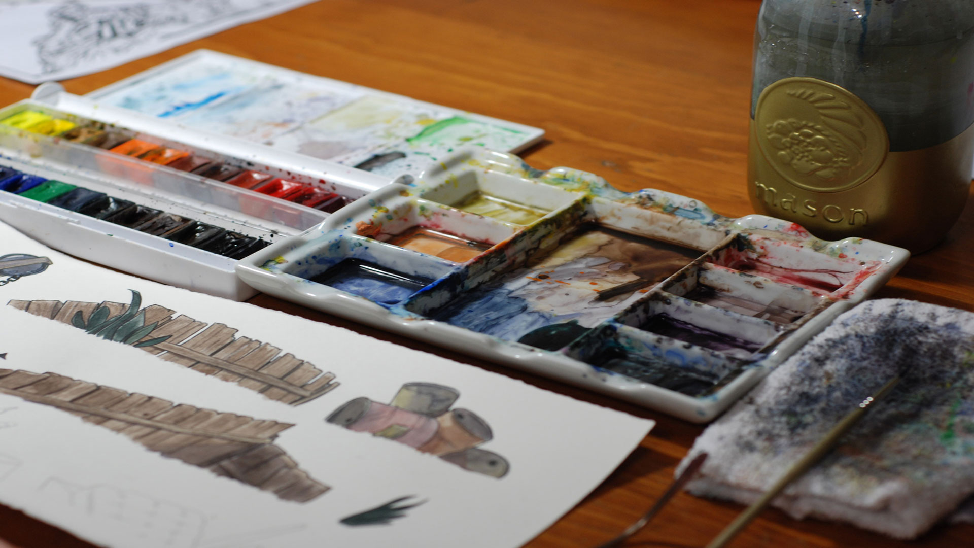
Marija is responsible, not only for production, but also for inking and cleaning up close to every single art asset you are likely to see in Cuphead. The team only had five full-time animators, one background artist and one digital painter; the assets in Cuphead are scanned in digitally once they have been drawn and inked to then be coloured in Photoshop, and that's the one and only modern conceit the team has had to make in the interest of actually ever getting Cuphead finished – the process of inking onto transparent cells and painting directly onto the back of the glass is pretty messy and very expensive, and the last thing the studio needed was any more complications to its design process.
But the results are immediately impressive. Cuphead has, even as the team has steadily grown over the years, still had the same ethos at the heart of it – the same devotion to sticking as close to a historical form of animation as humanly viable. This isn't something you can quickly jump onto Google and learn in a few afternoons either, it's a process that needs to be devoutly studied to gain a true understanding of the artistry and skill behind it. And that has ensured that expansion was never going to be easy, especially as the scope of the project grew in size and complexity.
"One of the unique features of our company is that we don't have a central office. Everybody on our team is located remotely and the main reason for that is because this [style of 2D animation] is a dying art," confirms Marija who hopes – along with the rest of the team – that Cuphead can contribute to keeping the style alive for another generation to study and enjoy. "We were not able to find animators who were classically trained, who still animate using a pencil and paper, this way locally to where we are based. So we had to kind of expand our horizon and our vision in trying to find people across North America. We have people out of San Francisco, LA, from DC, Toronto, New York... we really had to hunt for people that still do that type of animation."
This is just one of the reasons why Cuphead exists as such an anomaly. Why nobody attempted to swoop in and copy its style over its many years of development. But, like Marija says, there's a huge amount of love being poured into this project. "One of the biggest factors that might veer [other developers] off of this path is because of the amount of work that goes into it. Every single person on our team put in more than a full-time job – much, much more. I've said it before, but it really is a labour of love; you have to be passionate about it to do this day in and day out, and for the amount of hours and work ethic that goes into."
Strange designs
"We basically started with pens, pencils, and a sketchbook. We would watch hours and hours of cartoons; there are two specific ones that we do want to call out as being the major influences that inspired Cuphead, and they are Bimbo's Initiation and Swing You Sinners," says Marija, explaining that the Fleischer Studios' work still resonates to this day, a force of creative ingenuity and impossibly crazy design. "We just watched hours upon hours, and endless hours, of those cartoons. Taking screenshots and analysing the line work, analysing the pen weights and the ink weights, it's all things like that for the initial research... and then we took all of that knowledge to the drawing board."
Walt Disney's Silly Symphony and Max Fleischer's Betty Boop are the clearest works that have defined what Cuphead has become. Those shows, and their associated spin-offs, are a rhythmic descent into absolute psychedelia – and this was years before LSD was first synthesised. The hallucinogenic quality, ferocious surrealism and morally unhinged nature to '30s cartoons was born from a desire to do, well, just about anything the creators wanted.
This was the majesty of the pre-Hays Code era of production – the Hays Code, which became strictly enforced in 1934, limited the freedoms studios had in their works in an effort to make cartoons more kid-friendly and socially acceptable. Before the code censored the genius of these works, it was a time where everything and anything was possible; anything could happen in a '30s cartoon, and the same can be said of Cuphead. It's the unexpected nature to the characters that you encounter, where literally any object in the game can transform into some otherworldly manifestation of itself, that means Cuphead can reinvent itself in each and every one of its scenarios.
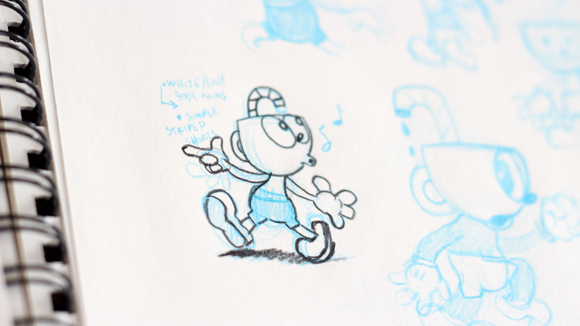
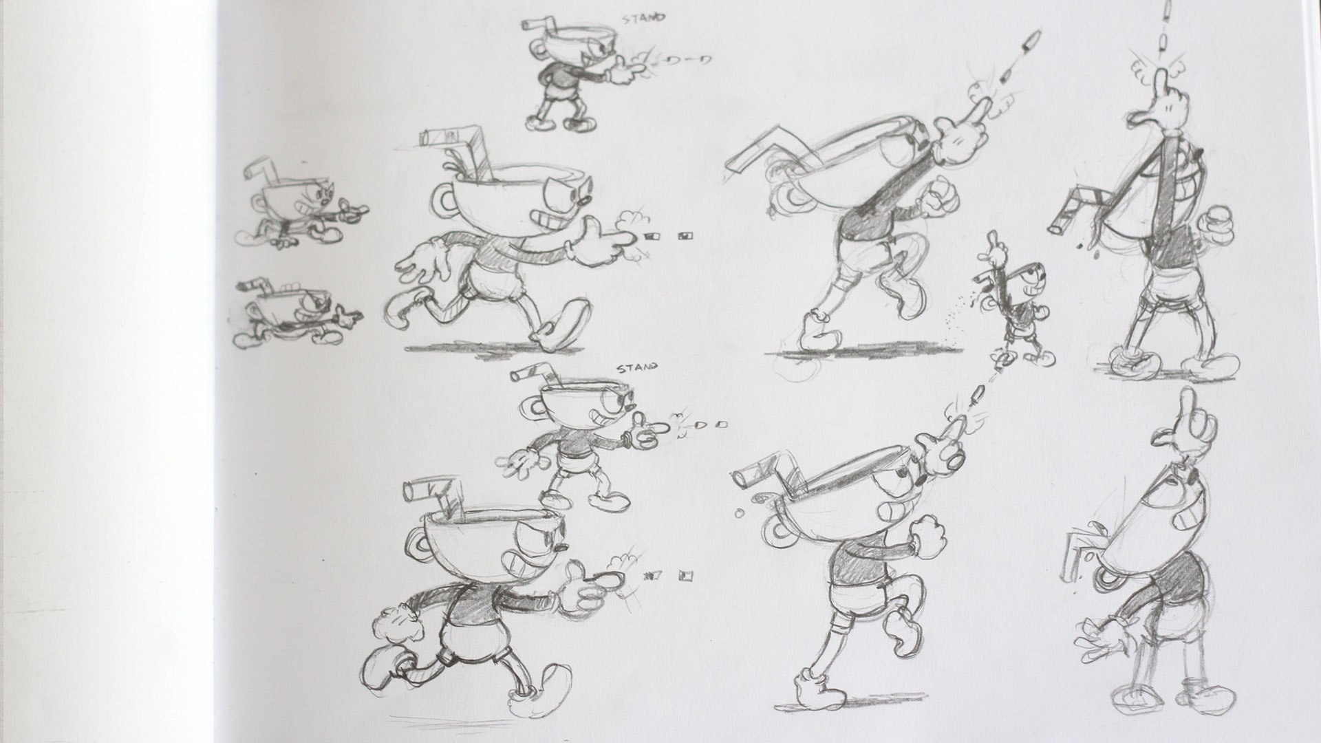
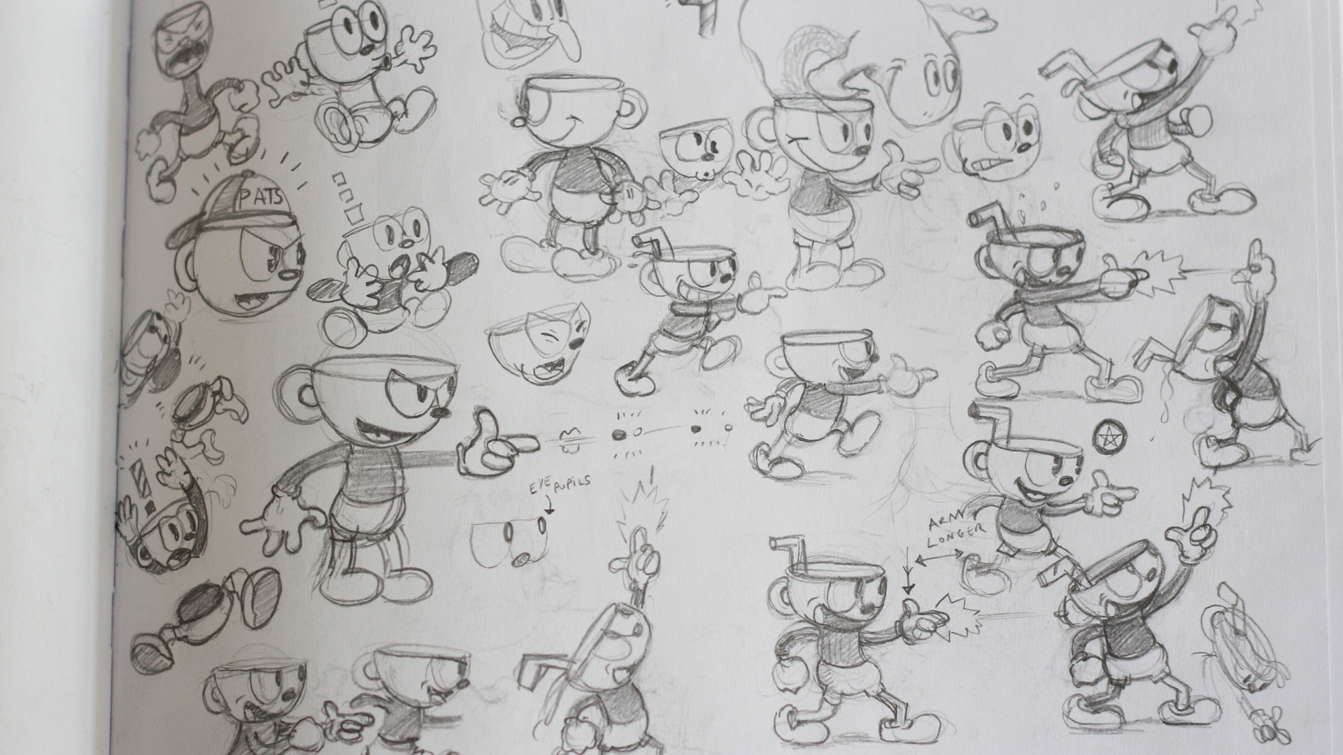
"For us, it was all about staying true to the era, to what cartoons were like in the pre-Hays era, where the rule was: the creepier the better"
Marija Moldenhauer, Studio MDHR
"For us, it was all about staying true to the era, to what cartoons were like in the pre-Hays era, where the rule was: the creepier the better," Marija says, noting that this didn't just apply to the sort of off-kilter bosses and characters that you can see in the game, but even down to the way in which they were designed. "That eerie feel, the surrealistic approach... We studied a lot, and researched a lot, and really tried to stay authentic to that era of animation. For example, like, Rubber Hosing. In a lot of the characters, movements and bosses you'll see that there are no joints and bones, and we don't constrict ourselves to using physical anatomy when the character moves, and there is a lot less care for structure, so it lends itself to being a lot more creative in terms of what the characters and bosses are able to do.
"Many people that I talk to frequently say 'it must be so hard to do a game in this style', which it is, it's painstaking, to physically be doing drawing all day long. But from a creative lens it's actually a lot easier. There are no rules. We aren't constrained to realism. But we can be as out there as we want to be and as possible; the weirder, the quirkier, the better... there are just no boundaries and that's nice, to have that creative freedom."
Crafting Play
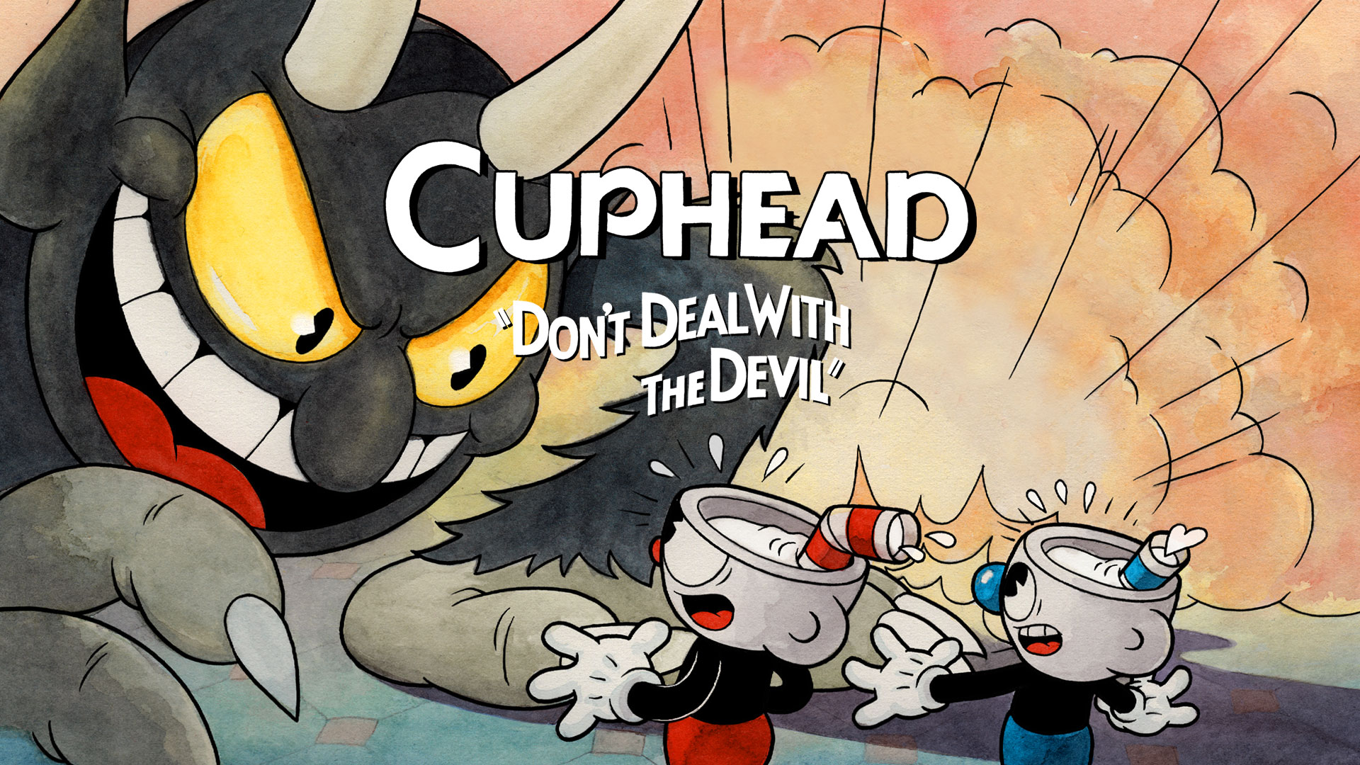
Cuphead changed dramatically over the years of its development. But certain elements had always been consistent – the art and the technique behind it, for example – but that doesn't mean it hasn't been subjected to new creative challenges at every step on the long road to release. Cuphead was originally envisioned as a boss rush game, featuring 'eight or nine' starring enemies. A proving ground of sorts, a way to see whether the appetite was out there for something more – it would have to do; back in 2012 the studio didn't have the time or resources to create anything bigger.
Studio MDHR began with three people and has swollen to include over 14 full-time staff stretched across North America. But at its genesis, work on Cuphead was completed in fleeting moments of spare time found between other work and life commitments. It was the reaction to the E3 2015 showing that sparked a change in the team, pushing the Moldenhauer brothers to take Cuphead to the next level. "We quit our jobs, maxed out every loan possible, and partnered up with Microsoft. This allowed us to expand the team and produce a larger game," Chad Moldenhauer says of Cuphead's origins.
Switching engine from the XNA framework to Unity early in development was one thing, creating all of the assets necessary to support a larger game? That brought its own unique set of challenges to the table. "As illustrated by the delays, the biggest challenge for us was time. The scope significantly increased and that was directly linked with time. In that, we needed more of it," Marija laughs once again, eager to impress upon us just how time consuming the design of Cuphead has been. "We needed more of it to fulfil our vision and make it exactly what we wanted it to be without sacrificing integrity or style. You know, we said, 'all right, let's go all in – let's go big or go home'. We started going full-time on this to make the game into exactly what our vision was for it."
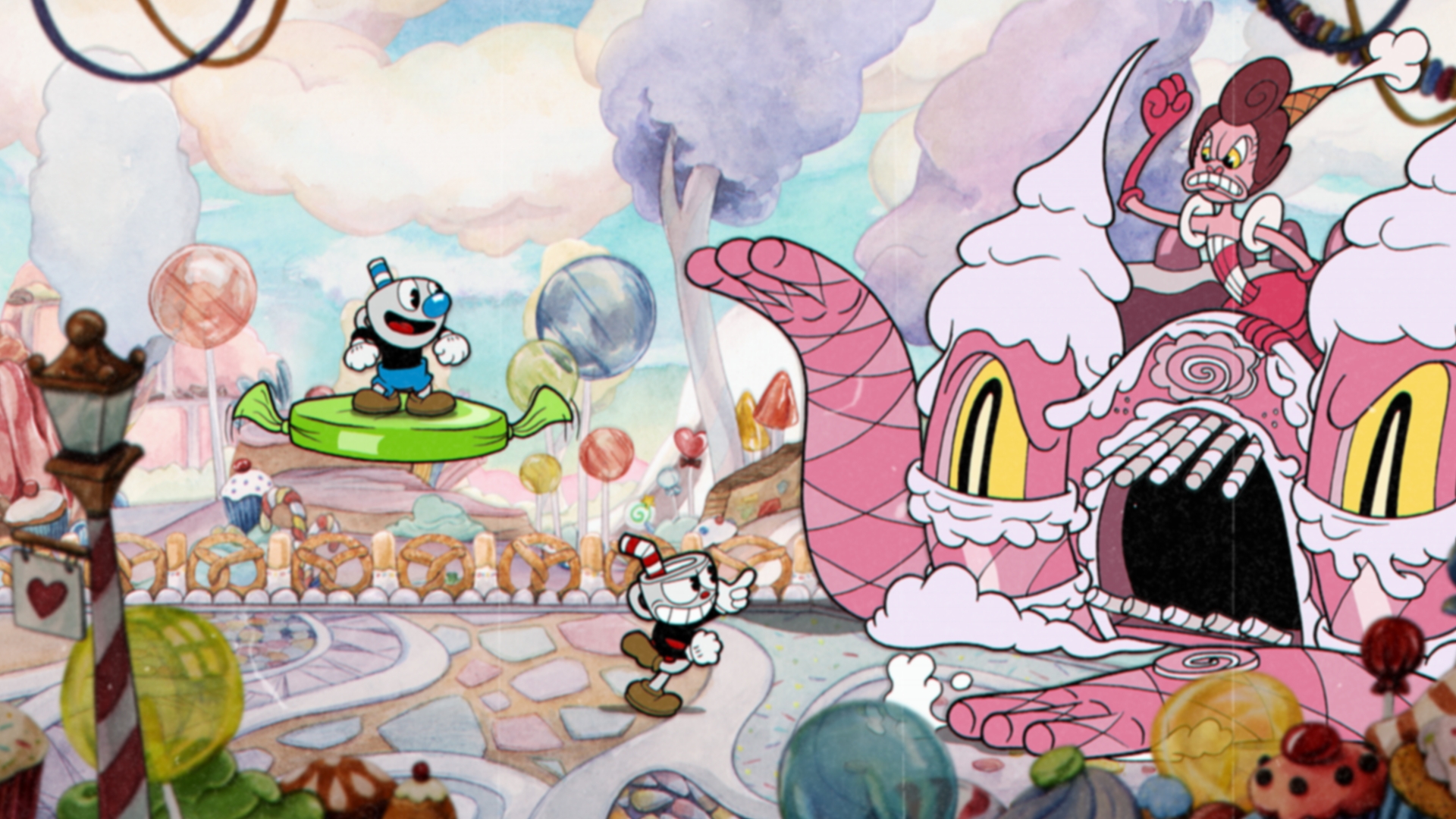
The Cuphead that launched on 29 September, 2017 on Xbox One – and is launching 29 July, 2020 for PS4 – features triple the amount of bosses and full platforming sections compared to the version of the game that existed back in 2012, not to mention multiple overworlds that were introduced to replace the simple boss select screen the game once had. While Cuphead has clearly been driven by its artistic design, its core play was also approached with a similar passion and dedication to getting the details right. Four designers focused on fine-tuning small details – such as hit-boxes, weapon balancing, input response times and screen movements – and the result is a challenging run and gunner built with an unwavering dedication to authenticity and reverence for the past.
For the studio, it's been worth all of the time, passion, and paper cuts it would take to deliver such an individual experience. With over 5 million copies sold, and The Delicious Last Course DLC in the works, the difficult development of Cuphead has proven itself to be a story of success. Still, for better or for worse, there's nothing out there like Cuphead and, given the amount of work that has gone into it, we imagine there won't ever be one like it again.
Want more Cuphead in your life? We recently got a new look at the Netflix's The Cuphead Show, and we found out that Cuphead is now available for PS4!

Josh West is the Editor-in-Chief of GamesRadar+. He has over 15 years experience in online and print journalism, and holds a BA (Hons) in Journalism and Feature Writing. Prior to starting his current position, Josh has served as GR+'s Features Editor and Deputy Editor of games™ magazine, and has freelanced for numerous publications including 3D Artist, Edge magazine, iCreate, Metal Hammer, Play, Retro Gamer, and SFX. Additionally, he has appeared on the BBC and ITV to provide expert comment, written for Scholastic books, edited a book for Hachette, and worked as the Assistant Producer of the Future Games Show. In his spare time, Josh likes to play bass guitar and video games. Years ago, he was in a few movies and TV shows that you've definitely seen but will never be able to spot him in.
