Very Bad Twilight Fan Art
11 Mini-Masterpieces Of Vom-Inducing Vamp-Worship
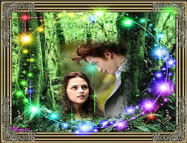
Sparkling Vampires
The power of Paintshop helps to describe some of sulky Edward’s allure: in Twilight , vampires literally sparkle.
In this case, like a low-rent Santa’s grotto about to spark into a disfiguring electrical fire at any second.
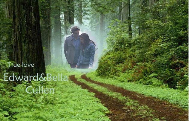
True Love Doesn't Have To Try...
Seriously now. These are your romantic icons, and what do you do?
Chop them at the knee, spray them with mist and dump them in a forest.
Shame on you, anonymous Livejournal user. Shame on you.
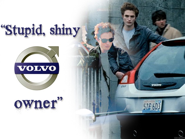
Who's Gonna Drive You Home?
That caption’s a quote from the film. Really.
Vampires are generally gloomy bastards and right in the heart of the target market for a spot of classical Scandinavian design.
So it probably makes sense that Edward drives a Volvo and not something fast, dark and dangerous and liable to frighten the tweens.
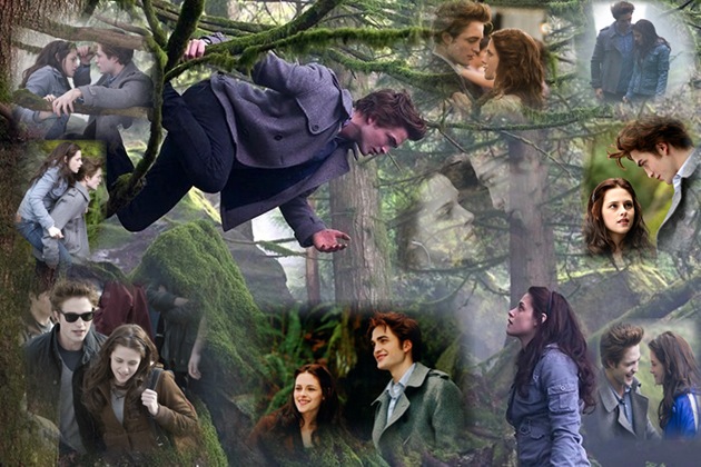
In Dreams...
This fly’s-eye-view of the movie suggests a yearning heart...
“Sometimes, when I close my eyes and try to sleep, this is what I see. Bella! Edward! Edward! Bella!”
Because every girl wants a boyfriend who can climb trees horizontally, right?
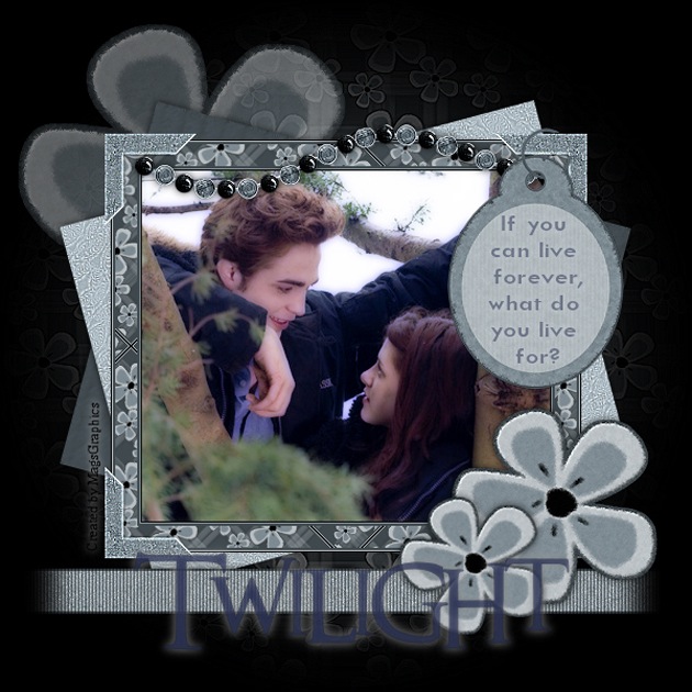
If You Can Live Forever, What Do You Live For?
It’s the question that’s tormented immortals since, uh, forever, but Twilight fanart has the answer...
You live for the unmeasurable joy of slapping shoddy clip-art frames around pictures of pretty young death and his simpering maiden, of course!
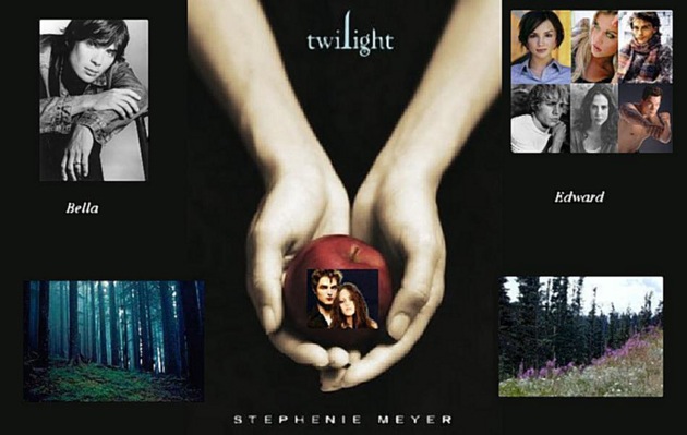
Symbolism!
Author Stephanie Meyer says the apple on the cover of Twilight symbolises temptation and lust, and this artist totally gets that.
They demonstrate their getting it-ness by pasting a picture of the tempted, lustful couple onto an actual apple.
Do you see?
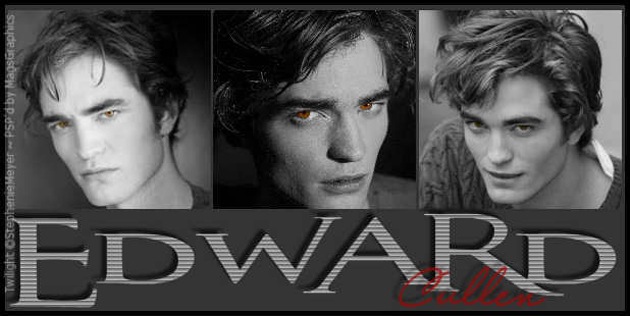
Look At His Face... OMG!!! He's Gorgeous!!!!!
This is what it’s all about. Shove your damsel in distress and stick your prom: we want Edward, Edward, Edward in sexy greyscale with just a splash - ooh! - of dangerous blood red.
Who’d have thought you could be so crushingly crass with such a limited palette?
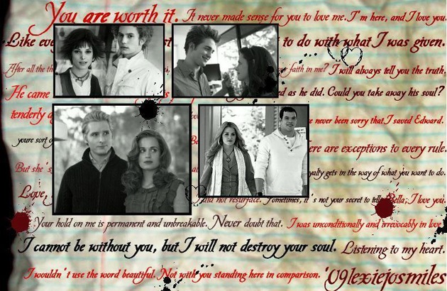
Ye Olde Teene Romance
Did you know the Vatican website is designed to look and navigate like an ancient scroll?
Because everyone knows that the really important stuff – God, death, Robert Pattinson being super-hot – needs a lousy script font and a blob of wax.
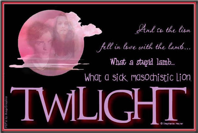
Self-Awareness For Bloodsuckers
Our gallery so far might suggest a crippling lack of self-knowledge, but this shows that the kids totally get the protagonists’ “sick” and “stupid” trans-mortality love.
Flinging a job-lot of ugly typefaces at the quote really brings out the pathos. Now to drag them over to the moon... Aaand… finished.
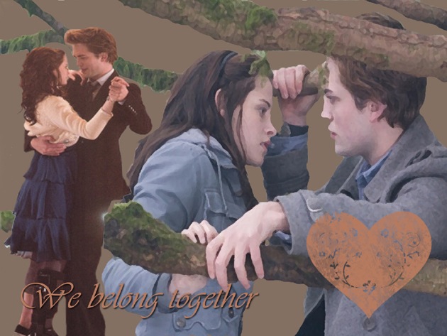
When Fan-Art Meets Real Art
Bella and Edward reconceived as a Blackpool pier couple, their love recorded for the ages in the form of a 50p automated artist watercolour printout.
Later, he pukes on her chips and she rip the portrait to tiny bits and throws it in the sea.
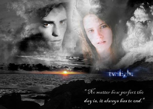
And So To Bed...
It’s true, you know. No matter how perfect the day, it always does have to end.
And as the sun goes down, the romantic leads’ faces will be hoisted into the air like giant pouting hot air balloons.
Because love will do that, see. If it’s true and forever and stuff...

 Join The Community


