The evolution from the XCOM FPS to The Bureau: XCOM Declassified
Evolution
When XCOM was revealed in 2010, it had more in common with BioShock than it did with 1994's UFO Defense. The moody first-person shooter was being made by 2K Marin--the developer behind BioShock 2--and tasked players with investigating a strange alien threat invading rural America in the 1950s. But after its reveal, the developers went silent for a year... until showing it off again as a hybrid first/third-person shooter. Just as before, the reveal was followed by silence, and speculation that the "XCOM shooter" was secretly cancelled.
But it wasn't. On the contrary--2K Marin was hard at work, changing and iterating the shooter, molding it into a different game. The developer's goal was to give gamers a unique XCOM experience, not from the perspective of a commander from the sky, but as an agent on the ground. Eventually, this became The Bureau: XCOM Declassified. What happened during those periods of radio silence between announcements? We sat down with UI Art Lead Pat Guarino, who gave us the answers with an exclusive look at the transition of XCOM to The Bureau.
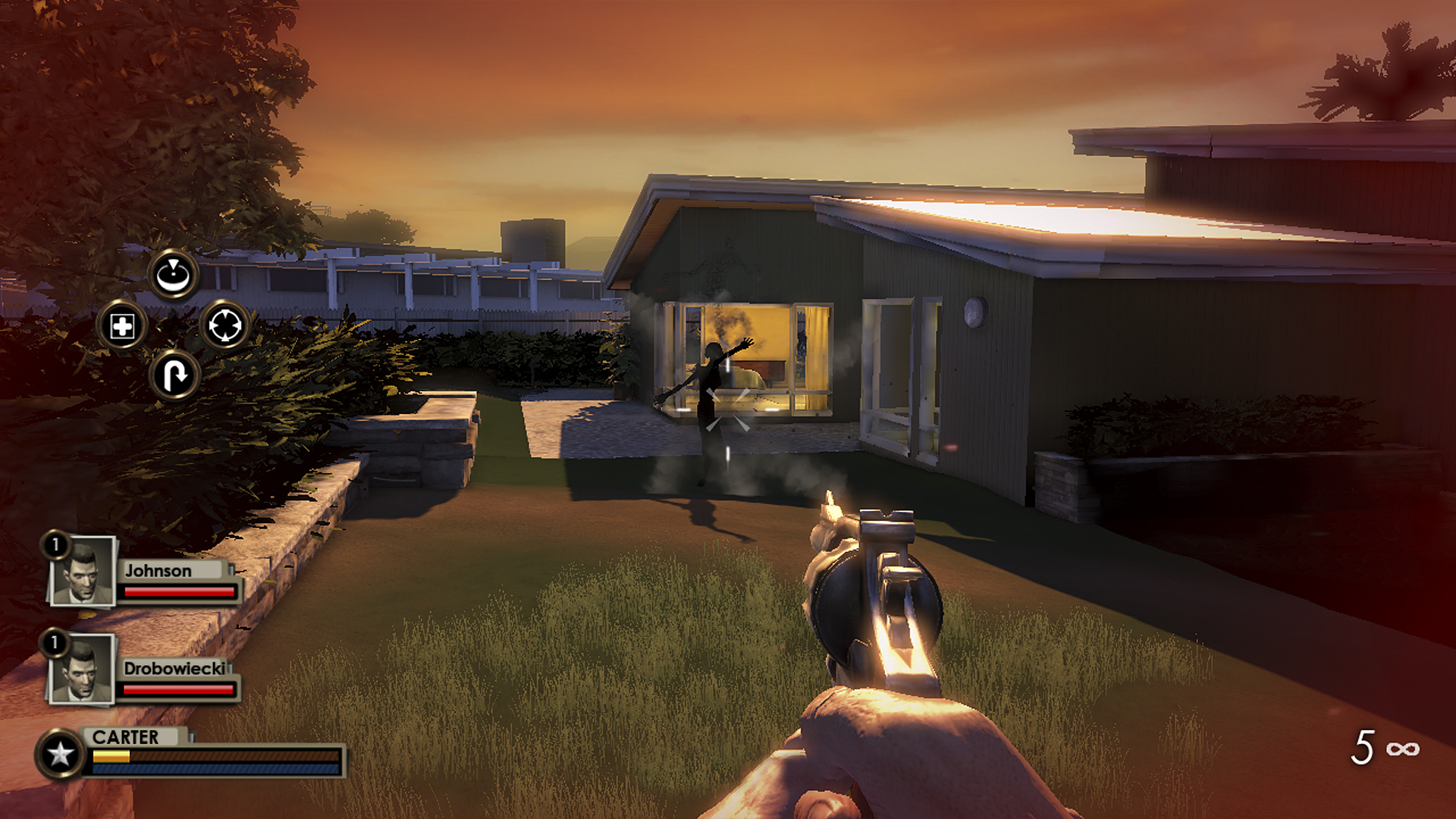
In 2010 it was a first-person shooter
If you've been following The Bureau, you know that it began as the simply named XCOM--the latest attempt to reboot a classic franchise into something that would resonate with modern audiences. This was before Firaxis' XCOM: Enemy Unknown was even announced, mind you, and the tactical franchise hadn't been relevant in a long while. But even in this adolescent state, with a first-person camera angle and a focus on shooting enemies in the face, you could see what the developers were attempting to accomplish.
You'd control Agent Carter in first-person, doing most of the work yourself as your two squadmates (with avatars on the bottom left) tried to stay out of your way. You had basic control of them with the d-pad, as noted by the icon on the left, but Guarino says that they weren't all that useful. You couldn't micromanage them, and to tell them to shoot an enemy you'd have to aim and hit a button; at that point, you could've just shot at it yourself. It was too hectic, and not at all rewarding.
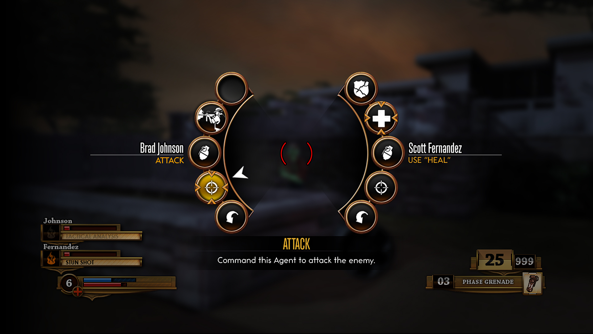
A radial was added to make the commands more useful
Things weren't working in 2011, and the developers began researching new ways to allow the player to feel in control of both themselves and their allies. Introducing: the radial! You'd still be in first-person mode throughout the game, but you'd be able to hit a button and pull up a menu that gave you control of individual agents. These agents were given specific powers and abilities that you could assign as you saw fit.
But there was a problem. While pulling up this menu provided more control, it also forced you to plan too far ahead. If you wanted to tell an ally to throw a grenade at an enemy, you had to target the enemy, pull up the radial, and then assign them to throw it. There was also the issue of the other agents not really feeling present in XCOM--instead, Guarino said that it felt like you simply had "left hand abilities and right hand abilities." Your teammates avoided you, so assigning one to use an ability would result in an attack flying in from the periphery--it was like you had magical abilities that would shoot in from off-screen.
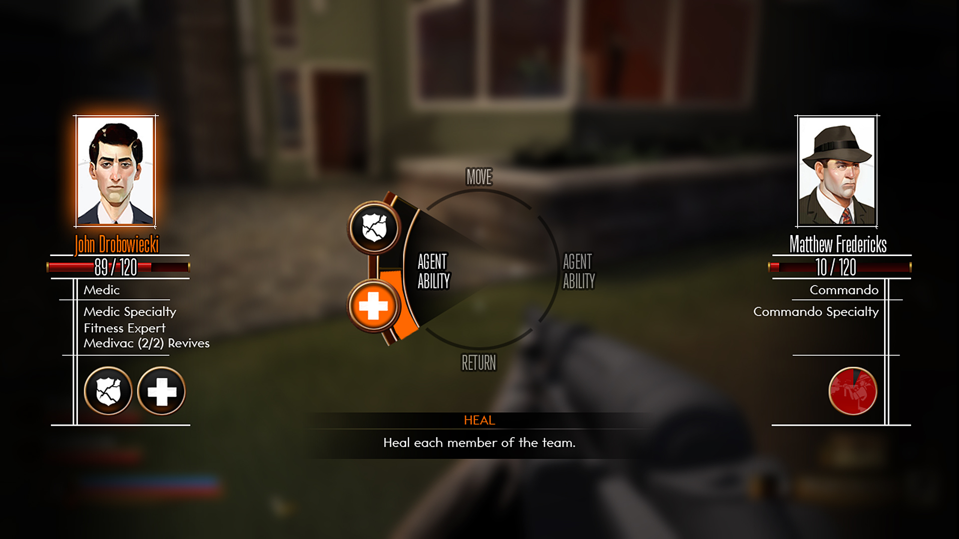
Giving the radial a personality
The first redesign of the radial consolidated abilities and added a human element that players could sympathize with. With the names, faces, and abilities of the agents displayed on the screen, players would know that they had allies, not superpowers. The abilities were also grouped into sections instead of simply being spread around the wheel, cleaning up screen clutter.
But it still wasn't enough. Though you'd feel connected to your teammates, you still had to plan too far ahead to use them. It also didn't really fix the issue of you never interacting with your allies, since seeing a still image isn't really as important as seeing them in the actual world.
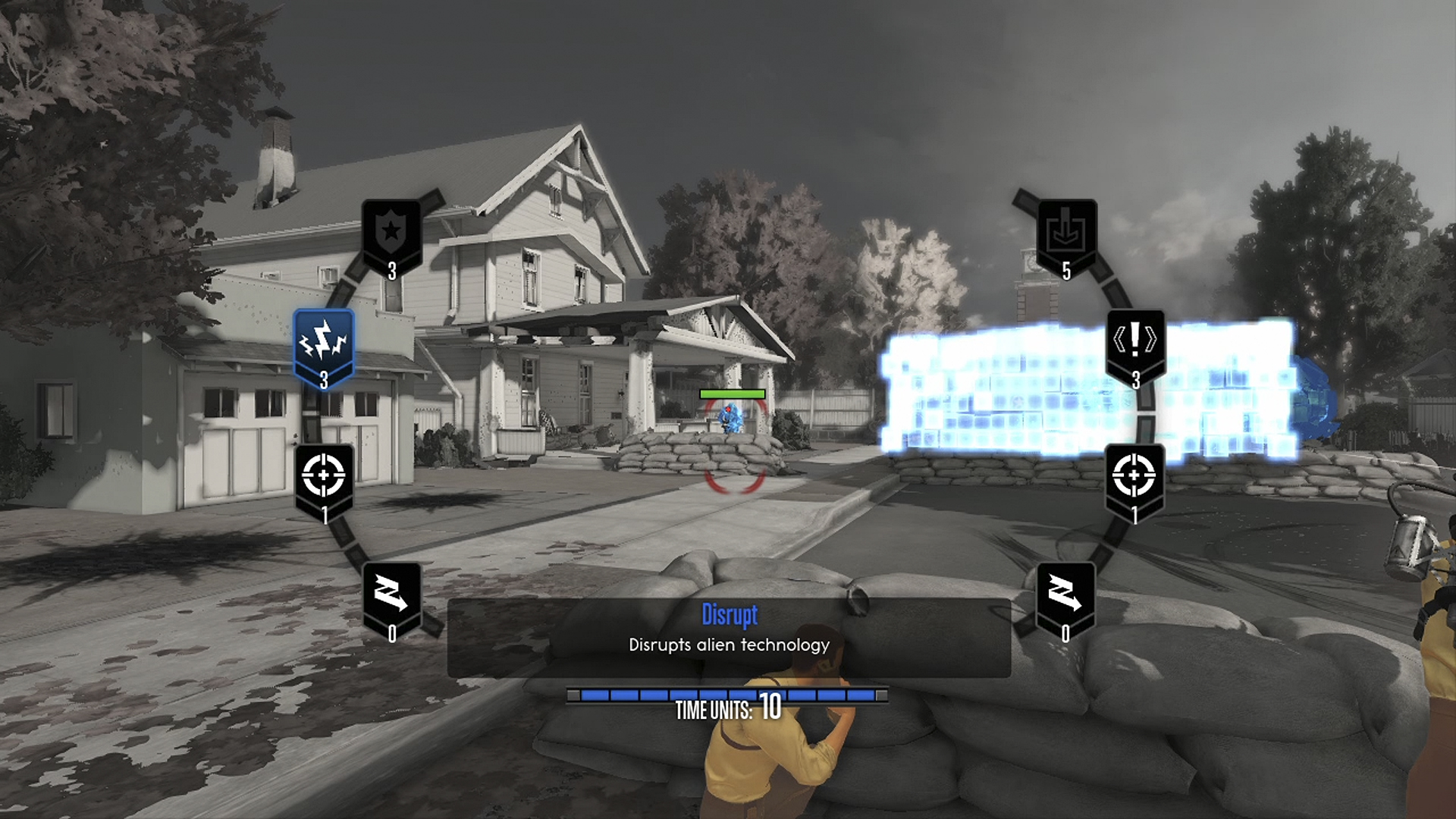
Hybrid first/third-person gameplay and Time Units
XCOM slowly began to evolve into The Bureau in the middle of 2011 with flashes of third-person gameplay. In this iteration, when you'd enter Battle Focus (the name given to the screen where you could assign abilities), you'd transition to a behind-the-back view. Third-person Battle Focus gave you a much better view of the battlefield and your teammates, and let you actually move around to assign skills--fixing many of the issues that plagued the game up until this point.
Time Units were also added, further enhancing the tactical side of XCOM and moving away from the run-and-gun tactics of the 2010 version. Time Units were a shared team resource that worked essentially like a mana pool: All of your agent's abilities would cost Time, meaning you needed to carefully decide when to use certain skills lest you eventually run out. They'd replenish as you fought, but drain as you used Battle Focus to command your units.
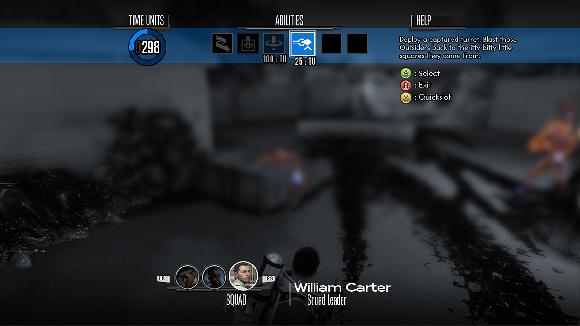
Total third-person comes in 2012
After E3, 2K Marin started to flesh out a lot of the gameplay elements, going back to the drawing board on some concepts that had been with the game for years. The radial was abandoned and replaced with the ability to switch between squadmates when in Battle Focus mode. Being able to change your viewpoint made it easier to mix abilities together, necessitating a larger Time Unit pool to draw from. Carter was given some abilities, too, making him more than just a pair of boots with a rifle.
But the most drastic change came with the total abandonment of first-person. Battle Focus became a larger focus, so it made less sense to randomly have players jump into first-person to take pot shots at aliens. This switch might've moved the game away from the atmospheric, cinematic scenes seen in earlier demos, but it made sense from a gameplay perspective.
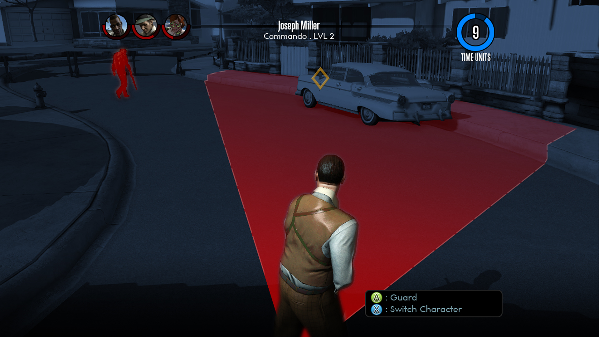
Changing perspective opens the door to new abilities
Up until the switch to third-person, abilities would automatically fire from an agent when the player hit a button. Switching to third-person--and allowing you to swap between characters--solved this. Suddenly, 2K Marin could create new abilities for the agents to use. Agents' abilities would be cone effects, have different ranges, and attack an area of the map.
Positioning also became more important, as you'd need to make sure your agents were in the right spots before attempting to combo a bunch of different abilities. The UI was redesigned once again, removing the large blue bar and trying to further integrate Battle Focus with the regular gameplay.
Late in 2012, things got weird
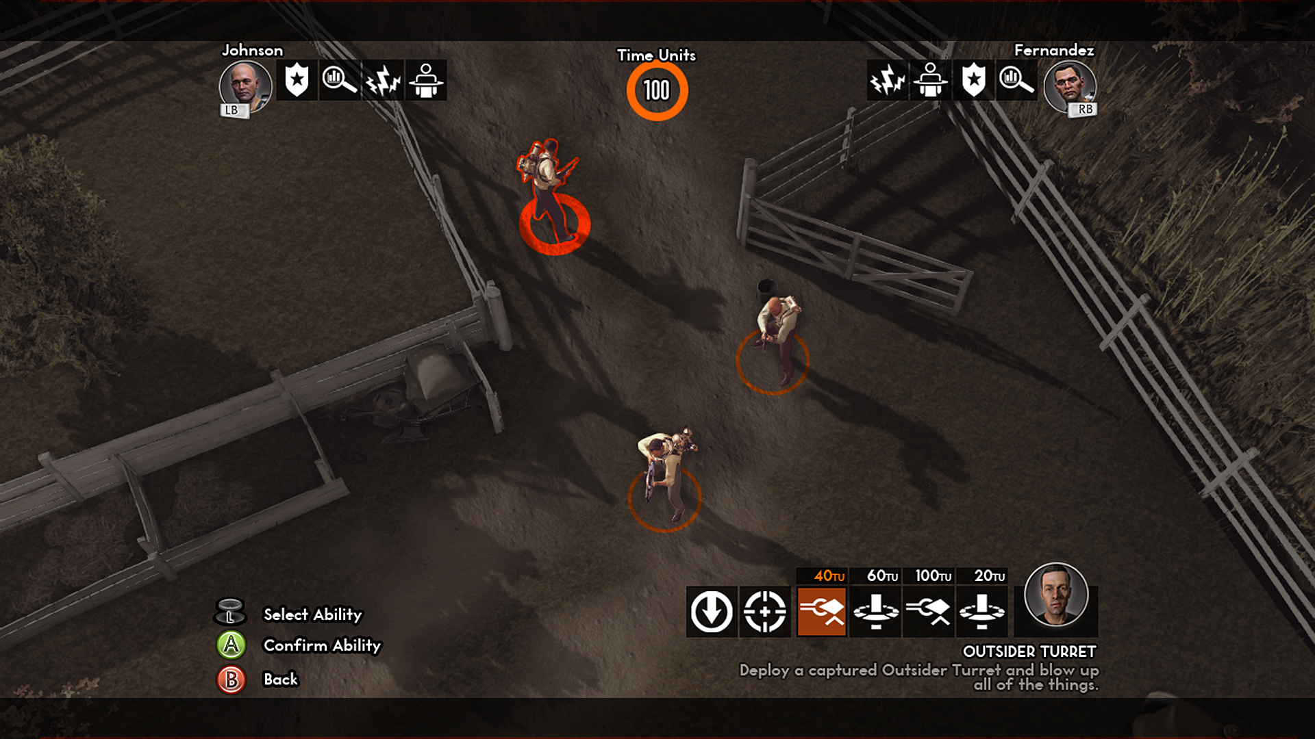
So, yeah, this happened. "We didn't want to say no to any idea just because we hadn't done it yet," Guarino explained. "We wanted to try and figure out what the best solution was for this mode. The left side/right side radial wasn't cutting it any more." The squad leader's information was moved to the bottom of the screen and the other agent's views were moved to the top.
Switching to squadmates would still have you swap to their perspective, but it was all up in the sky. This mode allowed for increased tactical depth, since you'd be able to see more of the world when in Battle Focus. It was a huge departure from the previous game, but it worked well at first.
More top-down experimentation solved many problems
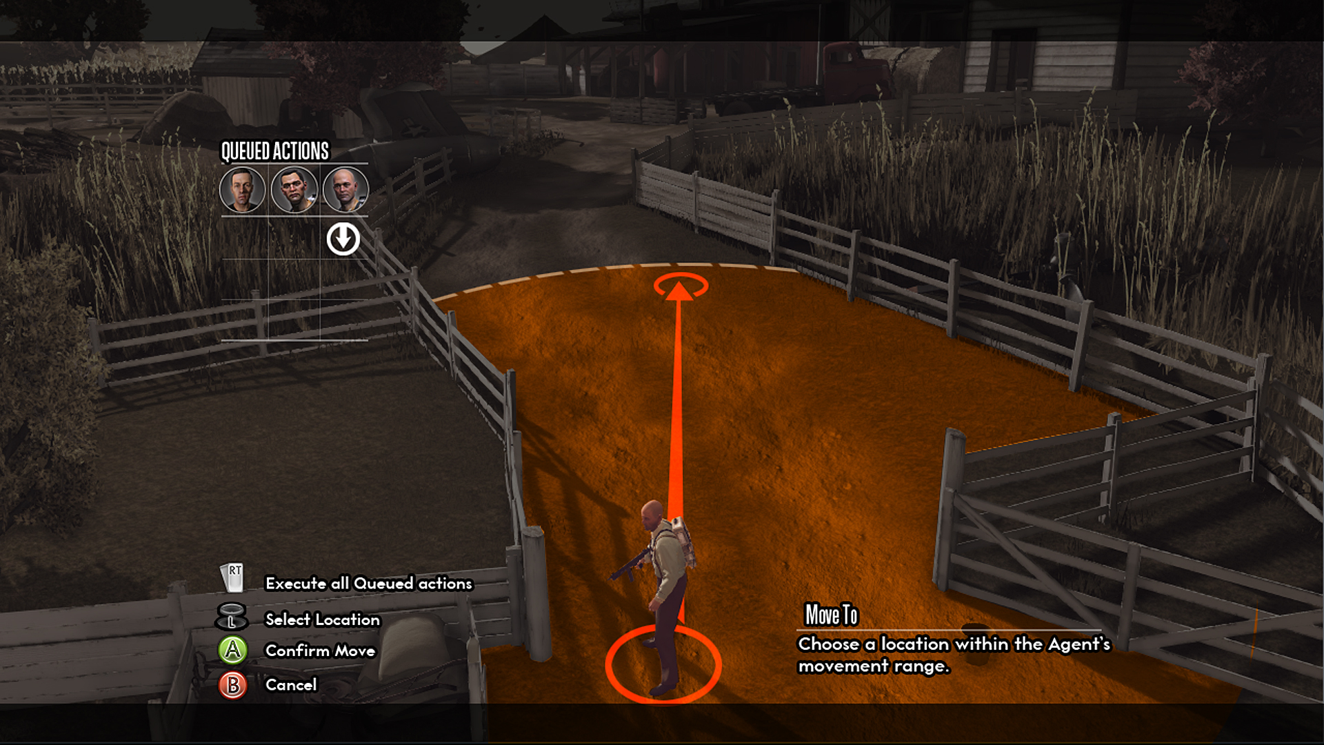
Besides adding tactical depth, the top-down view simplified a lot of the mechanics 2K Marin had struggled with. Moving units around was as simple as pointing from above where you wanted them to go, and queuing up commands was easier than ever. Everything was context-sensitive, too--all you'd need to do is move the reticule around the battlefield and click on stuff. Clicking on an enemy would pull up different attacks; clicking on an agent would display their abilities. Changing between agents didn't matter, since you were in control of an eye in the sky. But as interesting as it was, it also moved far away from the intent of the game. From its conception many years earlier, XCOM--this XCOM--was about Agent Carter giving commands to squadmates from the ground. Suddenly, it was a real-time strategy game with third-person shooting. This switch was also a nightmare for the art team, who had spent several years building objects that were never really meant to be seen from above.
Return of the radial (and third-person)
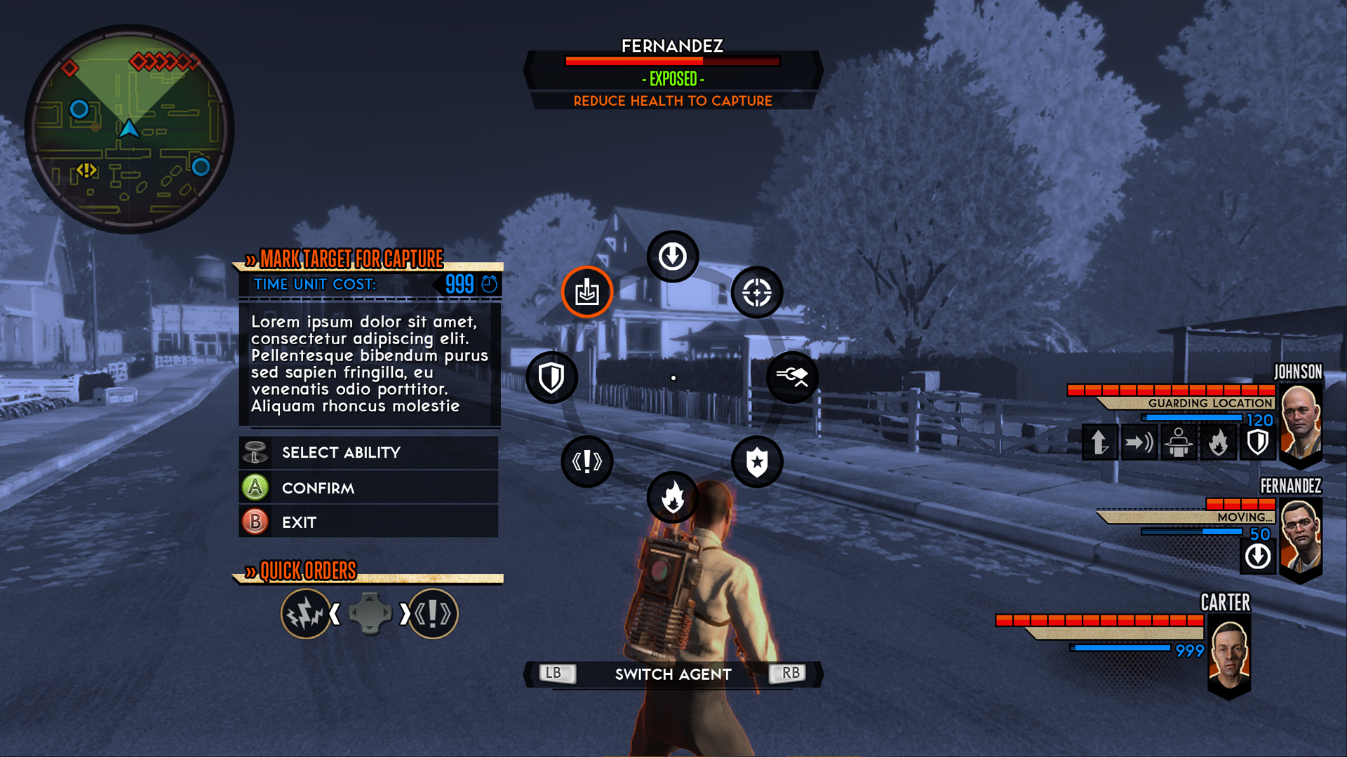
Dreams of a top-down XCOM shooter were dashed near the end of 2012, and the team went back to some of the already proven elements: the radial Battle Focus menu, and the third-person view. Experimenting with other UI options and camera angles taught the developers a lot, and they used these lessons to create a slicker, easier-to-use menu.
Guarino said that, at this point, 2K Marin finally thought it was close to the version that was going to ship. You were controlling one person at a time, but you could switch between agents in Battle Focus mode--and there was a consistent UI, which helped keep everything cohesive. Time Units were still in, but they were no longer a shared resource. This allowed players to build complex plans using multiple abilities and multiple agents.
But there was a problem...
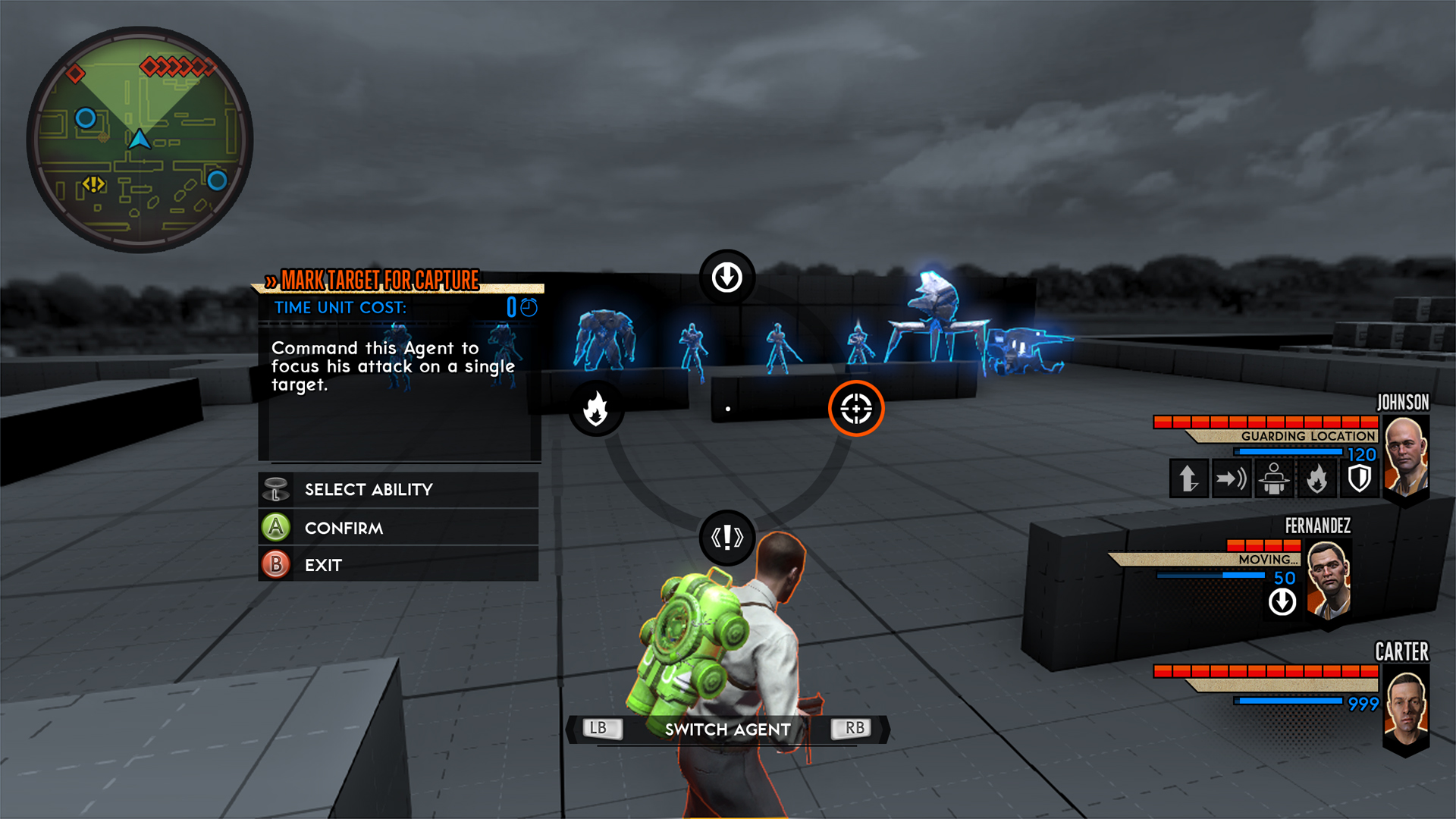
Everything was in place--you could queue up commands, everyone had their own Time Units, you were always seeing your squadmates, and everything was great. Technically. Once the controller was in people's hands, though, 2K Marin noticed a problem: no one was switching between agents, even with the giant "SWITCH AGENT" thing at the bottom of the screen.
According to Guarino, players would enter Battle Focus during a hard battle, use a power, and then watch it happen. They could switch and use another power, but they just wouldn't. The few brave individuals that actually took the time to switch complained that it was too slow and inhibiting--there were too many things buried under too many menus.
For every problem there's a giant, radial solution
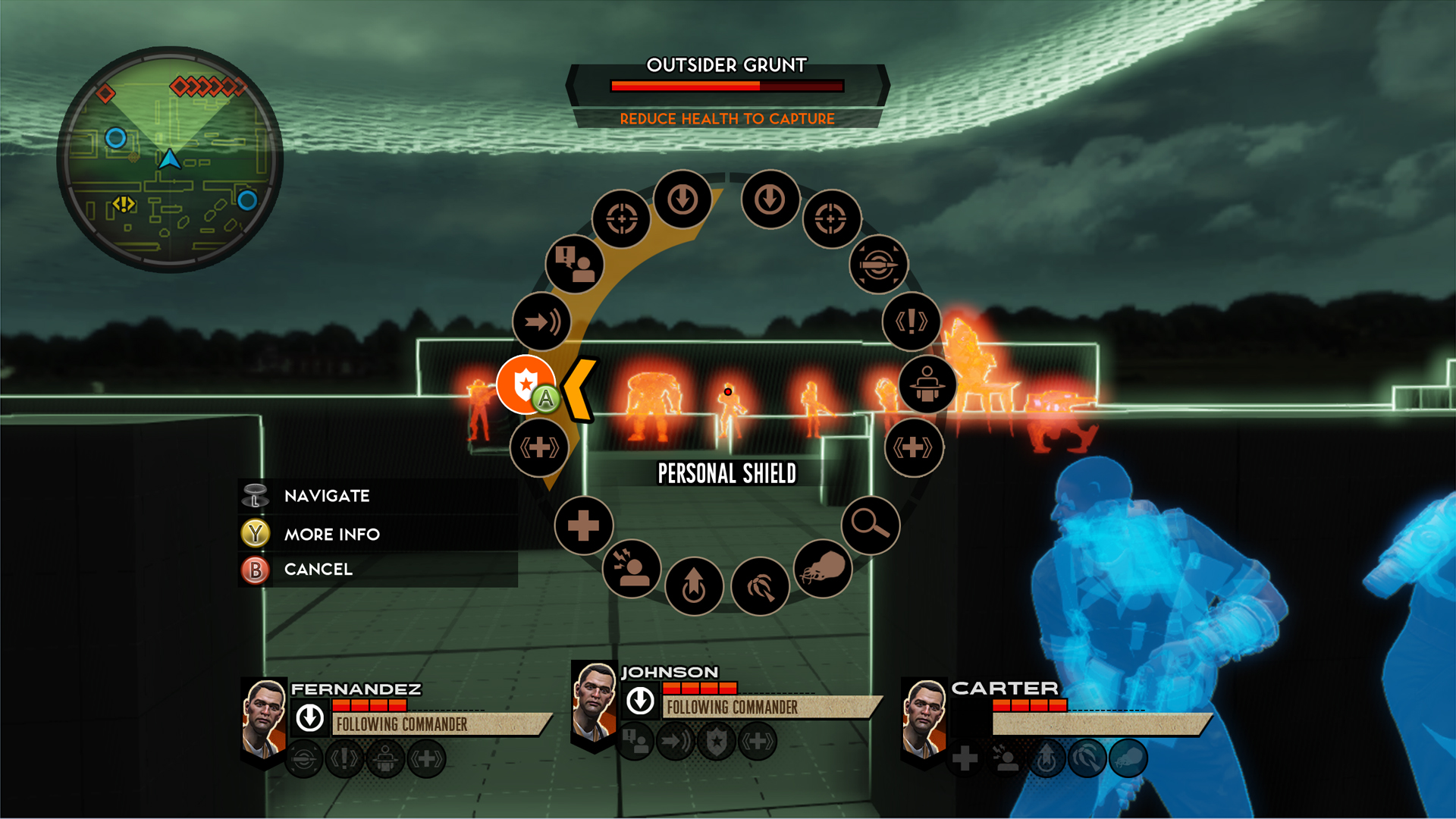
XCOM was almost there, but there were still a few hurdles in the way. At this point, 2K Marin decided to simplify things--Time Units were abandoned entirely, replaced with cooldown timers that accomplished the same goal. You also no longer switched between agents, instead just changing to their perspective when you moved over to their section of the radial menu. Everything was more organic.
But even after some of the UI elements were cleaned up, it was still too cluttered. Every agent could have six abilities by the time they were at level cap, meaning the radial could have 18 abilities at once. This made it hard to select anything with the analog sticks--a basic, but important issue.
The final piece: the incredible shrinking radial
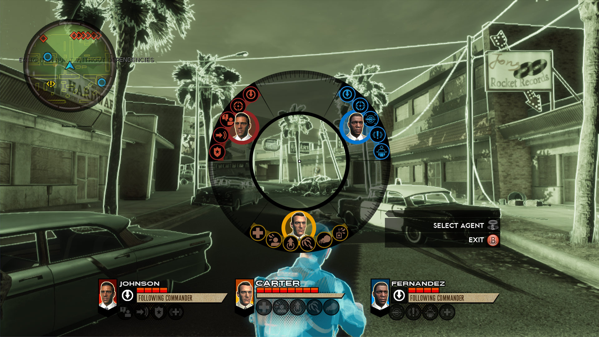
And here's the solution: a radial menu that can grow or shrink depending on where you're focused. Moving the analog stick to the left would expand that section to take up the left half of the wheel, giving you plenty of room to select an ability. Move back to the other side, and the camera would switch as well, going over to the agent you were selecting.
This solved a bunch of problems. With the unified wheel (and the growing and shrinking radial) you could use agent abilities easily, switch between them easily, and see the world from their perspective easily. The pulse of the radial growing even corresponded with the camera moving, adding a nice effect that helped fully sell the experience.
Introducing The Bureau: XCOM Declassified
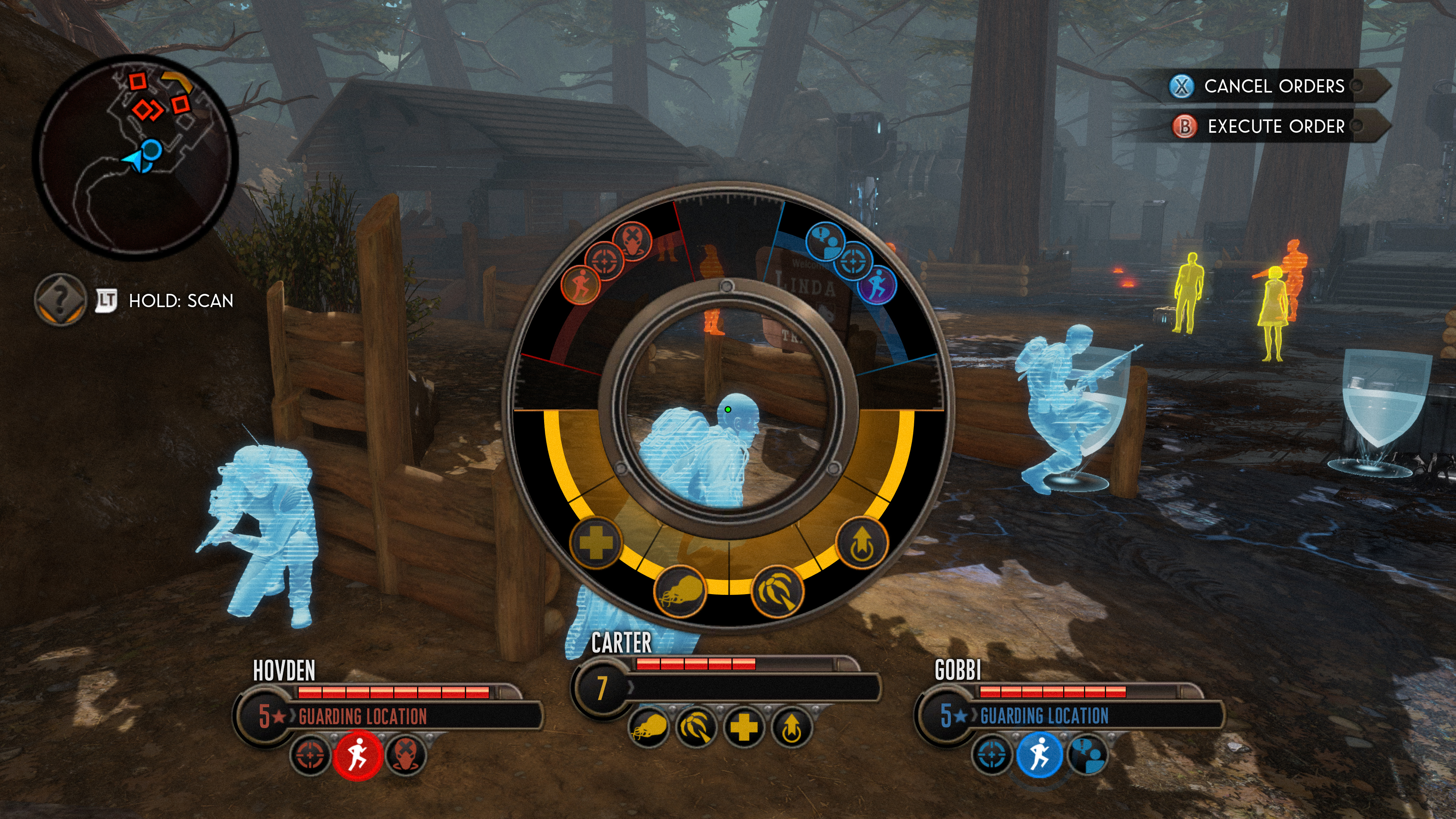
And here we arrive at the current-day, and the version of XCOM that will ship in August. The name was changed to The Bureau: XCOM Declassified, and the UI was cleaned up. The portraits were removed from both the radial and the bottom of the screen--since you were mostly looking at the back of their heads in-game, it didn't really add any valuable information. Instead, 2K Marin focused on color coding, a method it found even more helpful, to create the game that exists today.
So, did it work out? Is XCOM Declassified a better game than the XCOM shooter was going to be? We have no idea, but we know that you'll be able to decide for yourself next month when the game is released for PC, Xbox 360, and PS3.
Revolution
For years, we've wondered what happened to the XCOM shooter, and why 2K Marin decided to make such drastic changes to something that, honestly, looked fine. While we're not totally sure the new direction is the one we'd have picked (we were really looking forward to BioShock in rural America with aliens), we definitely understand why it happened. What about you? Do you appreciate this look behind the curtain?
And if you're looking for more looks into the other side of gaming, check out the top 7 cancelled games we wish we could play and 7 games we hope aren't cancelled.

Hollander Cooper was the Lead Features Editor of GamesRadar+ between 2011 and 2014. After that lengthy stint managing GR's editorial calendar he moved behind the curtain and into the video game industry itself, working as social media manager for EA and as a communications lead at Riot Games. Hollander is currently stationed at Apple as an organic social lead for the App Store and Apple Arcade.
