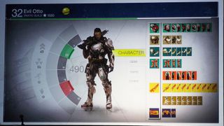
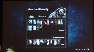
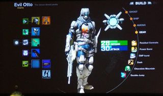
Well Destiny's original menus sure were fugly
GDC tends to be a bit techy, so no surprise there was a presentation on menus. BUT. Destiny menus, which makes it far more interesting.
Given that Destiny's UI (that's user interface if you're not a GDC type person) is a lovely smooth experience. It's interesting to see its evolution via a talk entitled “Tenacious Design and The Interface of Destiny,” by Bungie lead UI designer David Candland (as reported by Kotaku).

Destiny's swooshy cursor wasn't an overnight success, with Candland saying it took a lot of work to perfect elements like the feedback when you pass over a selectable element - the pointer slows veeery slightly, and the bit you've reached expands to add an element of response from the game.

These shots are apparently mainly mocks ups and concepts created during development so these weren't working prototypes, rather a valuable step along the way to what we eventually got.

Seen something newsworthy? Tell us!
Sign up to the GamesRadar+ Newsletter
Weekly digests, tales from the communities you love, and more

I'm GamesRadar's Managing Editor for guides, which means I run GamesRadar's guides and tips content. I also write reviews, previews and features, largely about horror, action adventure, FPS and open world games. I previously worked on Kotaku, and the Official PlayStation Magazine and website.
The Destiny 2 dev behind Titan's game-changing Banner of War was also on its new Exotic shotgun Slayer's Fang: "I gotta live up to this, especially as my first gun"
"If your cake is trash, nobody wants to eat it": At a tough time for Destiny 2, Bungie drops an Exotic mission promising vampire vibes, a cool shotgun, and a finale with bite
Most Popular
