“We’re going to Titan, there’s 40-foot methane ocean waves” - Destiny 2’s art director reveals the visual secrets of those new planets
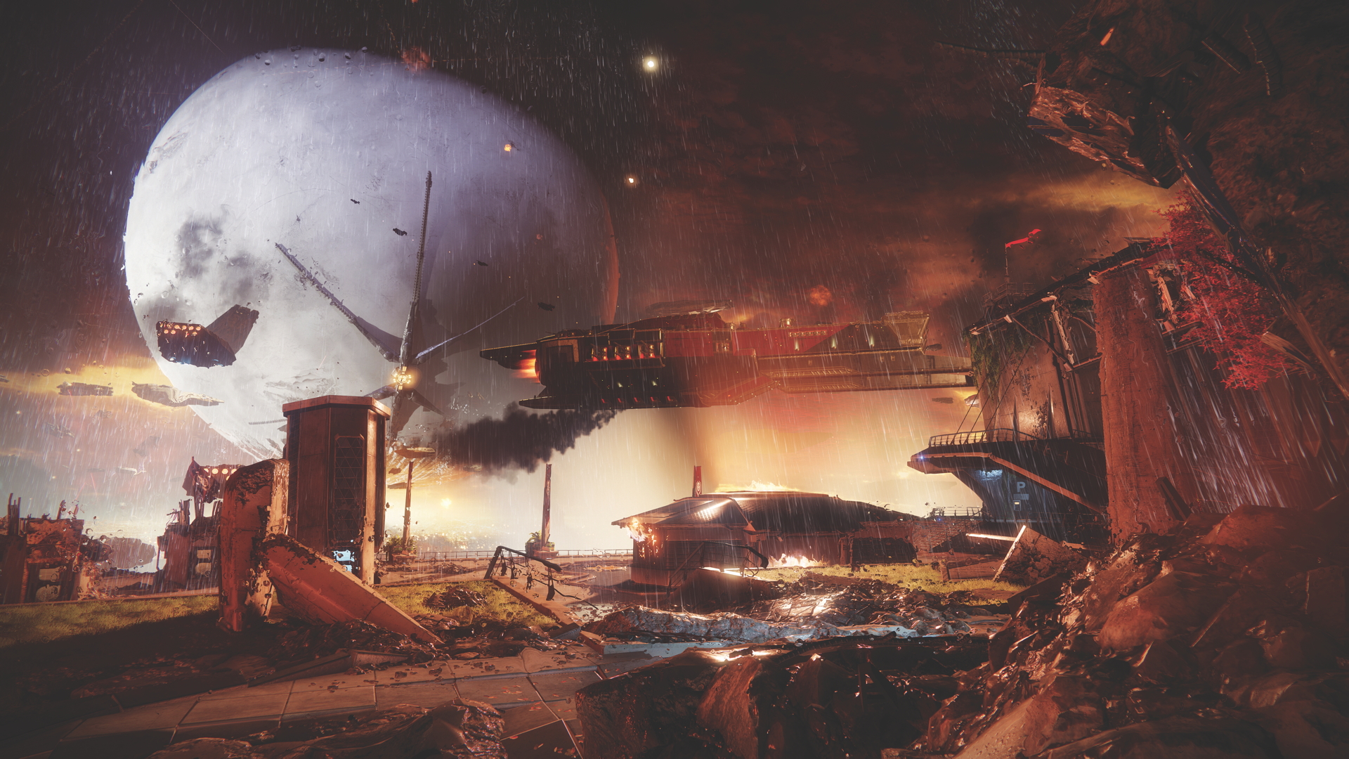
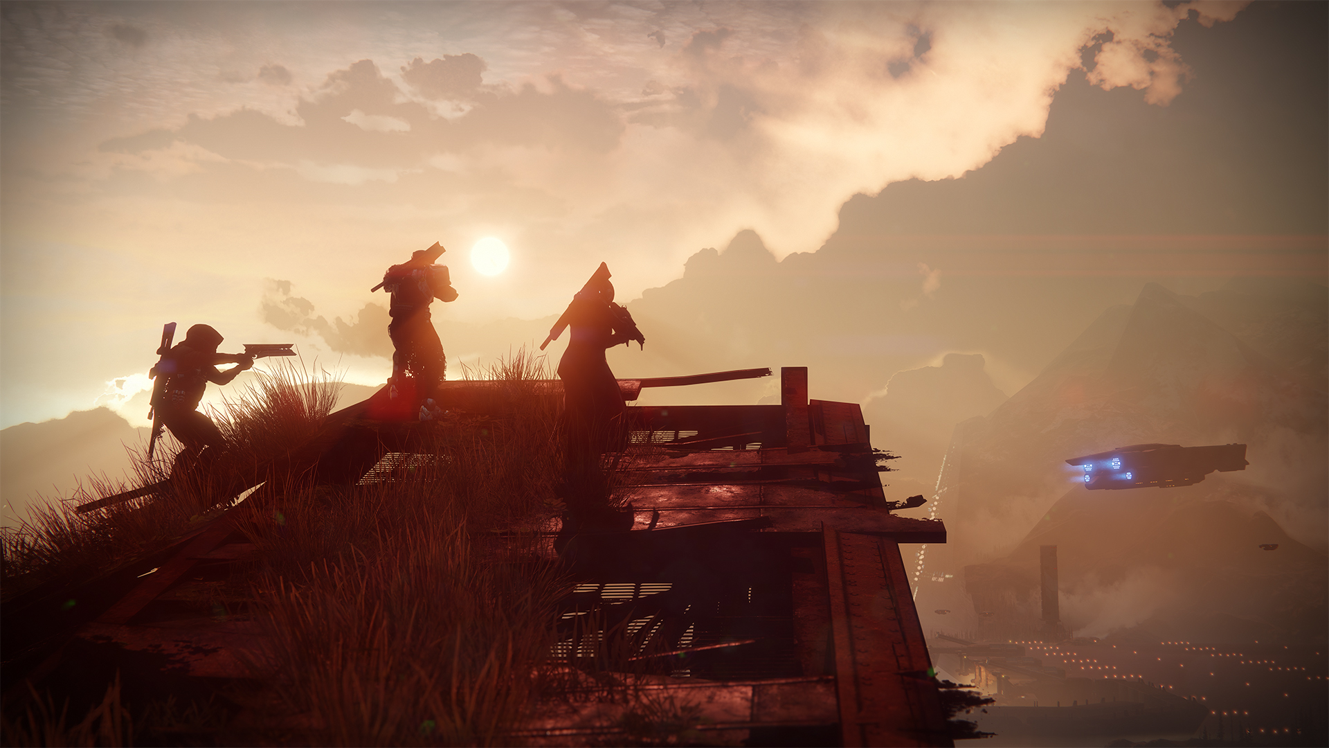
As the old saying goes, ‘the devil is in the details’. For a game built around epic space opera, grand vistas, and exotic new worlds to explore, what made Destiny memorable was the minutiae. It was the crest on a Guardian’s armour, the remnants of ancient machinery, and the tease of a new town just over the horizon.The sequel will be no different. Great care is being taken to build worlds that feel more alive than ever before, despite having been partially destroyed by the Red Legion, splinter faction of the Cabal.
After playing the game we met up with Michael Zak, art director on Destiny 2, to discover the tiny, yet world-building, details he’s had a hand in designing. From the clothes the Guardians wear, which offer a deeper insight into their play-style, to the exotic but contradictory blend of claustrophobic environments set inside epic landscapes, Zak’s art team is aiming for higher, broader, and deeper worlds than we’ve seen so far.
OPM: Can you give us an idea of what exactly you are working on as art lead? What sort of things in the game have you worked on?
Michael Zak: Ultimately I’m responsible for the way everything looks: the visual appearances of our worlds, our characters, our enemies, our gear. I have the privilege of enjoying looking at the amazing work that the team creates – I don’t actually do a lot of that myself, to be honest. In my case, it’s just about making sure that our art team’s full of amazing and talented people working on things that are going to align best with the goals of the game, the theme of the game, the design intention, that it all comes together, co-ordinating all that, setting some direction, and once in a while I get to have an opinion and maybe say, “You know, I’d really like more pink in that please”.
OPM: You’re clearly underselling your role, but how do you design a look that conveys Destiny 2’s themes of loss and recovery?
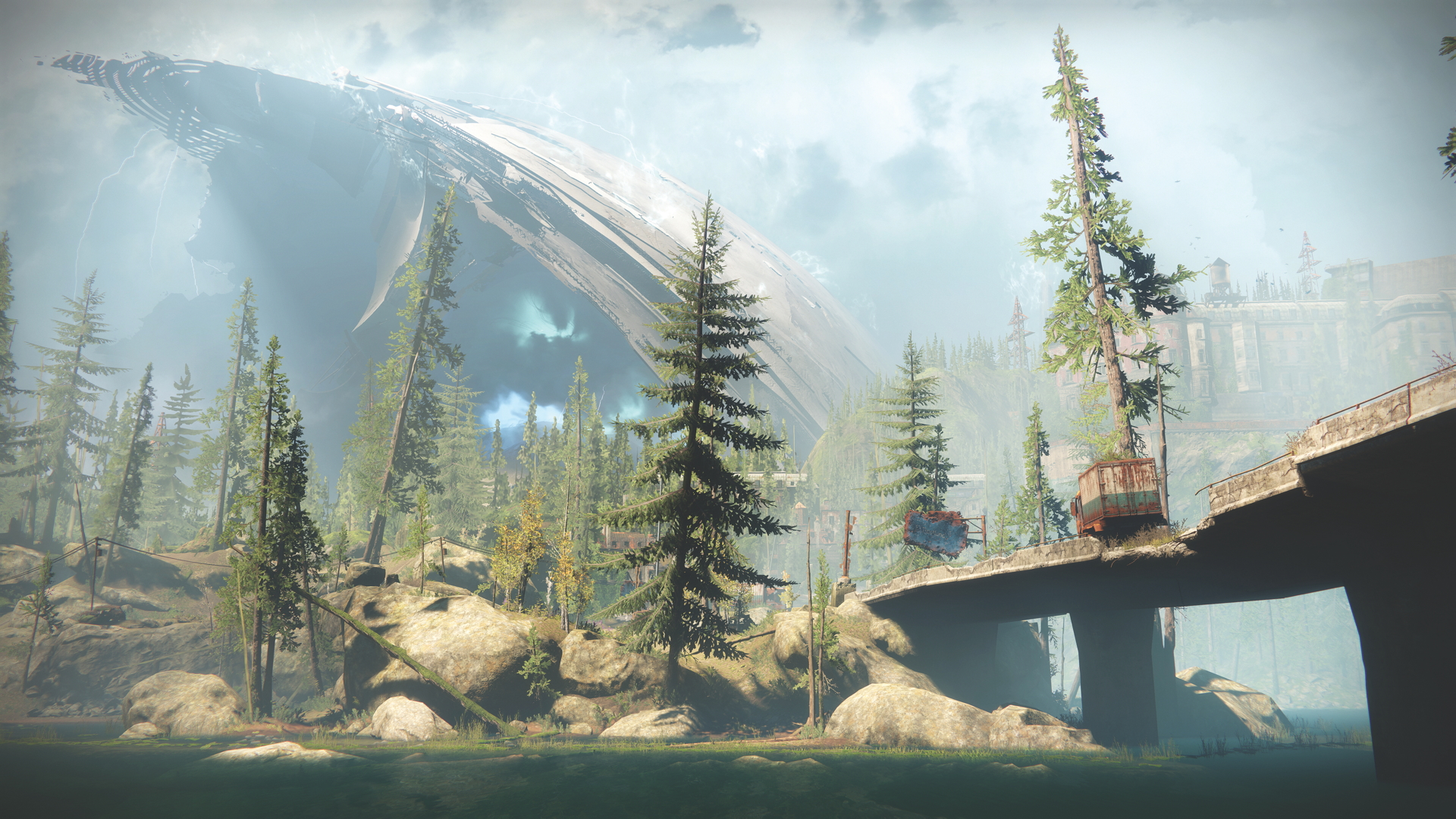
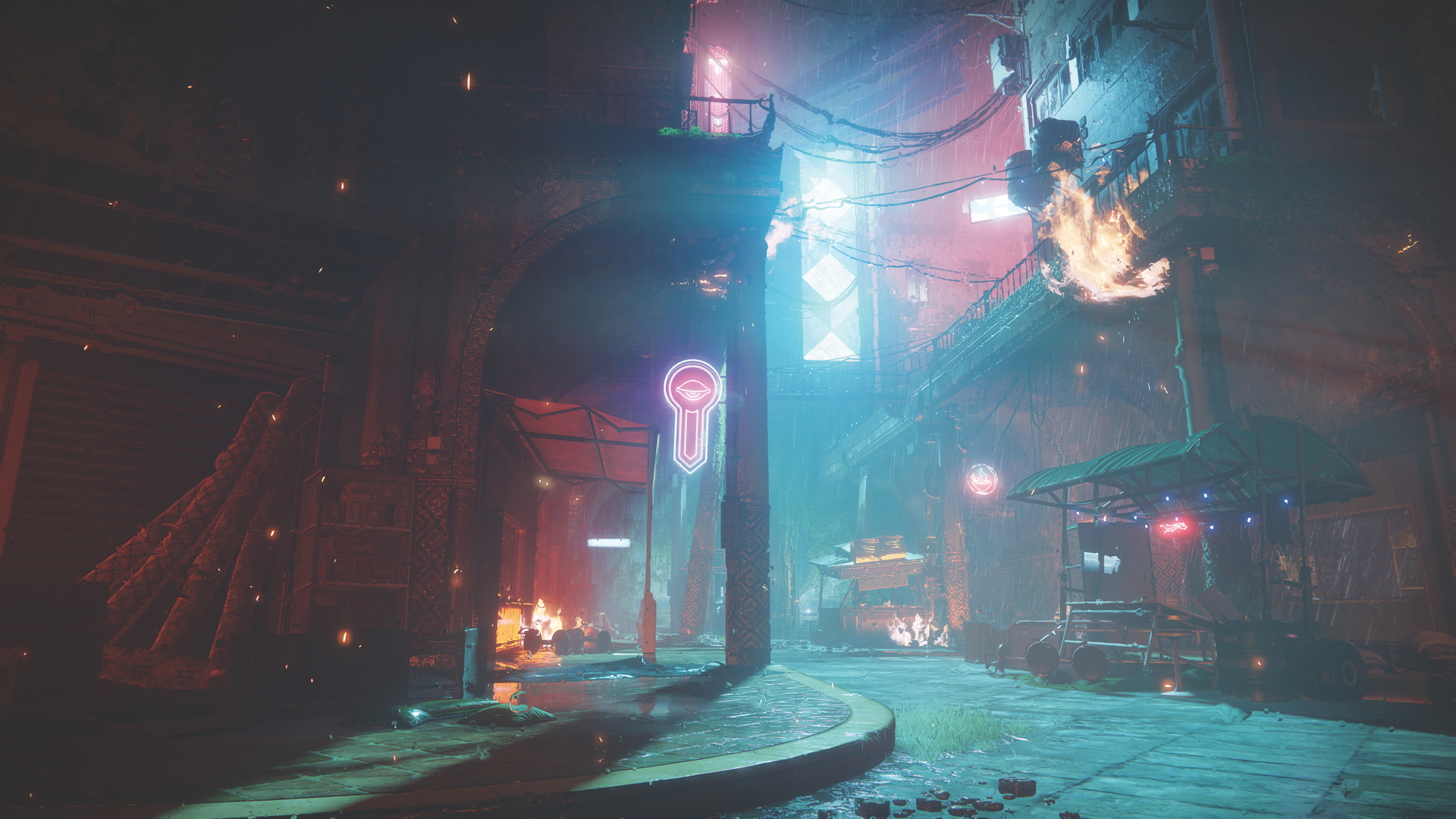
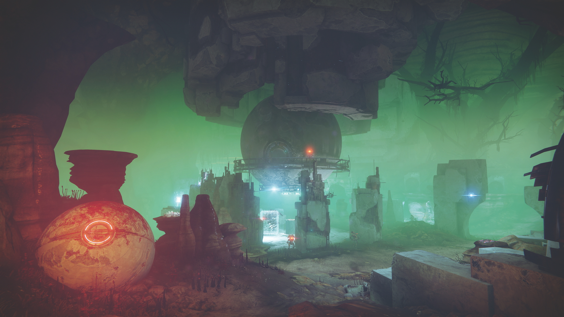
MZ: Guardians have been spending a bunch of time in very familiar places, the Moon, and Mars, and Venus, and when we do get kicked out of our home at the start of Destiny 2, for us it totally made sense to go explore the forgotten corners of our system, some of the lesser-known places. With that, for me, comes along this opportunity to do things that are a little more unique. Nessus, for example, is actually a real celestial object, it’s a centaur [a minor planet that is like a cross between an asteroid and a comet] and it’s like, “Oh yeah we could do something there. It’d be cool if the Vex completely converted this world and turned it into a machine world, we’ve always wanted to do that, let’s do that here”. Ideas like that present themselves, and sometimes we indulge ourselves.
OPM: What other cool things did you do?
Sign up to the GamesRadar+ Newsletter
Weekly digests, tales from the communities you love, and more
MZ: [This one] came straight out of the brain of Jesse van Dijk, our world art director. He just basically showed up in a meeting, we were talking about the story of the Vanguard and how’d they been scattered, how they were reacting to their loss and what their character arcs demanded and yeah, he just showed up with a pitch and just said, “We’re going to Titan, there’s 40-foot methane ocean waves,” and we were like, “Yeah, that sounds good. Let’s do it!” It was pretty awesome.
OPM: It sounds like developing the Titan class, seen in the first trailer, became a passion for the team?
MZ: For me, that Titan right there came from a concept that Joseph Cross did. He’s our concept lead; he’s amazing. It wasn’t for anything other than general class exploration that we were doing at the start of the project.
We really wanted to see where we could take the silhouettes, really push the archetypes of each of these classes that really leaned into their bespoke personalities and emphasise them in ways that maybe we’d been more timid in Destiny 1. I mean, there’s nothing timid about those shoulder pads, for example. I think they’re awesome, I think it’s fun, that image really resonated for me. It’s really evocative, that original concept, so we translated that into this gear set, which was sort of a seed for the other two sets that we basically designed to feel like this prototypical, idealised Guardian. That’s where we started because there’s new players coming into the fold, and what better way to introduce them that with a canonical, pinnacle look?
But also for returning players, give them a new suit, some new threads, but then have Ghaul show up and just take it from you. It gave us an opportunity then to really lean into what happens when that power’s been taken from you and how can we then represent that? So, the gear you get in the early game is really driven by that state that you are in, where you are an underdog, you’ve been kicked in the dirt. My hope is that the journey you’re going on as a Guardian is really reflected in the journey your wardrobe goes on through the campaign.
OPM: What was the thought process behind the new allocation of the Lion, Snake, and Eagle symbols?
MZ: We love graphic design, we love design at Bungie, those came from the mind of, again, Joseph Cross, the concept artist. He just felt like that would be a really cool way to express something more symbolic around the classes that maybe people didn’t immediately relate to, and the spirit animal for Destiny 2 for each of the classes, and that was his idea and I thought it was fantastic and we’ve incorporated it into a lot of the art.
OPM: Can you explain them a little more?
MZ: Sure, I mean every animal you choose will have different connotations and no one will be exactly right on. So part of it was pushing the envelope, I mean, we had a lot of the imagery, in the Hunters’ case, around wolves and pack wolves, and we kind of leaned into that. That was an obvious one to do, but it was like, “It’s a sequel, let’s push things a little bit, let’s generate conversation”. There are aspects of a snake that I think are absolutely Huntery and I think if you were to do a sorting game and say, “Snake, which class?” Probably Hunter, right? Like, quick strikes, you know?
OPM: Is there any content being carried over from Destiny?
MZ: We’re sort of leaving the original Destiny, there’s a lot of content there and there’s a lot of universe building that was done, and Destiny 2 is definitely going to converge for a moment. I think it’s really going to focus on what its core-to-the-universe premise is. That was the starting point for us, we wanted new players to come into this world and to understand it, and a kind of narrowing for our existing players, so that you can create that contrast and they can go back and rediscover those old things and find out more about them.
OPM: You designed the Inverted Spire that we played earlier. What is your favourite moment from that Strike?
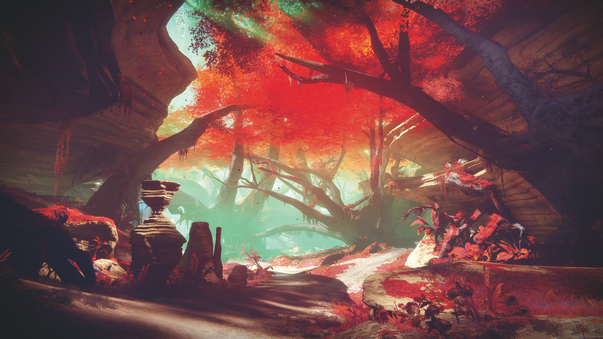
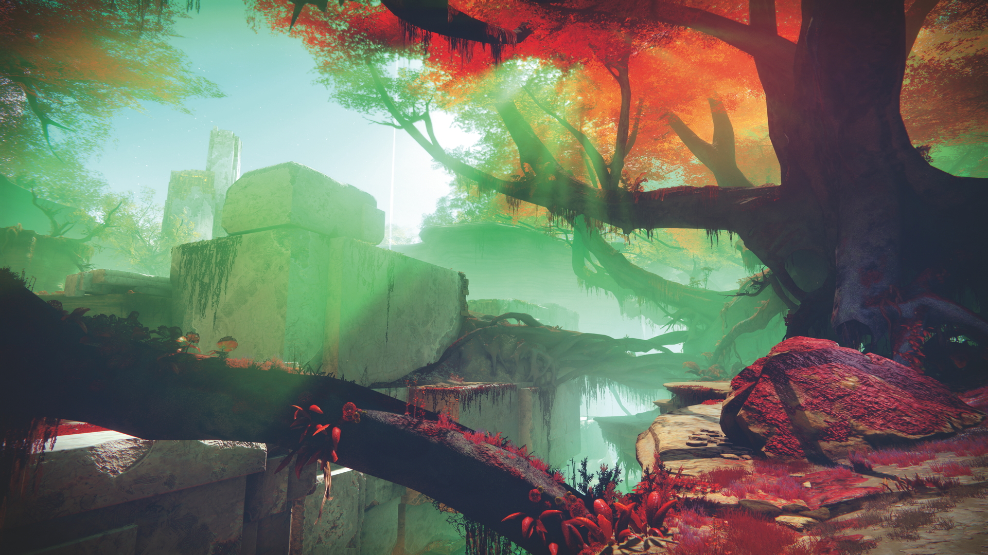
MZ: That view; where you land is typical Nessus landscape, it’s this incredible red foliage and these beautiful alabaster Vex structures, giant Vex milk waterfall into an abyss... it’s incredible.
That’s a beautiful place to land and I was struck by the poignant beauty of the space, but I knew there had to be some interaction between the Red Legion, as this dominant occupying force, and the beautiful Vex world. And there was this concept we’d had, that was really sort of done as a thematic piece for the Cabal, which was this giant tower of a strip mining drill that carves corkscrews down into the earth, so I said, “Let’s combine these two elements and let’s use this opportunity to take the beauty of Nessus and this Vex world, and combine that with the tyranny of the Red Legion, who are just absolutely ravaging the landscape”.
So there’s this moment where you walk through some tight Vex corridors and you come out expecting to just pass through a barrier between two beautiful places, and all of a sudden it’s just this wasteland where these guys have destroyed it. It’s kind of apocalyptic, but it’s an amazing view, and you’re really high and you have to jump down really far. Arguably a little bit punitively far, maybe some falling damage will happen, but it’s worth the view! Every time I peek out there I’m like, “Okay, it’s annoying that I have to jump down there, but the view’s amazing”.
OPM: You’re now using physically-based rendering (PBR). How has that improved Destiny 2’s graphics?
MZ: It’s an enhancement we made to our engine this time around which basically gives us two big benefits. One is the environments, they just look more grounded, the lighting’s richer. On the player’s side, that allows you convey material responses that are more realistic and more subtle and more varied, so we can represent materials that we couldn’t in the past, very plausibly. So leathers are going to look more like leather, with metals you can have a real matt powder-coated paint, you can have super gloss, you can go all the way to chrome, you can do iridescence. These are really beautiful effects, a lot more sophisticated.
This article originally appeared in Official PlayStation Magazine. For more great PlayStation coverage, you can subscribe here.
Jen Simpkins is the former Editor of Edge magazine, and is a multi-award-winning creative writer. In her most recent industry role, Jen lent her immense talents to Media Molecule, serving as editorial manager and helping to hype up the indie devs using Dreams as a platform to create magical new experiences.
