What are the favourite 'types' of people used on video game box-art?
We find out who is the ultimate front cover hero
A lot of the box-art we'd picked out seemed to avoid dwelling too long on facial detail altogether, choosing instead to either partially obscure the face, leave it hidden in shadow or offer only a view of the box-art model's back. Almost 20% of our gathered box-art featured faces that weren't clearly visible. It's like not having a face is the new having a face.
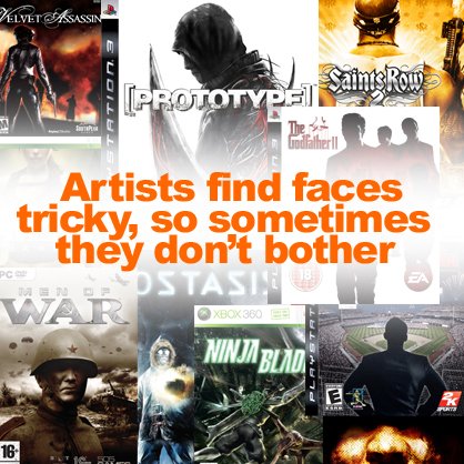
Conclusion: Drawing faces can be hard.
And while looking for hidden faces, we were amazed by how prolific headgear is on box-art. Whether hat, helmet, headscarf or hoody, scalp decoration appears on almost half of the 100 covers we'd collected.
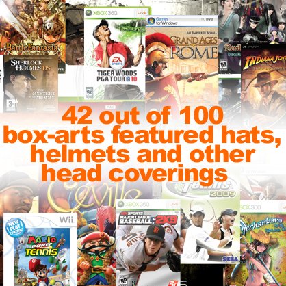
Conclusion: Game characters wear hats.
How many game covers embrace the idea of using just a not-white person? Only 7 out of 100. That's 7%. And one of those is that blue dude from Rogue Trooper: Quartz Zone Massacre.
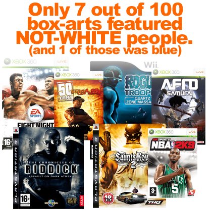
Conclusion: In comparison to white game characters, there aren't many not-white game characters.
There were more box-arts that featured both white and not-white people cohabiting in harmony on a single cover. Of our 100 pieces of randomly picked box-art, 8 of them chose to portray both white and not-white types of people. And one of those was a menacing looking green man from Sacred 2: Fallen Angel.
Sign up to the GamesRadar+ Newsletter
Weekly digests, tales from the communities you love, and more
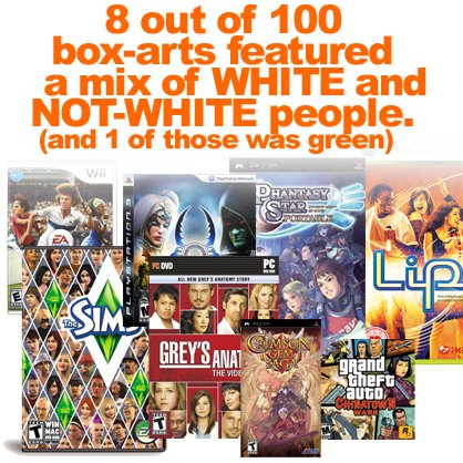
Conclusion: Colour diversity is less than 10% important.
In addition to physical characteristics, another aspect we looked at was the actual style in which the types of people on box-art were 'drawn'. Split between realistic and cartoony styles, realism proved more popular, with 61 out of 100 box-arts using either photography or accurate depictions of people. The vast majority of cartoony box-art was from Wii and DS games.
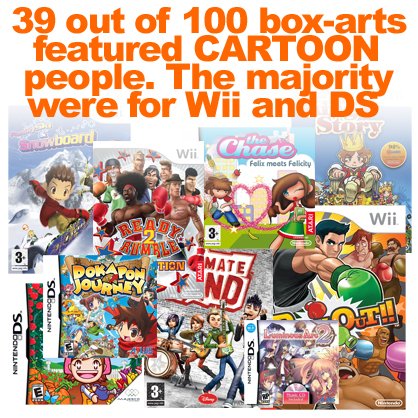
Conclusion: Gaming is less real on Nintendo consoles.
Several types of people are definitely NOT box-art favourites. You'd be hard pushed to find many old types of people, for example. We only found 2 out of our 100 box-arts that used an image of a grey-haired wrinkly.
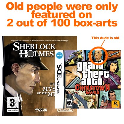
Conclusion: Being old is not aspirational.
It seems that overweight types of people are definitely a box-art no-no. 98% of our box-arts featured body-perfect images. And even then the only exceptions were hardly portraying super-flabby fatness - one was Mario's round belly and the other a bunch of darts players.
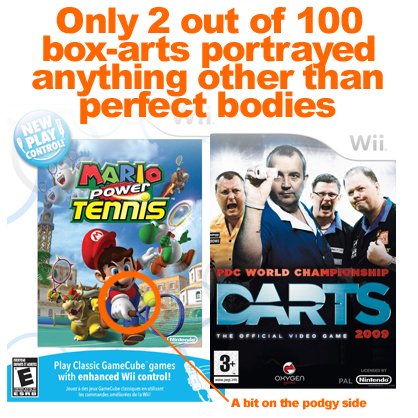
Conclusion: Imperfection is unacceptable.
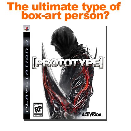
So, what is the favourite type of person to use on video game box-art? It would be a young, slim, serious-looking, realistically rendered white man with an obscured face holding a weapon and wearing a head covering of some description. Based on that, we've determined that - out of our 100 box-arts - this is the one that ticked all of those boxes:
July 1, 2009


The year's best examples of awful packaging

16 games crying out for a Photoshop job

Packaging from the era of day-glo everything

