The worst box art of 2012
50 of the year's ugliest attempts at game packaging
'Tis the season to mock box art

You have one chance--one chance--to make a first impression. So why would you squander it with a hideous image? Box art designers have failed to learn this lesson time and again, constantly slapping a repugnant visual onto the cover of their game and shipping it to store shelves. Though the well of horrid DS and Wii shovelware has been running dry as of late, we've still been able to wrangle together 50--count 'em, 50--specimens from the bottom of the bad box art barrel.
As is tradition, we'd like to remind you that we're not passing judgment over the games themselves--just the boxes that they unfortunately shipped in. With that, let's steel ourselves to run the gauntlet of the ugliest, most unappealing, and flat-out worst box art of 2012...
50. 737 Professional
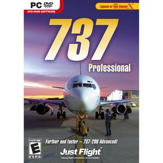
Inner monologue of that poorly-Photoshopped-in man in the foreground: "$#!*, I locked the keys inside."
49. Xia-Xia
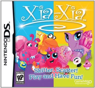
Let's pretend, for a moment, that young girls would have an affinity for brightly colored hermit crabs. Even IF they had any clue how to pronounce this game name, or had any interest in skittering and/or scattering, how does the presence of a living globe, clock, cupcake, and stunted eskimo make any sense? At all?
48. Spy Hunter
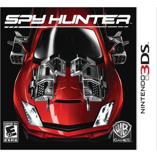
The longer you stare at this cripplingly boring boxart, the less value your life seems to have. Also, guys, a Spy Hunter game came out this year. Yeah, we dont remember it either.
47. Smart as
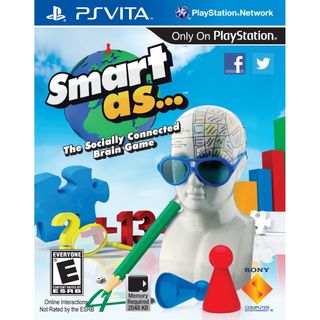
Some of the worlds greatest mathematicians have been driven to madness by one cryptic formula: ? +13. Whats the missing number? Only after youve plummeted into the deepest depths of cerebral insanity can you know the answer.
46. MIB: Alien Crisis
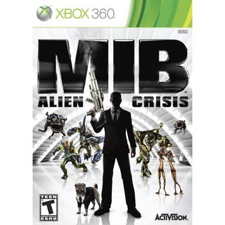
Not only could they not afford to license the likenesses of Will Smith, Tommy Lee Jones, or Josh Brolin, but were not even sure thats the same pug from the Men In Black movies. Cmon, guys.
Sign up to the GamesRadar+ Newsletter
Weekly digests, tales from the communities you love, and more
45. Warriors Orochi 3
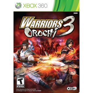
Typically, when were spear-fighting someone, we have this habit of actually looking in the direction of the person were clashing blades with. Throw in a hydra in the background with absolutely no context, and youve got some truly golden box art.
44. Order Up!!
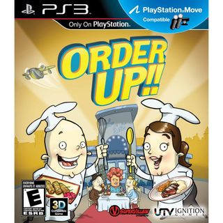
If a chef delivered our food to the table with a chin looking like that, wed immediately lose our appetites. Also: Was the second exclamation point really necessary?
43. Carrier Command: Gaia Mission
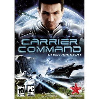
Honestly, the bottom half isnt so bad. The top half, on the other hand, depicts a creepy, dead-eyed man doing the E.T. finger. Could this the grown-up version of the freaky space baby from 2001?
42. Wheel of Fortune
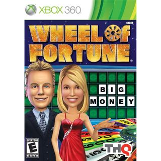
I'd like to buy a better-looking game, Pat.
Lucas Sullivan is the former US Managing Editor of GamesRadar+. Lucas spent seven years working for GR, starting as an Associate Editor in 2012 before climbing the ranks. He left us in 2019 to pursue a career path on the other side of the fence, joining 2K Games as a Global Content Manager. Lucas doesn't get to write about games like Borderlands and Mafia anymore, but he does get to help make and market them.
