The worst box art of 2012
50 of the year's ugliest attempts at game packaging
41. PES 2013 Pro Evolution Soccer

As seen in Missed FIFA Connections on Craigslist:
Me: white-clad soccer player that looks a bit like the male version of M.I.A. You: footie boy in blue with popping leg veins. We were both chasing after the ball on the field--then our eyes met, and it felt like time stood still. Now, Im chasing after your heart.
40. Freakyforms Deluxe
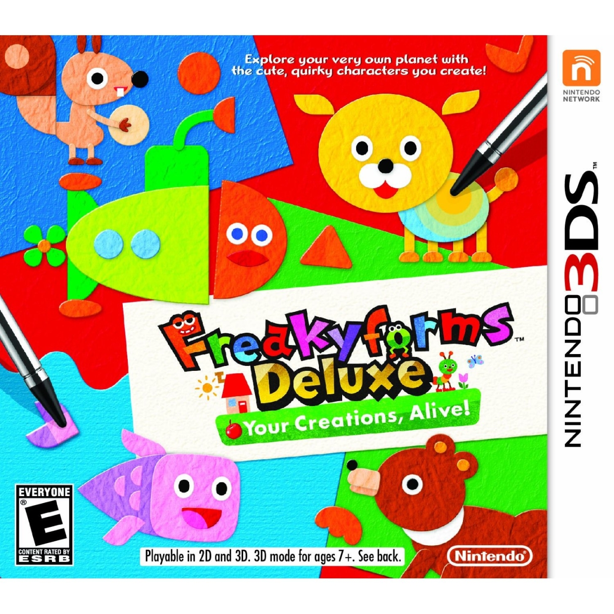
Besides the chintzy color palette and rudimentary animal (and, for some reason, submarine) designs, there's something else distinctly wrong with this picture. What, in the name of all that is holy, is wrong with the capital F in the title? He looks like a creeper that's stoned out of his mind, and were it not for "reakyf," he'd be sexually assaulting that open-mouthed o.
39. Blades of Time
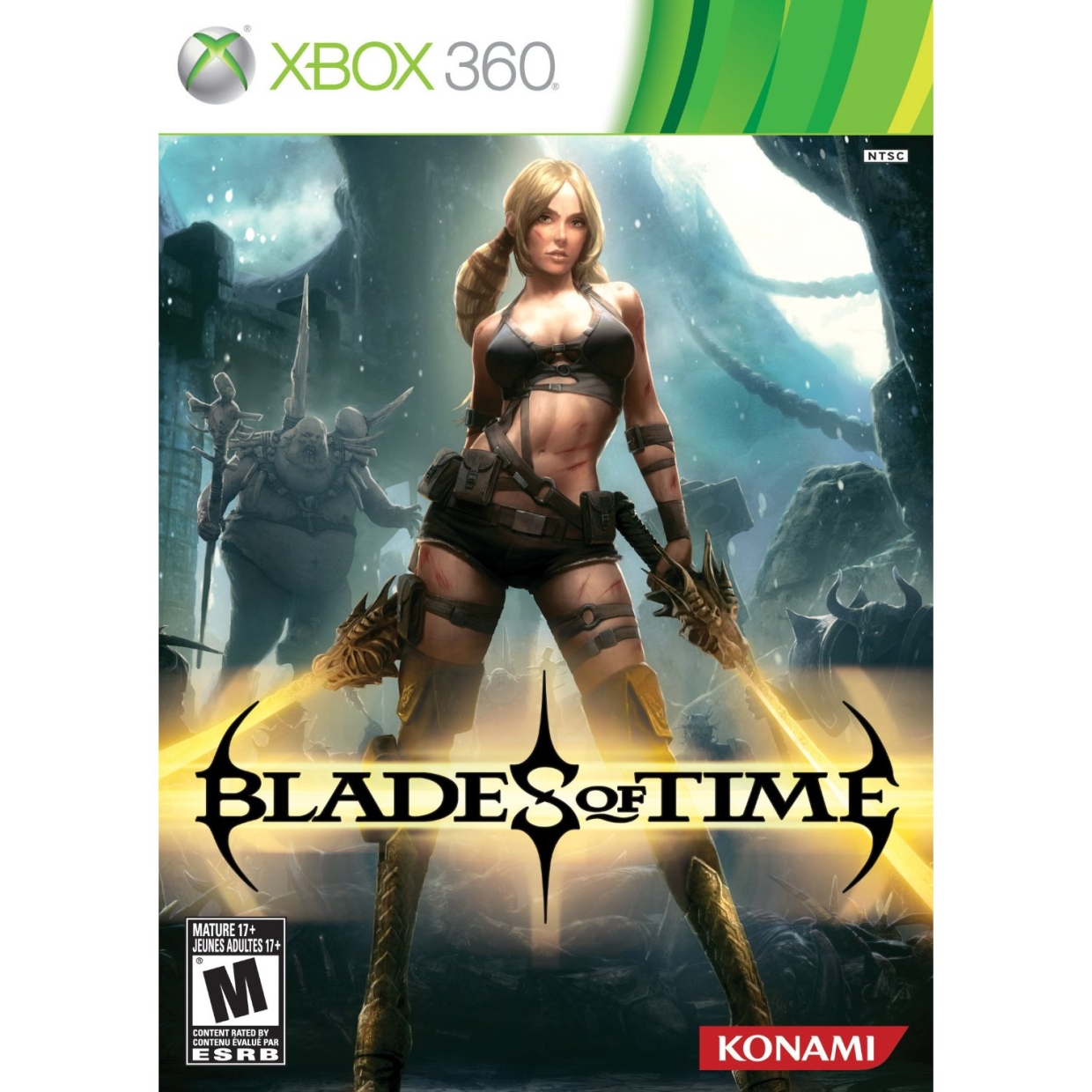
Foreground: Stereotypical video game vixen dressed like she's trying to ride the wave of titillation wrought by the original Tomb Raider. Background: A hideously ugly ogre with an indiscernible gender, and the armor from the Unreal Engine 4 demo. Box art: bad.
38. Sledge Hammer

Clearly, the artist poured five minutes of labor into this riveting rendition of vehicular mayhem. So we dont have the heart to tell him that he drew a truck and not, in fact, a sledgehammer.
37. Code of Princess
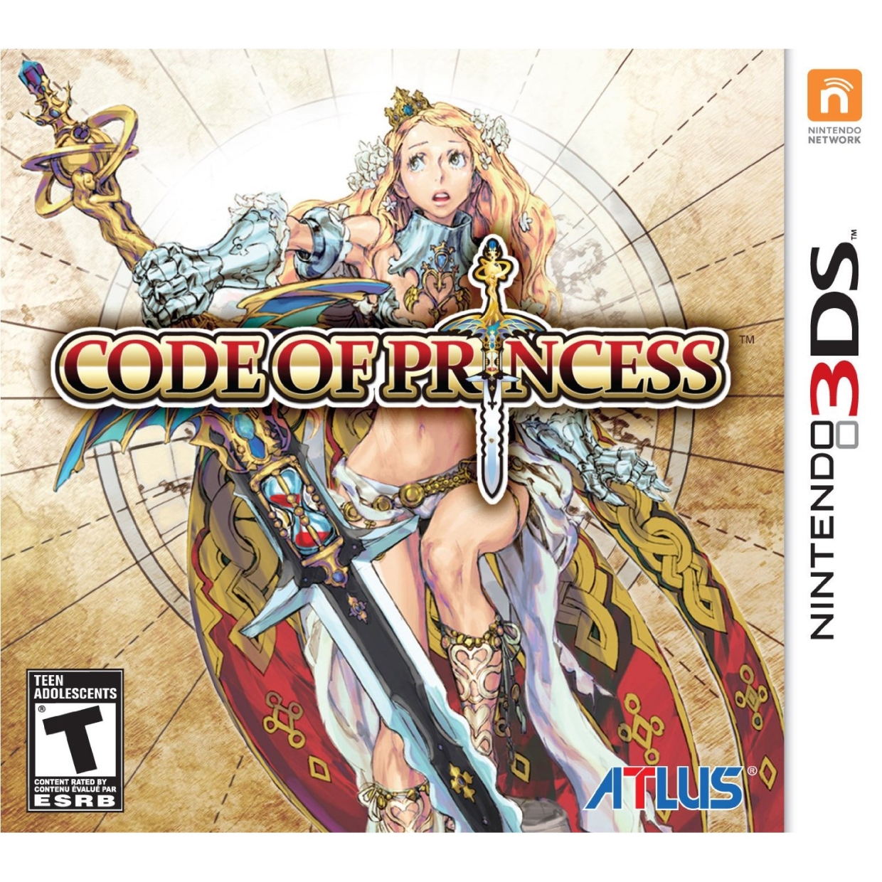
Were not sure what this grammatically bankrupt game name means, and the box art gives us very little to go on. So heres what we can surmise: This Princess dons gauntlets, but cant stand wearing armor below the waist. Her timid expression shows a clear anxiety, either of something cool out-of-frame or the overly ornate hilt of her sword. And the games logo has been meticulously placed above her breastplate, to make it look at a glance like shes topless underneath. Seems like the makings of a winning heroine to us.
36. Living Legends: Ice Rose

What if you paid your graphic designers more than minimum wage?
35. Alan Wakes American Nightmare

Alan Wake's so afraid of the dark, he feels the need to brandish a flashlight during the day. He also seems completely indifferent to the three floating hands clawing at his feet.
Sign up to the GamesRadar+ Newsletter
Weekly digests, tales from the communities you love, and more
34. 007 Legends
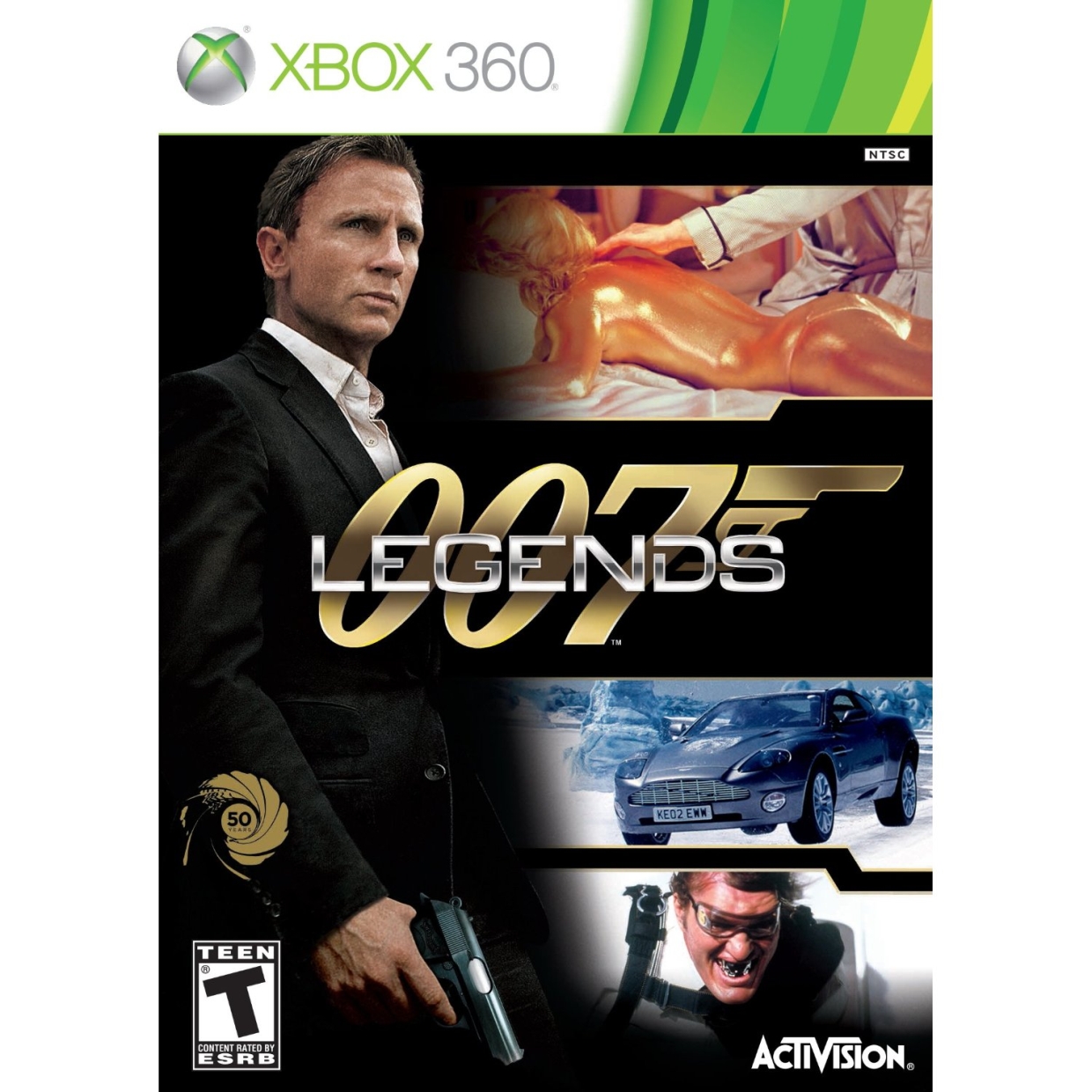
This dapper gentleman, who barely looks like Daniel Craig even though Activision mustve paid thousands for his likeness, has some options. He can: A) Pose for a hover-hand photo with a gold mannequin, B) Drive a floating automobile over ice, or C) Have a friendly chat with a man sporting some sick-nasty grillz. Sure, it makes sense to diehard Bond fans--but for those unfortunate souls with no exposure to 007, this box art means nothing.
33. Poptropica Adventures
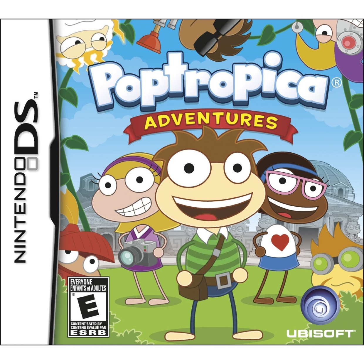
We really, really want to know how much someone got paid to draw this. It looks like the artist ripped off Don Hertzfeldt, Ape Escape, and the stick figures from a third grade art class. AND WHERE ARE THOSE GIRLS' NECKS?!
32. Resistance: Burning Skies

Okay, we get that this is a dead alien who's just been axed to death by this "Riley" fellow. So why does it look like this deceased Chimera's trying to pull off a sexy pose, with seductive eyes transfixed on the camera and tongue enticingly stuck out? And if it IS dead, how is it still holding that rifle perfectly upright?
Lucas Sullivan is the former US Managing Editor of GamesRadar+. Lucas spent seven years working for GR, starting as an Associate Editor in 2012 before climbing the ranks. He left us in 2019 to pursue a career path on the other side of the fence, joining 2K Games as a Global Content Manager. Lucas doesn't get to write about games like Borderlands and Mafia anymore, but he does get to help make and market them.

