The worst box art of 2012
50 of the year's ugliest attempts at game packaging

Ah, that makes sense.
4. Natural Threat
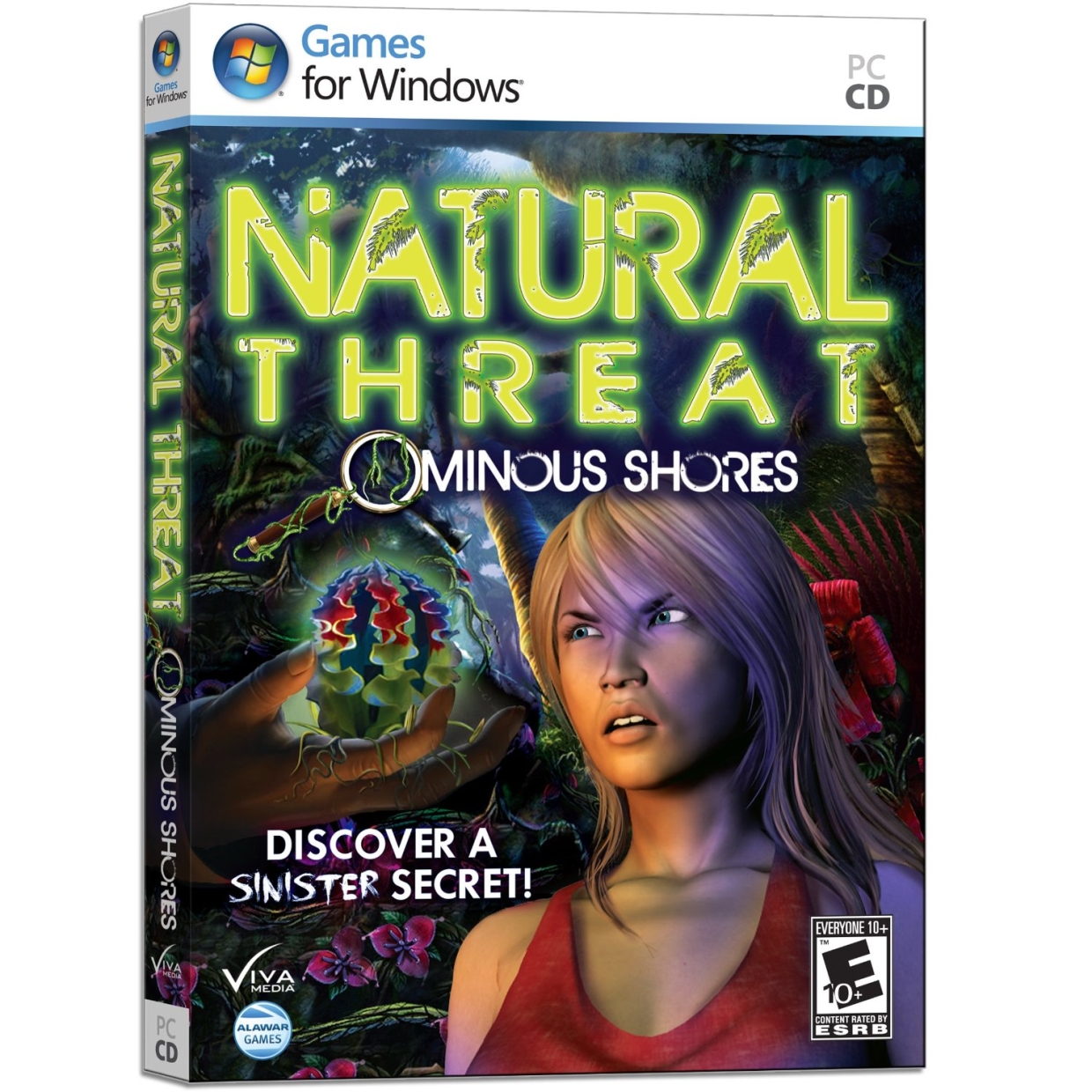
The only sinister secret is how that 3D modeler managed to land a job. There's a difference between rendering a face of bewilderment at a strange specimen of nature, and making your main character look like she was just flashed by man with abnormal genitals.
3. Batman Arkham City: GOTY Edition
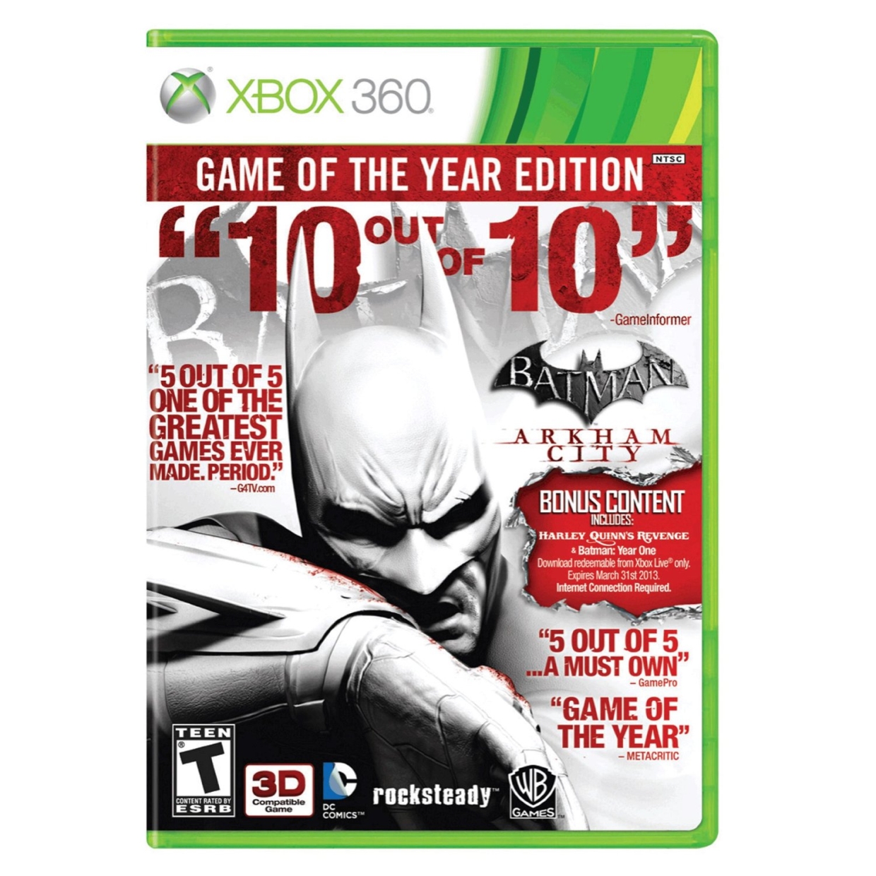
TENOUTOFTEN! Thats the name of Batmans new game, in which he angrily snorts strawberry jam off his wrist to get high. Weve already mocked this misguided mess at length, but bad box art is simply timeless. Also, R.I.P. GamePro, which was already decommissioned by the time this special edition hit shelves. Oof.
2. Circus World
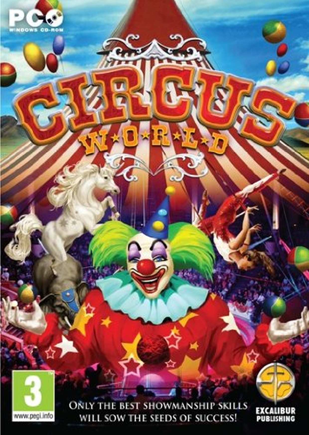
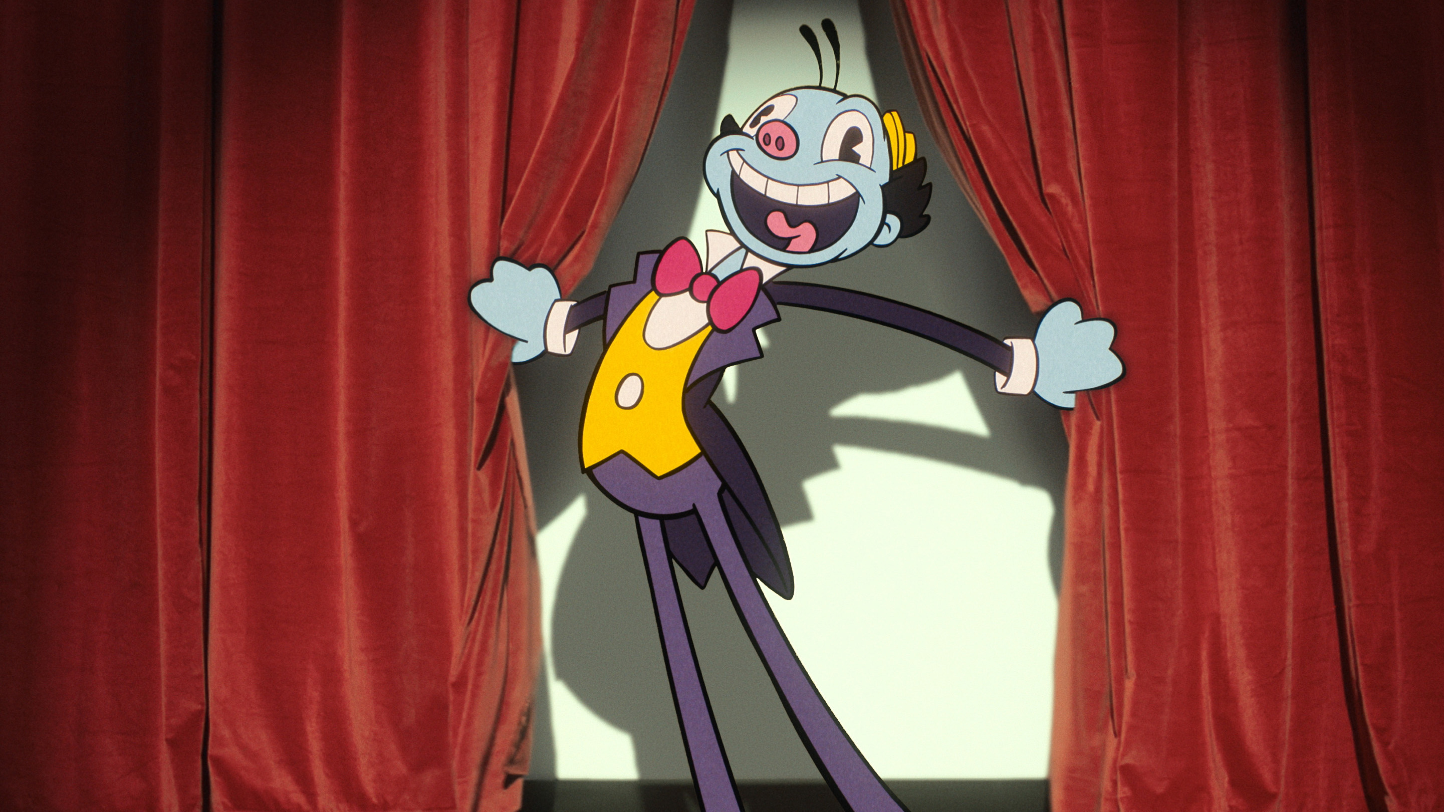
The "Circus World" is just a front for a truly horrifying food trap. Attendees take their seats in the bleachers, completely unaware that they're soon to be ritualistically devoured by this gigantic, terrifying clown. His favorite delicacy? Three-year-olds. The horror. The horror.
1. The Horse Lovers Ultimate Compendium
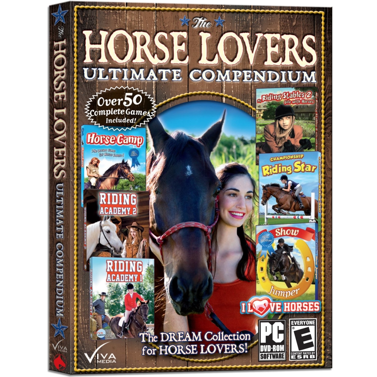
Yeeeeeeaaaaaaah. We're just gonna come out and say it: Those two are clearly in a relationship--and it's a romantic one, at that. You can't really blame her for falling madly in love with a horse, given their loyalty to one another throughout the course of over 50 games. Games like "Riding Star" and "Show Jumper." You know what? This box art is only missing one thing...

There we go.
The "Just cant wait 'til next year" award: Tiger Woods PGA Tour 14

Arnold Palmer looks as though he just painfully sharted his pants. Tigers caught a whiff of the foul odor, and is very displeased and embarrassed with his gigantic friend.
Sign up to the GamesRadar+ Newsletter
Weekly digests, tales from the communities you love, and more
Looks aren't everything
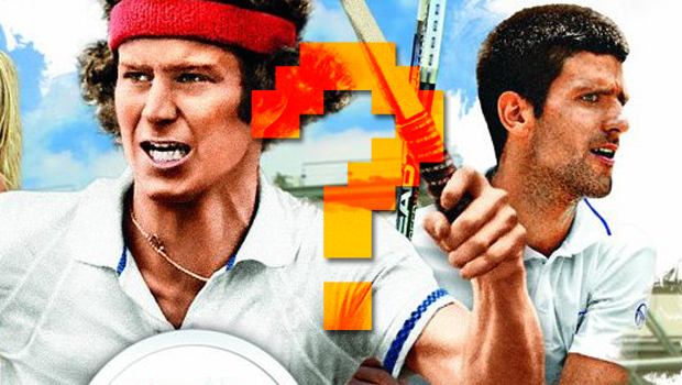
By our estimation, those are the 50 worst pieces of box art we could find polluting store shelves in 2012. Think you've seen worse? Let us know in the comments--though we seriously doubt that anything can top Horse Lovers. (That game pictured above, by the way, is Grand Slam Tennis 2.)
Want to revel in the ridicule of even more bad box art? It's your lucky day. Check out the worst box art of 2011, the worst box art of 2010, the worst box art of 2009, the worst box art of 2008, and last but not least, the worst box art of 2007.
Lucas Sullivan is the former US Managing Editor of GamesRadar+. Lucas spent seven years working for GR, starting as an Associate Editor in 2012 before climbing the ranks. He left us in 2019 to pursue a career path on the other side of the fence, joining 2K Games as a Global Content Manager. Lucas doesn't get to write about games like Borderlands and Mafia anymore, but he does get to help make and market them.

