The worst box art of 2014
21. Teenage Mutant Ninja Turtles
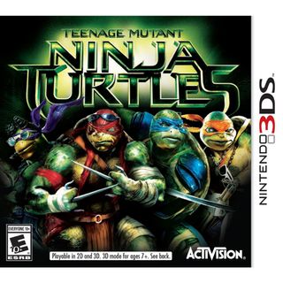
There is no harsher reminder of last year's TMNT film and its abject failures than this piece of garbage box art. I mean really, people - even the most deluded Turtles fan has to acknowledge that Raphael and Michelangelo look like honest-to-God goblins here.
20. NASCAR '14
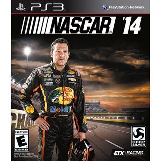
There's a distinct look of dread in Tony Stewart's thousand-yard stare, and the darkening sky behind him can only mean that The Rapture is finally upon us. But I'm sorry - I just can't take a man seriously when he's got a Bass Pro Shops logo emblazoned on his chest.
19. Enemy Front
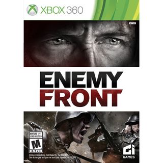
How do you make your World War 2 game stand out from the hundreds upon thousands that came before it? Simple: just slap a super close-up shot of a mildly irritated Tom Cruise above yelling Nazis!
18. The Voice: I Want You
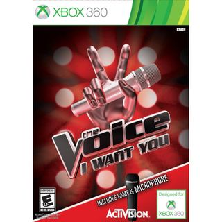
Woah there, The Voice - at least buy me dinner first! No, I don't want to see your included microphone, that's just - oh, and now you're making lewd gestures with your fingers again. This is why my mother warned me about dating a disembodied metallic hand.
17. Hello Kitty Kruisers (with Sanrio friends)
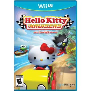
Take the concept of Diddy Kong Racing, remove any sense of imagination from the graphics, and replace all the cute Rare characters with cute Sanrio characters whose blank stares suggest that they've undergone a lobotomy prior to sitting in the driver's seat. Next, attempt to give the bland box art any semblance of movement by adding copious blur effects and sand particles being kicked up from the ground. Finally, add laughably bad clouds and a pointless lens flare to the background for the finishing touches. Congratulations! You've just made a Wii U racer that should never be played under any circumstances.
16. Beach Resort Simulator
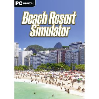
The artist who made this box art must've been confusing their actual paid job with a rousing game of 'Absolute Minimum Effort Simulator'. On the other hand, few pieces of box art pack this much fun in the sun into one image.
15. Duck Dynasty
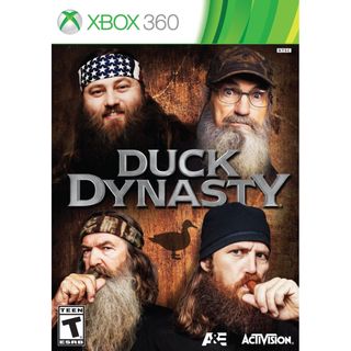
I've never watched Duck Dynasty, nor do I ever intend to. This box art has only strengthened my conviction. The only positive thing I can say about it is that I've never seen someone suck on an uncooked hot dog with the same prideful vigor as the man in the bottom right. I can't imagine this box art getting any worse, seeing as...
Sign up to the GamesRadar+ Newsletter
Weekly digests, tales from the communities you love, and more
14. Duck Dynasty
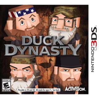
...AND I TAKE IT BACK! I might actually prefer the Lego-looking versions of these 'reality' 'stars' if not for the fact that three out of four of them look like they want to molest me.
13. Stronghold Crusader 2
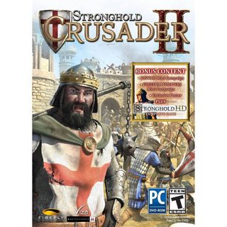
Shouldn't this guy be, like, fighting someone right now? Instead, this mace-wielding fatso is just standing idly with his hands on his hips, having decided that now would be the perfect time to show us his jagged teeth and pubic-looking beard.
12. Why So Evil
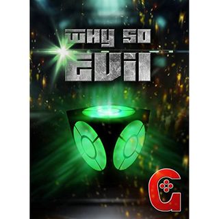
Why so ugly?
Lucas Sullivan is the former US Managing Editor of GamesRadar+. Lucas spent seven years working for GR, starting as an Associate Editor in 2012 before climbing the ranks. He left us in 2019 to pursue a career path on the other side of the fence, joining 2K Games as a Global Content Manager. Lucas doesn't get to write about games like Borderlands and Mafia anymore, but he does get to help make and market them.
Assassin's Creed Shadows devs "actively looking at" an even harder difficulty mode for the RPG: "How challenging do you want it?"
Assassin's Creed Shadows' delays were mostly used to polish the RPG, creative director confirms, not for deeper changes brought about by Star Wars Outlaws reaction

