XCOM: Enemy Unknown interview and exclusive screens
We talk about spaceships and X-Files and other cool stuff with Greg Foertsch
The prettiest alien invasion in years
XCOM: Enemy Unknown is one of the most interesting games of the year, both in terms of its turn-based strategy gameplay and its awesome artistic style. While we've covered the gameplay in our last preview, we never had a chance to really find out about the inspiration behind the game's art. Thankfully, we recently talked with Firaxis Games' Greg Foertsch, project art director for XCOM: Enemy Unknown, to fix that.
Oh! And we have some awesome, new, exclusive images to ogle, too!
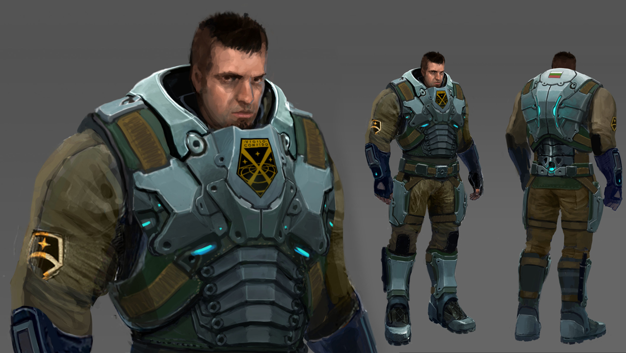
GamesRadar: The game looks super slick what inspired the heavy, armored look of the soldiers?
Greg Foertsch: Thanks! We took our inspiration from modern military armor for the basic armor kits your soldiers start out wearing. With the Carapace Armor and Skeleton Suit, theyre based on your early studies of alien tech, but we intentionally made them angular and geometric, in contrast to the repeated organic curves of the alien equipment and armor (actually, the Muton armor provided a lot of direction for the alien look.) The most advanced armor in the game uses a lot of the aliens own tech, and that shares that organic look of the rest of the alien armor, so you know at a glance that your soldiers have gone past human technology and are now becoming like the aliens.
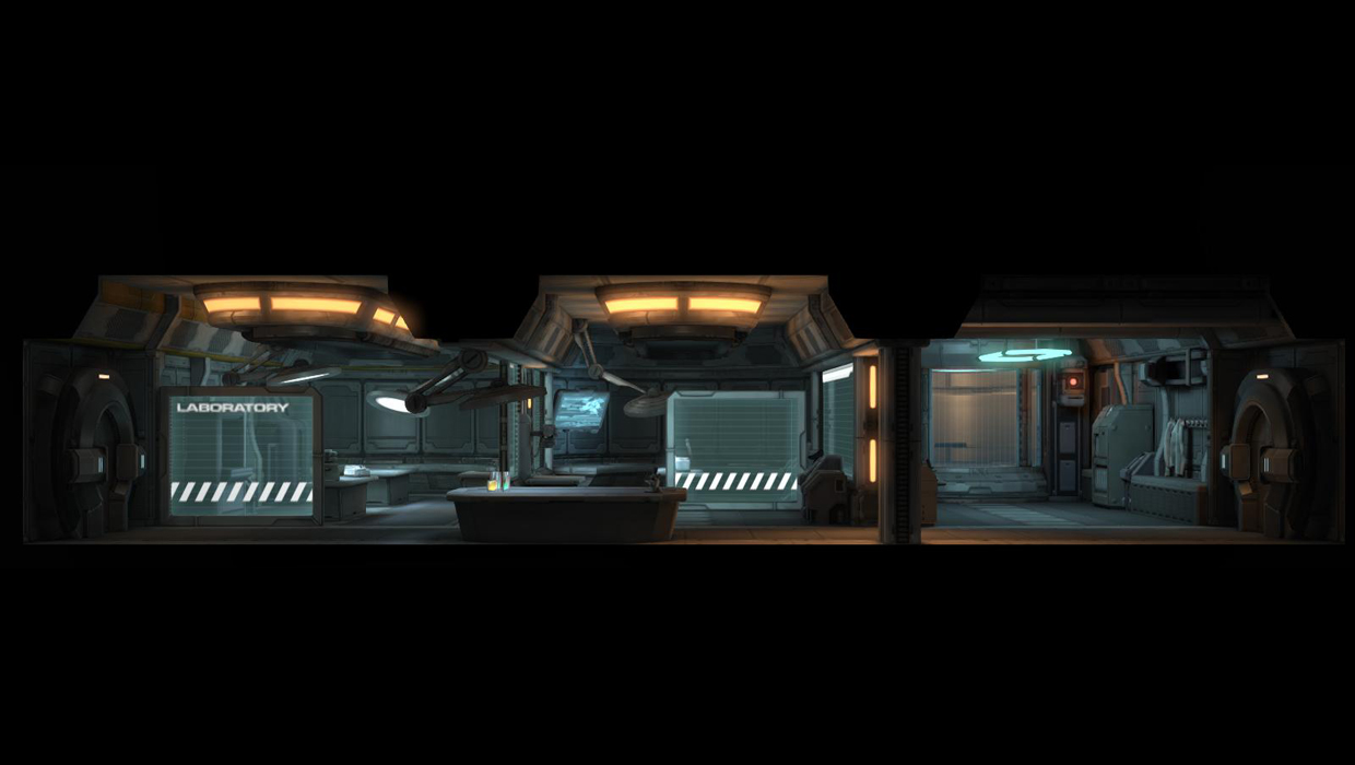
GR: The actual XCOM lab has a neat cross-section design, what inspired this look? Were there any other iterations?
GF: We iterated a lot on the design of the base. Early on, it was kind of an isometric view, a bit like the combat angles you see, but it didnt feel right and there were gameplay and visibility problems with it, and nobody was entirely happy with it. Then my lead technical artist, Dave Black, mocked up the current side-on view and showed it at a meeting, and Jake Solomon, the lead designer, and the rest of the team all went Yes! Perfect! And it really was. It solved so many problems from a technical and artistic standpoint.
As for Dave Blacks inspirations, he said that as a kid he used to love books of cross-sections and cutaways.
GR: We get a Starship Troopers vibe from some of the designs, and a District 9 feel from others. Is that intentional?
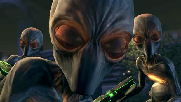
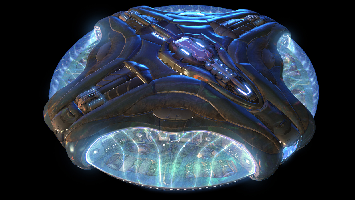
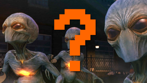
GF: Were borrowing pretty heavily from UFO culture in general, and I think a lot of movies come to that material to draw inspiration. Thats good! It gives people a starting point to understand what youre showing them. The little gray alien is supposed to be kind of weedy, but maybe psychically dangerous, and the bug-like alien is always bad news if it gets too close. We can use what people already know from the pop culture to help them understand parts of our game.
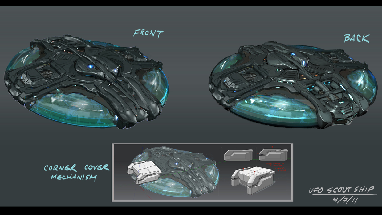
Flying saucers have been in a ton of science fiction movies and books and shows. Just think of all the movies where flying saucers are the alien ships from The Day the Earth Stood Still up through Mars Attacks or Independence Day and you can see that a lot of creative people know how to tap into that. If you see a UFO out there, then thats probably a bad sign for humans.
We did have some technical constraints that we were operating under for XCOM: EU, and the rounded shapes of the UFOs were a bit tricky to implement in the game. Our designers figured out how to implement them really well within the game itself, so we ended up with round UFOs that still work well with the underlying geometry of our game. Thats one of those great points of game development that makes both the artists and the engineers happy.
GR: Have there been any unorthodox inspirations outside of media or pop culture for the designs?
GF: We drew a lot of inspiration from the original X-com itself, and that game was very much a product of the UFO culture of the '90s, from Roswell conspiracy theories to the X-Files. A lot of times we would look at what was done in the original game, then iterate on a new design, and end up with something very close to the original because many of the artistic decisions they made were what was best for their game. We could be humble about what had come before in X-com, while still having the courage to push the design in some new ways.
Our design has always been there to support the gameplay of XCOM. Early on we made some fundamental decisions about the combat cameras and how our designs would need to look in order to look their best from the isometric combat camera and the up-close cinematic cameras. Once we had our viewpoints, we could design assets like armor and weapons that could communicate key information about the gameplay. You always know which soldier has the best armor (because its shiny and flowing, or possibly making him invisible) and which guy has the best gun (it glows green for plasma.)
The invasion begins
So, what do you think about the game's art style? Does it remind you of anything? Let us know in the comments below!
And if you want more supernatural goodness, check out the Top 7... enemies that scuttle and jump at your face and read our reasons why Mass Effect 2 is one of the greatest games of all time.

Hollander Cooper was the Lead Features Editor of GamesRadar+ between 2011 and 2014. After that lengthy stint managing GR's editorial calendar he moved behind the curtain and into the video game industry itself, working as social media manager for EA and as a communications lead at Riot Games. Hollander is currently stationed at Apple as an organic social lead for the App Store and Apple Arcade.

 Join The Community


